Have you ever stumbled upon a product online and wanted to save it for later? Or found an article so intriguing that you wanted to share it with your friends? Well, you’re not alone! With so much information available on the internet, it can be overwhelming to keep track of everything. That’s why website designers have implemented two important features to help make your life easier: the “Add to Wishlist” and social sharing buttons.
As the world becomes more digital, the importance of calls to action (CTAs) in website design and enhancing user experience (UX/UI) cannot be stressed. That is why, when developing a brand, company owners and website designers alike should pay particular attention to the placement and functioning of CTAs.
So if you’re looking to improve your website’s conversion rates and create a more seamless user experience, it’s time to start thinking strategically about your CTAs.
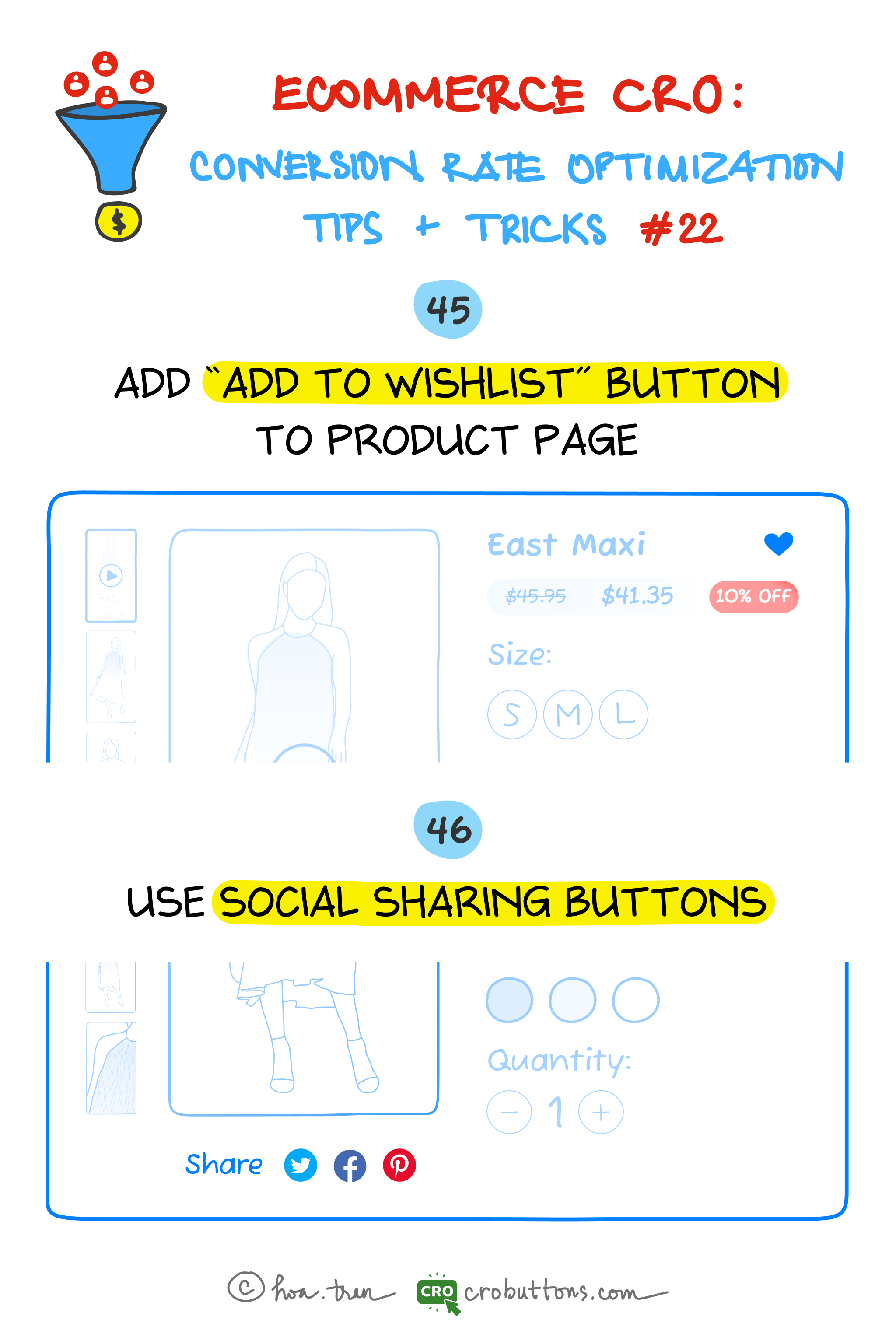
45. Add the “Add To Wishlist” Button To The Product Page
What is the “Add to wishlist” button?
A wishlist permits clients to create customized assortments of items they need to purchase and save them in their customer accounts for future reference.
Sometimes a visitor browses the ecommerce product page and then leaves without buying anything. Even when they are willing to buy, in most cases, they tend to forget where they saw the product. Wishlist will be a great tool for such users. It helps them maintain an eye-catching list of things on your website and then come back to complete the purchase. In many cases, users just need to dump products into their wishlist, then wait for the sale, and the coupon before buying them.
According to Baymard Institute, 58.6% of shoppers abandoned their carts because they were just browsing or were not ready to buy at the moment. Add to a wishlist also means to be an effective way to reduce shopping cart abandonment and fulfill sales from customers who showed intent but did not end up purchasing.
Wish lists are mutually beneficial: they give shoppers an easy way to remind themselves of a product and help customers measure product interest beyond a clear-cut sale.
The benefits of a wishlist
Have you ever come across a product online that you’re interested in, but not quite ready to purchase yet? Maybe you’re not sure if it’s the right color or size, or you simply want to save it for later. This is where the “Add to Wishlist” button comes in handy. Not only does it provide a convenient way for users to save products they’re interested in, but it also offers numerous benefits for website owners.
Firstly, it improves the user experience by allowing them to save products they are interested in without feeling pressured to make an immediate purchase. This way, users can take their time and return to the website to view their saved items at a later time, reducing the friction of committing to a purchase decision.
Additionally, the “Add to Wishlist” feature can increase engagement by encouraging users to return to the website to view their saved items, which can lead to further exploration and ultimately increase the likelihood of making a purchase. This increased return visit frequency can help to build brand loyalty and increase the chance of future conversions.
Furthermore, when users share their wishlist items on social media, it can drive additional traffic to the website and increase exposure for the products listed on the wishlist
What distinguishes the ‘Add to Wishlist’ button from the ‘Add to Cart’ one?
On an e-commerce platform, the “Add to Wishlist” and “Add to Cart” buttons perform different functions.
The “Add to Wishlist” button allows a customer to save a product they are interested in for future reference. It’s a way to keep track of items that they may want to purchase later or are considering buying in the future. The wishlist feature allows customers to create a list of products they like without having to commit to a purchase right away.
On the other hand, the “Add to Cart” button allows the customer to add the product to their shopping cart and initiate the checkout process. This indicates that the customer intends to purchase the product, and the item will be held in their cart until they complete the checkout process. However, please note that if you do not complete the checkout process, the items in your cart may be removed after a certain period or when you log out of the website.

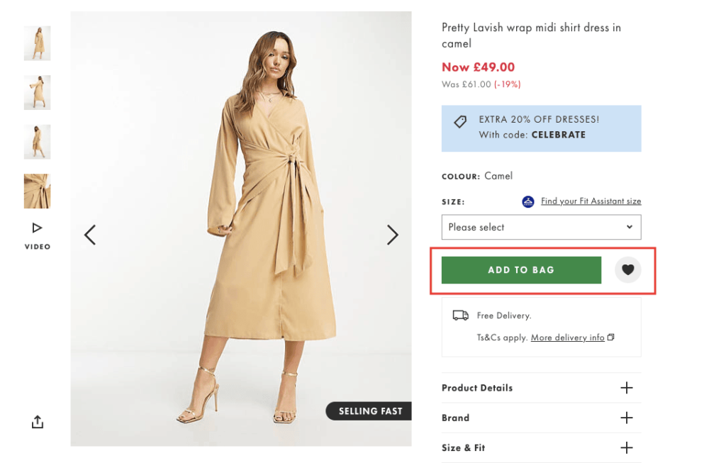
The business may choose to have either one of the buttons or both the “Add to Cart” and “Add to Wishlist” buttons. However, having both buttons provides more flexibility for customers and helps businesses cater to different purchasing preferences. The “Add to Cart” button is ideal for customers who are ready to purchase, while the “Add to Wishlist” button enables customers to create a list of products they are interested in without the pressure of making an immediate decision. This can lead to increased customer engagement and higher conversion rates for the business.
The ways to implement “Add to Wishlist” buttons on product pages
With the perfect plugin, adding the wishlist feature to your website is not a big hassle. This section will look at many approaches to integrating “Add to Wishlist” buttons on product pages, such as location, design, and functionality. Businesses may enhance their “Add to Wishlist” option by taking these things into account to deliver a seamless and successful user experience for their consumers.
Placement
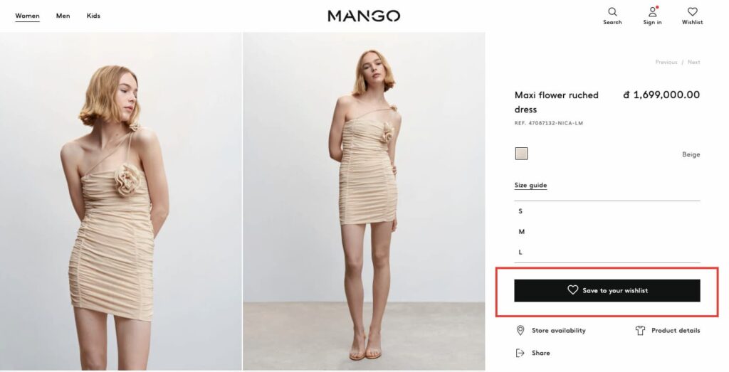
The placement of the “Add to Wishlist” button is critical to its effectiveness. It should be located in a prominent position on the product page, ideally near the “Add to Cart” button. However, it’s important to avoid placing it too close to the “Add to Cart” button, as this could lead to confusion for customers. It’s also essential to ensure that the button is not hidden from other page elements, such as images or descriptions.
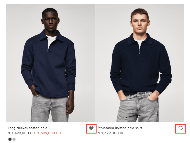
Businesses may improve the user experience by allowing customers to add things to their wishlist without leaving the homepage. Whenever a consumer falls in love with a product on the site at first sight, they should be able to add it to their wishlist with a single click on the heart icon or any other conspicuous CTA button immediately where they view the product. Businesses may boost user satisfaction by introducing this feature, which provides a smooth and simple method for customers to manage their favorite items.
Design
To make the “Add to Wishlist” button stand out, businesses should consider using a distinctive design that catches the customer’s attention. This can be achieved by using a different color or icon for the button then the rest of the page elements. Another option is to make the button larger than other elements on the page. However, it’s important to maintain consistency with the website’s overall design to avoid confusion for customers.
Functionality
The “Add to Wishlist” button should be easy and intuitive to use. Customers should be able to add products to their wishlist with just one click, without having to fill out any additional information.
It’s also essential to provide functionality for customers to manage and organize their wishlist, such as the ability to add notes or tags to each product.
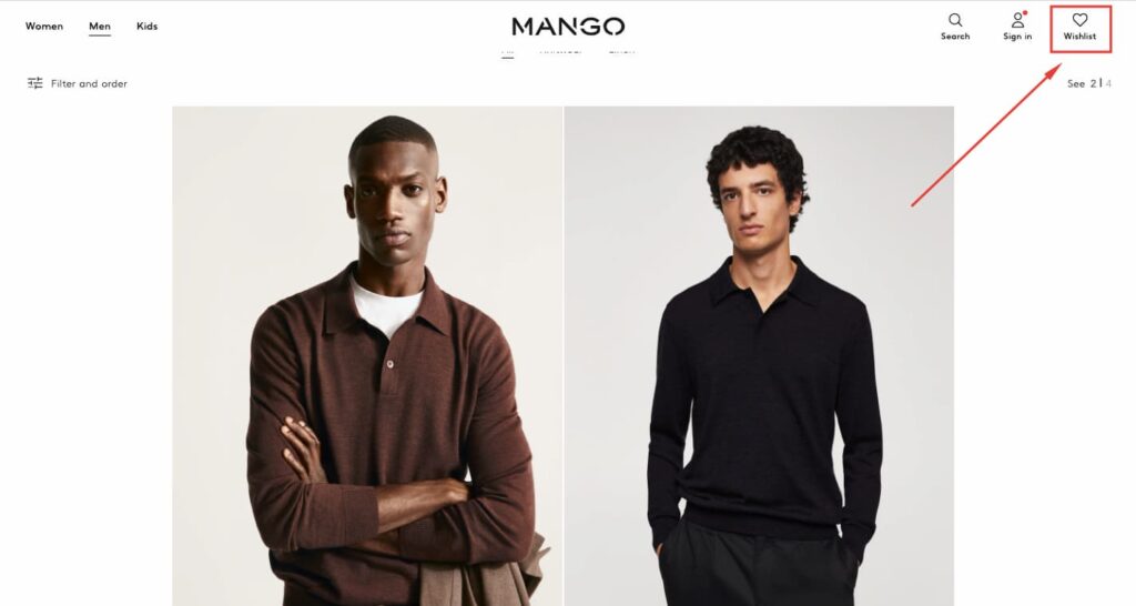
Additionally, businesses can consider offering a “view wishlist” button or link on the page, allowing customers to quickly access and review their saved products.
46. Use Social Sharing Buttons
Social sharing buttons on product pages are an excellent approach to improving brand exposure and reaching a larger audience. Businesses may make the most of social media marketing by analyzing their customers’ patterns, strategically putting buttons, and giving incentives for sharing.
What are social share buttons and how do they impact conversions?
Social sharing buttons are little icons on a website that allows visitors to quickly share its content on their social media networks. Customers may share their ecommerce purchases on Facebook, Twitter, Pinterest, and other sites by using social share buttons. The majority of online shoppers also use at least one form of social media, so these buttons create a free promotion for an online store.
When users share a website’s content, it can reach their followers and friends, who may not have been aware of the website before. This can increase the website’s exposure and ultimately result in more traffic and potential customers. Additionally, social sharing buttons can help to improve a website’s search engine rankings, as social signals are one of the factors that search engines consider when ranking websites.
The benefits of the social sharing buttons
As shoppers often use social media platforms to bookmark their favorite products or share their recent purchases with their social circle, businesses can leverage this trend by adding social sharing buttons on product pages.
By making social sharing a secondary call to action, businesses can not only provide customers with an easy way to spread the word about their products but also generate greater exposure through customers sharing their products. This can ultimately lead to higher conversion rates and increased brand awareness, making social sharing an essential tool for any modern business.
Tips for implementing social sharing buttons on your website
Choosing which social networks to integrate into an online store
Online store owners have a variety of social networks to choose from for sharing, but not all platforms are equally relevant. For instance, Facebook and Pinterest are highly visual networks, with some customers using Pinterest as a digital wish list.
As of Q4 2022, Facebook is the largest online social network in the world with roughly 2.96 billion monthly active users – Statista
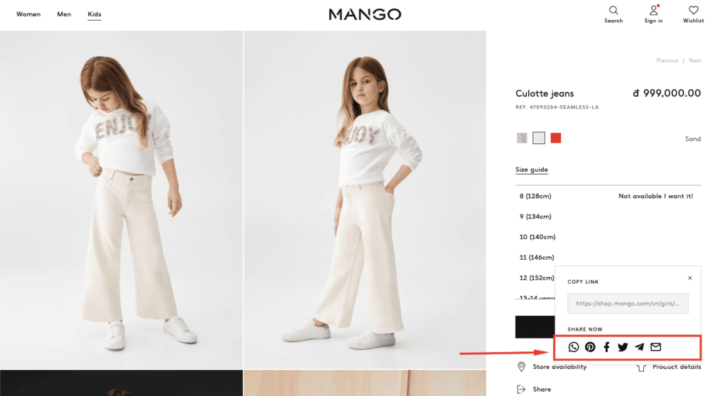
However, LinkedIn isn’t as applicable for this feature as product posts don’t align with how most members use the platform. Moreover, Google Plus has far fewer users than Facebook and Twitter, meaning shared items are unlikely to receive as much attention. By restricting social sharing buttons to Facebook, Twitter, and Pinterest, customers are less likely to get distracted by clutter on product pages.

Promoting social sharing for business growth
Businesses can also provide incentives for sharing. For example, offering a discount or freebie to customers who share their purchases on social media can encourage them to share and increase brand exposure. Additionally, businesses can consider creating shareable content such as blog posts, videos, or infographics to make it easier for customers to share.
Placement
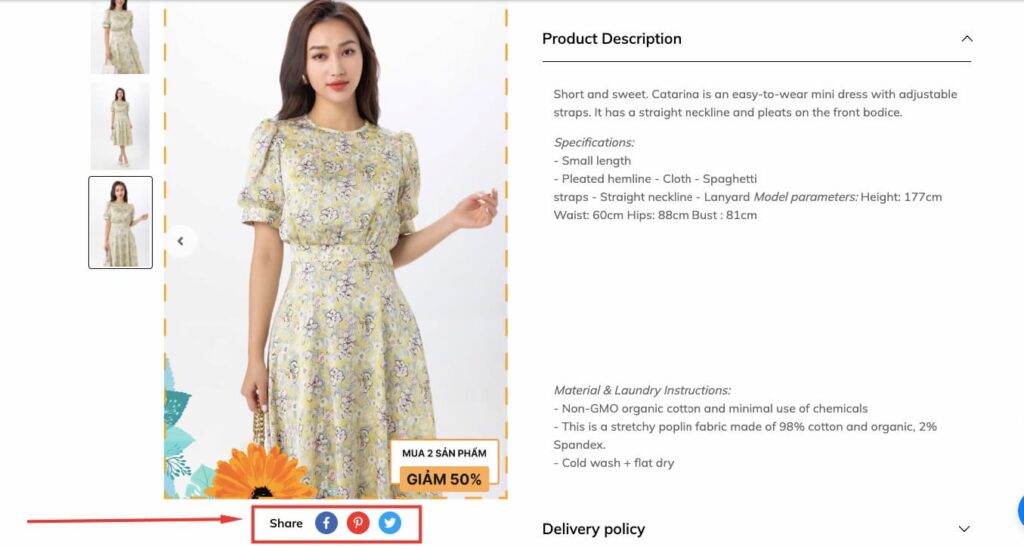
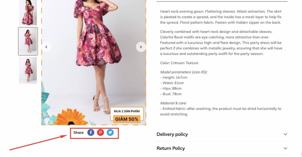
To maximize the effectiveness of social sharing buttons, their placement is crucial. They should be positioned prominently on the page so that users can easily see and access them. A good practice is to place them near the product images, which are the center of attention for shoppers. Another option is to include social sharing buttons at the bottom of the product description or alongside the “Add to Wishlist” and “Add to Cart” buttons.
