Complete guide to eCommerce CRO – conversion rate optimization. Includes templates, infographics, and more.
This is our complete guide to eCommerce CRO (conversion rate optimization) in 2023.
So if you’re looking for:
- More sales.
- More conversions.
- Easy CRO techniques.
Then you will love the actionable tips in our guide.
Let’s begin our journey into the land of CRO.
eCommerce Conversion Rate Optimization Fundamentals
What Is Conversion Rate Optimization?
According to Optimizely.com:
“Conversion rate optimization (CRO) is the process of increasing the percentage of conversions from a website or mobile app. CRO typically involves generating ideas for elements on your site or app that can be improved and then validating those hypotheses through A/B testing and multivariate testing.”
Yet we have a simple explanation. CRO is a set of tactics and best practices that help increase the number of people that take the desired action.
What Is an E-commerce CRO?
In short, E-commerce Conversion Rate Optimization is how we use tactics to optimize your web store for more sales.
Why Is E-commerce CRO Important?
In this age of heavy spending for e-commerce advertising, CRO is the key to your business success.
Here are some of the benefits that you can get from a good conversion rate in your stores:
- Increase average order value (AOV)
- Decrease shopping cart abandonment rate
- Get customers to buy more
- Build trust with customers
- Serve more customers with a quick checkout process
- Decrease return rate
- Get more love from loyal customers
In other words: eCommerce CRO can help you get the most bang for your advertising bucks.
Boosting conversion rates should be the top priority for your online businesses because they encourage customers to do what is most important, buy your products. And you can optimize your conversion rate with almost anything on your website:
- Landing page
- Mobile site
- Images, Videos, Font Size, and PageSpeed
- Free shipping option
- Cart and Checkout
- Product page, description, CTA
- etc.
Here are the Tips & Tricks to Improve your eCommerce CRO
Chapter 1: Landing Page Optimization
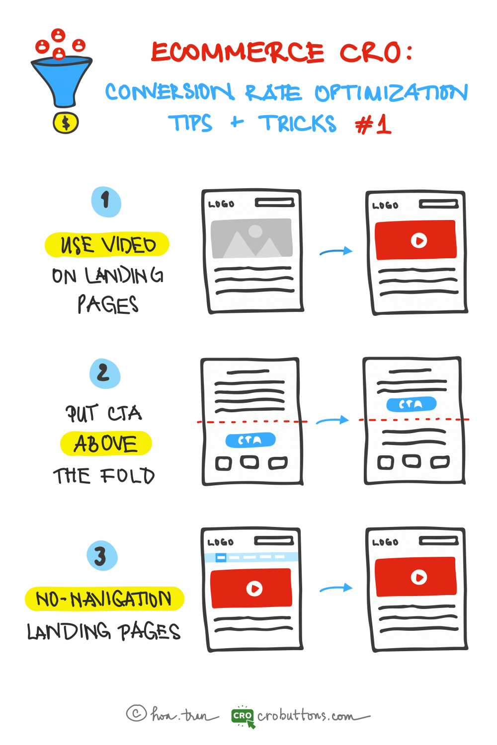
1. Use Video On Your Landing Page
A single minute of video is worth about 1.8 million words – Forrester
Video is a far better story-telling medium than most traditional text-based marketing applications. Video enables you to powerfully connect, convert and cultivate leads.
90% of information transmitted to the brain is visual, and visuals are processed 60,000X faster in the brain than text – Zabisco
How video can enhance the user experience?
When you navigate a landing page, there is usually a lot of text to read. This is because landing pages are essentially sales sites that want you to click on the call-to-action button right on the page or click through to the main page for the actual purchase. The excessive amount of text can be overwhelming and monotonous for viewers, leading to feelings of boredom and eye strain.

To tackle this issue, it’s recommended to utilize videos as a means of communicating information in a more engaging and visually appealing manner. Not only do videos help to hold the viewer’s attention, but they also offer a dynamic and interactive experience that keeps them interested and invested in the content. By using videos, the information can be effectively conveyed in a way that is both entertaining and informative, making it easier to attract and retain the viewer’s attention on the website for an extended time.
Benefits of using video on the landing page

- Increases conversion rate: The report showed that including a video on your landing page can increase conversions by more than 80%. That’s not up for debate. Since video on the landing page makes your product or service appear engaging, increasing the likelihood that your visitors will stay engaged and finally convert. Videos allow you to engage with customers more efficiently and convey information about your products and services.
- Increase credibility: Think With Google found that nearly 50% of internet users watched videos of a product or service before checking out a store. Videos help you show and explain your product or service to potential customers. It’s beneficial if your product is complex and cannot be easily explained in words. Moreover, people can see how your product works before they buy it. They are also more likely to remember what they see in a video than what they read in a paragraph.
- Increases retention and engagement: On average, people have spent 2.6X more time on web pages with video than those without. By integrating auditory and visual aspects, videos attract visitors to remain on your landing page longer. People will commonly scan a block of text to save time but will watch a movie in its entirety. It may be logical to assume that people spend more time on video landing pages because longer videos take time to run. However, the same study found that the page with the longest average time had only about one minute of video in total.
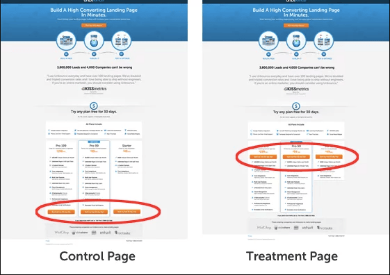
2. Put CTA Above The Fold
What does “Above The Fold” mean?
The area of your website that people see when they first arrive on a page is referred to as being “above the fold.” The header, text, image, or video that readers can see without having to scroll down is referred to as the content above the fold.
The “fold” of a website is considered to be at the bottom of the screen. The exact location of the fold will depend on the device that the visitor is using to load the page. As we all know too well, desktops, tablets, and mobile devices have different screen sizes and resolutions, so all content must be formatted differently to be appealing to all users.

Why CTA should be placed above the fold?
A report into the “importance of being seen” found that above-the-fold ads and CTAs had a 73% rate of visibility compared to only 44% for those below the fold. If your CTA is above the fold, then your chances of it being seen are significantly higher. Some customers might not want to scroll to the bottom of a page to find out what they need to do next in their buyer journey. And clients must be encouraged to make a purchase when they have a clear perspective and standout sight of your page.
3. No Navigation On the Landing Page
Why navigation should be removed?
The landing page has so many links that it directs users away from the present page, which is the largest problem that can adversely affect the conversion rate. As a result, the client is less focused and less attentive to the objectives of the website.
From a user experience (UX) perspective, it all makes perfect sense: When you take away distractions from a website, your visitors aren’t inundated with confusing options to make. Their thoughts are at peace, allowing them to concentrate solely on the landing page’s page objective.
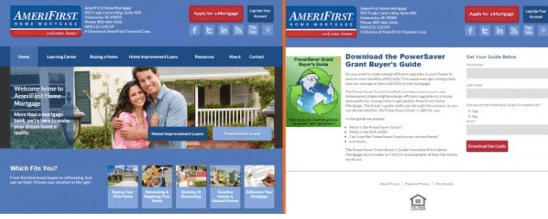
Making a landing page without navigation is best to increase conversions and ROI (return on investment). According to research by a HubSpot resource, removing navigation can increase conversion by 10 – 50%. Let’s agree on this principle: your landing page must be naked, don’t wear them with navigation. Let the customers focus on you and your offer, and complete the conversion.
Chapter 2: eCommerce CRO on Mobile
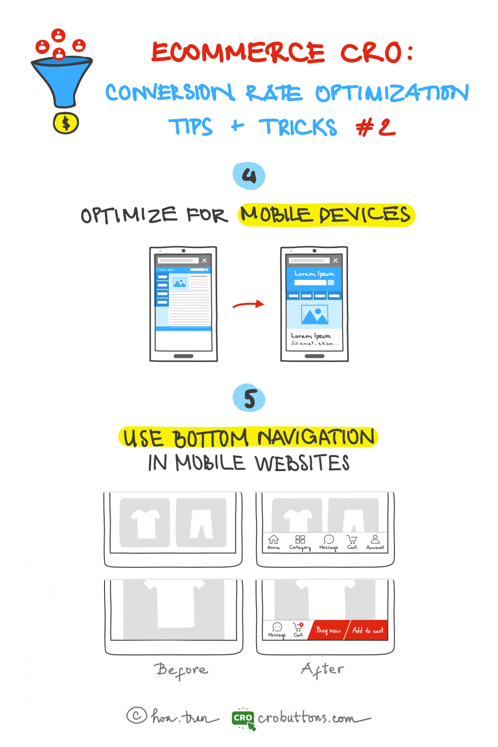
4. Optimize For Mobile Devices
In a recent research from Oberlo.com:
The share of mobile ecommerce sales in total ecommerce sales has increased a whopping 39.1 percent from its 52.4 percent market share in 2016 to the current 72.9 percent market share.
Put another way, 3/4 of online purchases today are made on mobiles.
US mcommerce statistics show a constant increase in the number of people jumping onto the mobile shopping train. In 2020 there were 167.8 million mobile shoppers stateside, which is around 60% of the entire US population. Mobile shoppers are defined as people who have bought at least one thing using a mobile device via an app or a website.

With consumers increasingly purchasing online via mobile devices, it is more crucial than ever for eCommerce enterprises to have a mobile-responsive website. The key to obtaining mobile responsiveness is to use responsive design techniques like flexible grid systems and dynamic image scaling, which allow the website to alter its layout depending on the device’s screen size. By adopting these approaches, eCommerce businesses can guarantee that their website delivers an excellent viewing experience for clients, whether they are using a smartphone, tablet, or desktop computer.
If your store is not mobile-friendly, how can your customers complete their shopping on their phones? Your store assistant refuses to help the customer, so they have to leave immediately.
Don’t let this happen. Be helpful. Assist your customer with a pleasing mobile shopping experience.
5. Use Bottom Navigation on Mobile Web
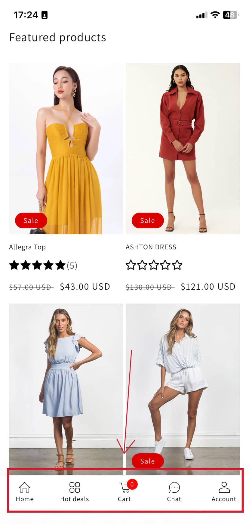
Everyone prefers to use their thumbs to navigate on the phone. And our thumbs are not growing like the screen sizes each year. There is a good reason why apps like Uber, Amazon, Facebook, and Instagram have bottom navigations. Your mobile web store is not an exception.
Creating a satisfying mobile experience is critical for gaining people within your app. Among the most effective ways to improve the user experience on a mobile eCommerce website is through the use of bottom navigation. By placing your most critical actions and navigation links near the bottom of the screen, you will significantly improve user experience, especially as smartphones become larger.
Furthermore, there are various benefits to adopting bottom navigation on a mobile ecommerce website:
- Improved user engagement: In the A/B test found that the sticky “Add to Cart” button gets more Orders by 8%. Bottom navigation allows consumers to easily access different areas of the website, increasing the chance of conversion and user engagement.
- Simplified navigation structure: Bottom navigation simplifies the website’s general navigation structure, making it easier for users to discover what they’re searching for.
- Consistent user experience: eCommerce organizations may deliver a smooth user experience and boost brand awareness by employing a similar layout and placement of bottom navigation across all pages of their website.
Amazingly, CRO Buttons brings the footer navigation for your Shopify online store. We transform your web into an app-like experience, after a few clicks. Several available themes are ready for you to use on your website. And you can make your shop as convenient as big e-commerce sites such as Shopee, Lazada, Flipkart, Shein…
Head over to our tutorial to see the magic.
Chapter 3: 3 ways to Reduce Your Bounce Rate and Increase Conversions
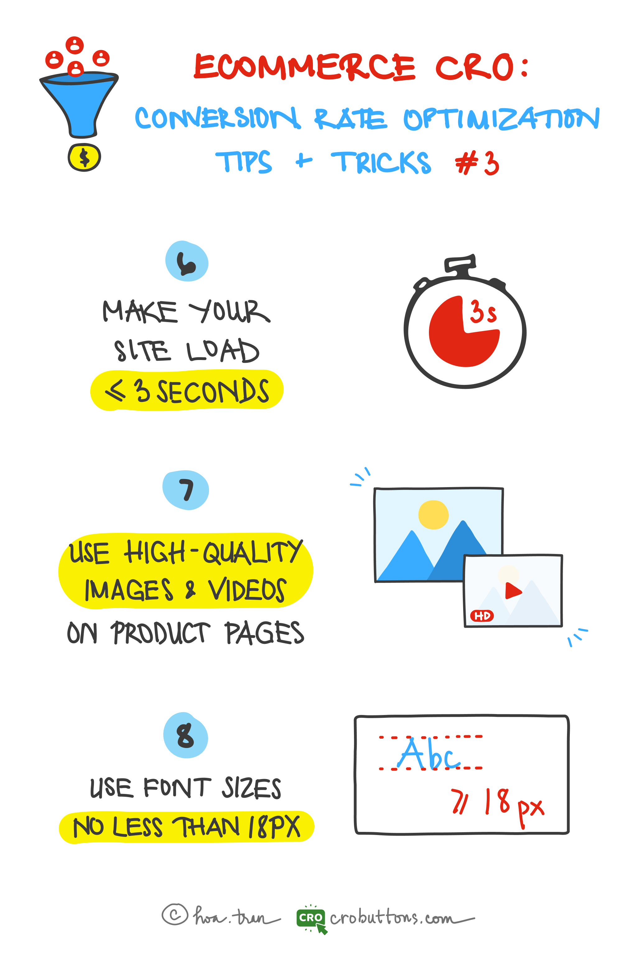
6. Make your site load approximately 3 seconds
Today, Page Speed is one of the most important metrics to keep your eye on. It directly impacts user experience, conversion rates, and search engine optimization.
What is page speed?
As the term suggests, Page Speed is a measurement for identifying how fast the content on specific page loads. This metric combines various elements loading on your websites such as images, videos, graphics, CSS, HTML, Javascript, and server response time.
Why is Page Speed Important?
Websites with faster Page Speed provide a seamless user experience. On the contrary, websites with longer load times tend to have high bounce rates and reduced average page time.
A fast website provides a much better user experience than a slow one. Research has shown time and again that a slow website gets fewer conversions, and the user doesn’t read or engage as much on slower sites. That in itself should be enough reason to make sure the speed of your site is as good as can be.
According to unbounce.com:
When it comes to waiting for pages to load, most consumers think they’re more patient than they are.
Nearly 70% of consumers admit that page speed impacts their willingness to buy from an online retailer.
Although they know it’s important, the majority of marketers aren’t making page speed a priority.

The faster your website’s load time, the happier users will be. A faster website will have higher conversion rates and an overall better user experience.
7. Use high-quality images and videos on product pages
Most people don’t understand how images influence user behavior. They think images are just for decoration. As you know, customers can’t physically verify the product when shopping online. So they must place absolute reliance on images and videos on the website to get the closest look of the items.
According to social media expert Jeff Bullas
“67% of consumers say the quality of a product image is ‘very important’ in selecting and purchasing a product” in an eCommerce site. It’s even “more important than product-specific information (63%), a long description (54%) and ratings and reviews (53%)”
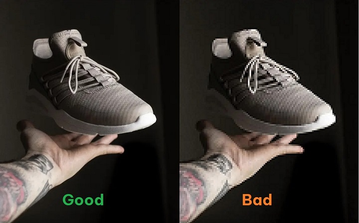
What defines a high-quality image?
The three main components that define a high-quality image are sharpness, relevance, and speed.
Why is having high-quality images important?
High-quality images and videos provide a better user experience
Most people are likely to stay on the website with comprehensive and supplemental images that connect to what they were researching. Furthermore, high-quality images allow the users to make an informed opinion about the value of your site. So it is almost common sense that the better quality images you have on your website, the better the experience for any user visiting your site.
High-quality images help improve website SEO
Although search engine bots can not see the images on your website, they are capable of reading tags, captions, alt text, and other textual context for an image. Make sure the alt text and keywords for the image are directly related to the image. And the file name for the image should be descriptive of the image. So it is important to have high-quality images to draw the user in and keep them there, thus reducing the bounce rate.
High-quality images improve the conversion rate
High-quality photography supplies you with more visits by increasing the quality of your user engagement. Therefore because of this, users are more likely to spend longer on your website means you have a longer period to sell your products/services through both content and images.
However, remember to compress images and videos before uploading to increase the page speed. Here are some tools for you to do it:
8. Use font no less than 18px
Why we should use a font of no less than 18px?
Words must be the first means that help your readers understand what you want to convey. So if the font size is too small, readers will have to strain to read the text, which causes their eyes to fatigue. On the other hand, if the font size is too big (making the line length too short), readers are forced to jump to the next line of text – is also hard on the eyes!
In The Effect of Font Size and Line Spacing on Online Readability, UX researchers at Carnegie Mellon University and Spain’s Universitat Pompeu Fabra discovered that 18-point font sizes are the best for UX readability as well as comprehension in the body text of pages.
How to choose the acceptable font size?
The font size must also be large enough to be easily read. However, we have to consider endless screen sizes, large and small!

For large screens, your base font size should be in the range of 18px to 26px.
Larger font sizes on smaller screens create an uncomfortable reading experience because lines of text get cut off too quickly. The font size needs to be reduced on the smallest screens (mobile devices) to keep the line length of the text in that desired 45–80 characters per line range. In this way, visitors will not be shocked when suffering the website.
Chapter 4: Use free shipping to boost your sales
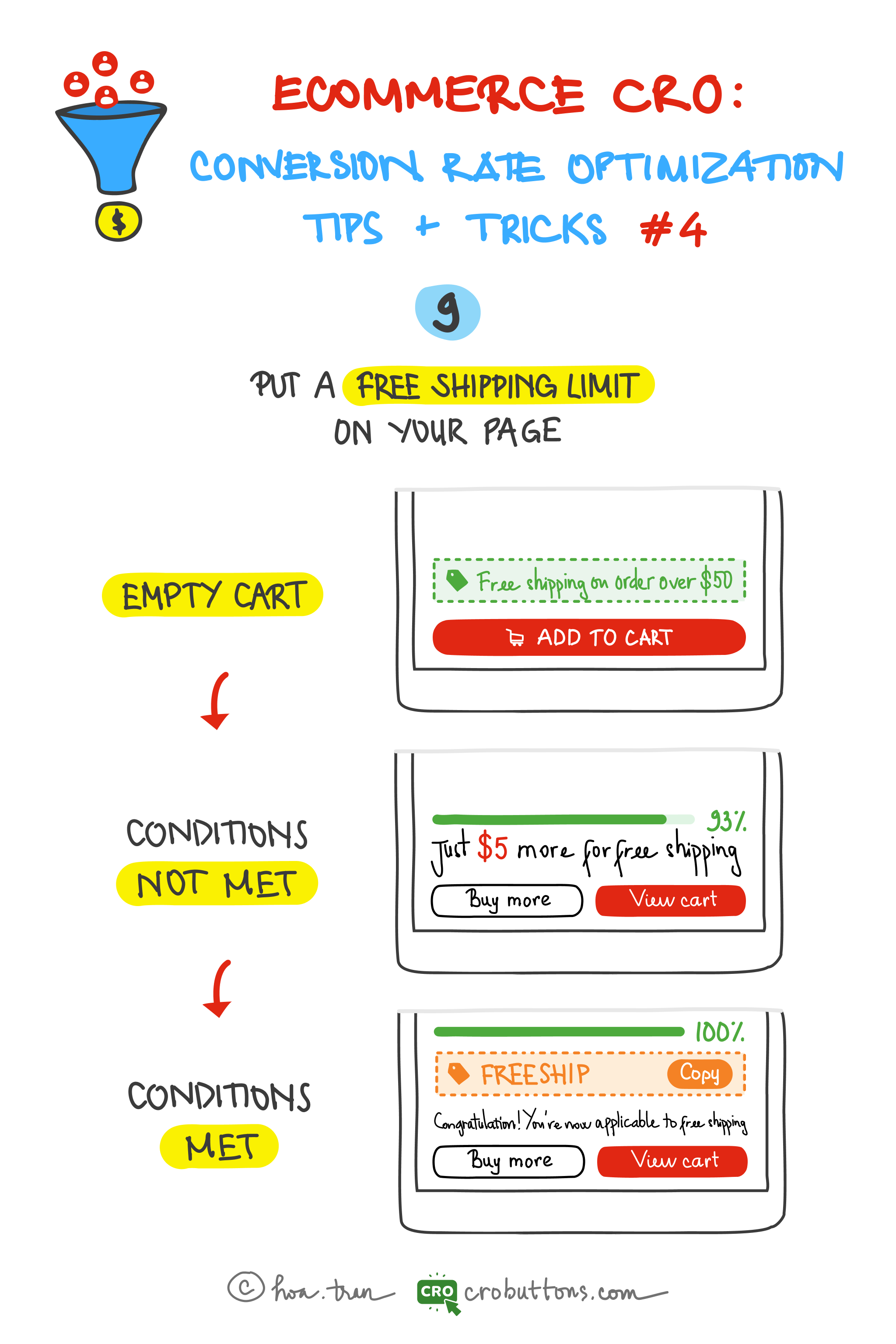
The word “free” has an amazing effect on purchasing behavior, like a psychological trick. “Free shipping” has become a common option when shopping online.
According to the Walker Sands Future of Retail 2016 study, nine out of 10 of the survey participants said free shipping was the No. 1 incentive when asked what would make them shop online more often.
Add minimum order threshold
Probably one of the most popular methods is to set a free shipping threshold – the lowest purchase amount that entitles a customer to free shipping. Very often buyers add more products to their shopping cart just to benefit from it. This will help increase average order values and potentially boost profits within certain product categories. Offering free shipping can help customers spend just a little bit more to avoid shipping fees. After capturing customers’ psychology, let’s do this tactic.
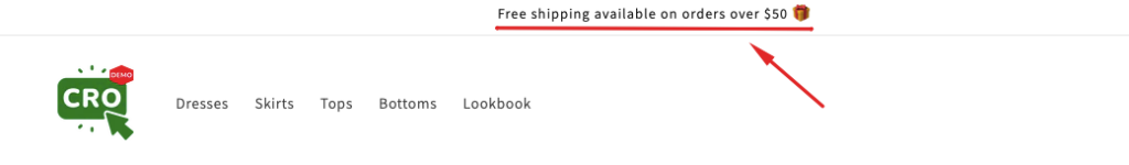
1. Inform the discount
First of all, the information about the discount must be displayed on the pop-up, main menu, header, etc to inform customers. Example: “Free shipping in orders over $50”.
2. Condition not met
Let’s motivate your shoppers to add more items to the cart to achieve the goal by using the progress bar and message so that they could catch up with the target.
3. Condition met
Finally, adding some gifs or animations appeared when shoppers met the condition to have a coupon for free delivery.
Such findings appeared, among others, in the BigCommerce report published in 2019
“Up to 84% of consumers admitted that they’re ready to buy more to receive free shipping”
Common free shipping thresholds include $25, $35, $50, and $100, but you shouldn’t just choose one of those numbers without doing the math. So, how calculate a free shipping minimum spend threshold to minimize risks?
Chapter 5: Optimizing Cart and Checkout Content

The shopping cart and checkout stages are critical since this is where conversion happens. Everything else leads up to those stages. So how to optimize your eCommerce cart and the checkout experience to decrease the cart abandonment rate?
10. Always show shopping cart content
Most online shopping customers will keep the items in the cart and have no decision to buy even though they are interested in that product. Therefore, it is necessary to make sure the most prominent shopping cart icon is possible on every page to provide shortcuts for customers when they need to carefully check the selected items. If they can not find the cart, they will reduce the level of payment ready for the last time, which can lead to the cancellation of orders and loss of conversion.
Design your product pages so that the customer doesn’t have to look for the “Add to Cart” button. You want them to keep adding products, so make sure they can at any time in the shopping process.

It would help if you also placed the Cart icon on the top right of the page, where most people expect them to be. This placement is especially ideal for mobile shoppers. Make the shopping cart icon as prominent as possible on every page to provide shortcuts to customers when they demand to double-check their selected items.
Make sure:
- Show the pop-up to confirm “Item added to your cart”
- Fully displayed subtotal and quantity for customers to verify firmly before paying.
11. Provide limited-time coupon codes
Limited-time coupons are a great way to get shoppers to take action immediately. When taking the final checkout steps, customers are likely to grow more satisfied knowing that their orders are qualified for coupon codes including discounts on the selected products or shipping fees. Shoppers experience the fear of missing out (FOMO) when they know a discount code is about to expire. So they want to get in on the action before the offer ends.
According to Statista:
The majority (88%) of people look for discount codes throughout the product research process.
The cart abandonment rate goes up because customers think that they can get a better deal elsewhere. Discount codes, by their very definition, assure customers that they get a special rate that’s just for them. And when they receive these via email, they know that the codes are not available to just anyone.
Try to create coupon codes that require conditions to acquire and avail at a set period only. Secret coupon codes given to certain customers illustrate the advantages of multiple special purchases. Setting a deadline for the included discounts generates a sense of urgency that encourages customers to quickly close the deal. The coupon codes should be automated and operated with the help of other useful tools such as emails or additional confidential links.
12. One-page checkout
According to “Reasons for Abandonments During Cart & Checkout (2022 data)” of Baymard:
17% of shoppers abandoned an order because the checkout process was too complex.
Some typical criteria determine an effective checkout page that stores can keep in mind.
Simple one-step checkout
Displaying all checkout information on one page helps reduce mouse clicks that normally take much time to conduct while giving customers a better category navigating experience. Besides, a one-step checkout form will enhance page loading speed, decreasing cart abandonments compared to a multiple-checkout-pages process.
Allow guest checkout
Guest or social checkout allows shoppers to complete their purchase without entering unnecessary details, such as their birthdate or password, which helps reduce the friction purchase process and fasten conversion steps.
Remove unnecessary steps
People want as few steps as possible. Store administrators should manage checkout fields effectively and select the necessary ones that can optimize customers’ payment conclusions.
The standard checkout process for a consumer should be:
- Adding to the cart
- Billing details
- Shipping details
- Delivery method
- Preview order
- Payment
- Confirmation
Save customers’ information for next purchases
Customers only need to fill in their information once. Their name, email address, and shipping location are stored within the payment processor for future use, allowing them to breeze through the online checkout experience with one click when returning to the same website. Information about customers should be stored and auto-filled the next time they visit.

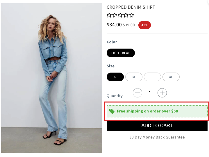
Chapter 6: Increase conversion rates with the “Add to cart”, “Buy now” and “Size chart” buttons
The CTA button (such as add-to-cart, Buy now) and the size chart are simple website elements that can transform your online conversion rate. Your shoppers may not remember what your button looks like or says, but an effective button can inspire a click and lock in their internal commitment to buy. Even the smallest design changes can turn casual browsers into buyers. We will show you some information and tactics to increase conversion rates with the CTA button and size chart.
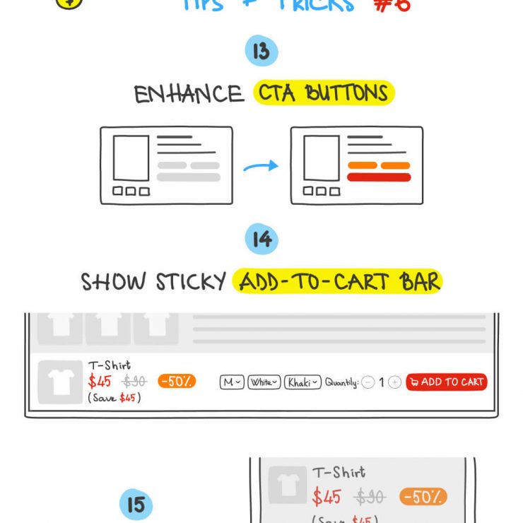
13. Enhance the CTA (call-to-action) button
According to Unbounce, more than 90% of visitors who read your title also read your CTA content. Many people depend upon the CTA at the end of the page to take the next step. So omitting the CTA can confuse readers and hurt your chances of sealing the conversion. CTA buttons make it easy for customers to do what you want them to do. That’s good for them and good for business.
There is no exact science on how to make a CTA more effective. But even though there’s no “right” way to craft your calls-to-action, there are a few best practices:
- Select your button color wisely
- Consider a Button Hover Effect
- Button Placement
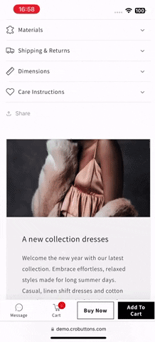
14. Show sticky Add-to-cart bar
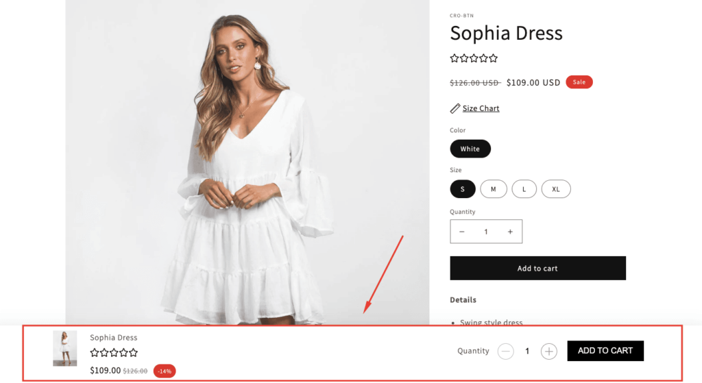
Growth Rock has surveyed
The sticky Add to Cart Button Gets More Orders by 8%
When the content of the product is long, users often find it hard to click add to cart button because it is at the beginning of the page. This plugin will solve the issue by adding a sticky cart at the top or bottom of the page. It also helps visitors who use mobile devices easily add a product to the cart. The smaller screen on mobile devices, the harder to find CTAs like the add-to-cart button, so making the add-to-cart button sticky could improve user experience.
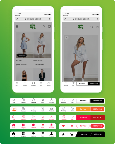
15. Add size chart
The main reason why customers are afraid to shop at the store or make online purchases is the matter of sizing. Many items require a fit of one type or another – sleeping bags, fishing rods, furniture… all need to fit the buyer. The instructions for choosing the ineffective size can make customers disappointed when making a conversion decision because they are not sure whether the items want to suit them or not. So, if we have such a small link of the size chart that does make a significant difference in conversion rate, that would tell us that the size guide link may have relative importance for certain apparel eCommerce sites.
Currently, the sticky bar and the size guide are available on CRO Buttons
Chapter 7: Involvement In The Decision-Making Process
When a customer encounters a problem with your product or service, they will abandon the order. They found difficulty in making a purchase. That’s why retailers need to involve in customers’ decision-making process to optimize the checkout process. By using tools to optimize the checkout process, you are encouraging more shoppers to complete a purchase.
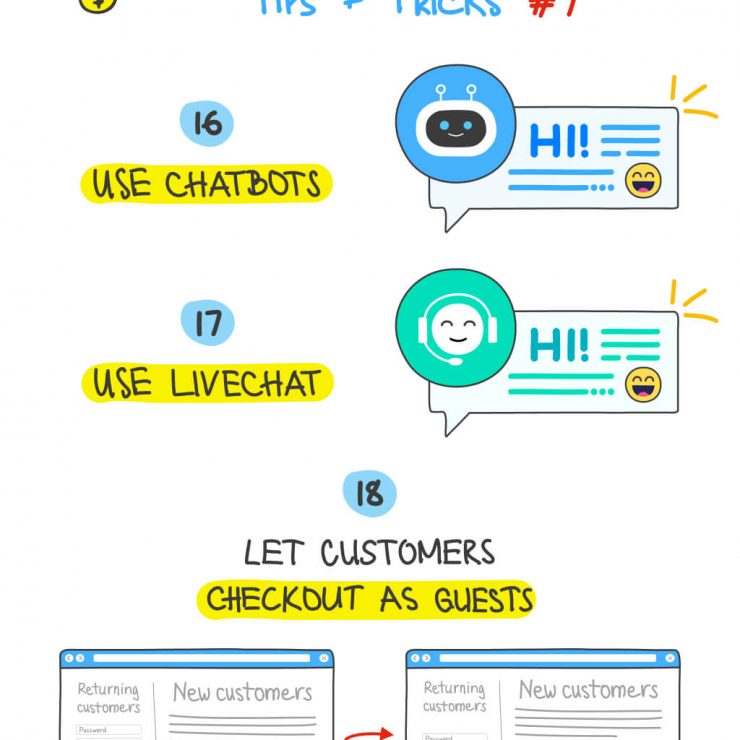
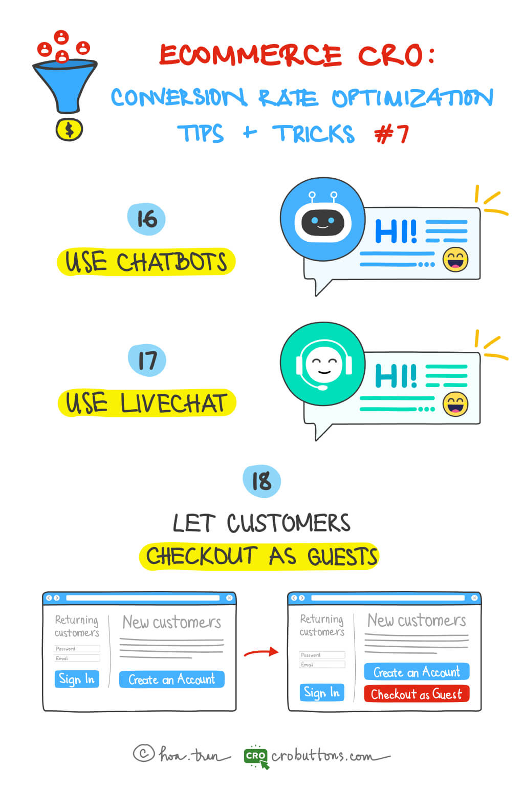
16. Use chatbots
What is the chatbot?
Chatbots are AI programs that interact with website users in real time. This mimics human behavior and speech patterns. AI chatbots have fundamentally automated services that are performed across many business processes such as answering questions, recommending products, gathering feedback, and tracking engagement. By using a chatbot, retailers can provide always-on support, at a better price than full-time staff.

Why should we use a chatbot for the web store?
When making a purchase decision, customers always need support 24/7. At this moment, a chatbot can function as a real-time assisting salesperson with automated responses to resolve customers’ queries and provide them with useful guidelines.
The chatbots also can offer post-sale support like ordering issues, shipping delays, refunds, and returns. This reduces the workload for custom service agents. It helps boost average lifetime value (LTV) and build long-term brand loyalty.
17. Use the live chat
What is the live chat?
E-commerce live chat normally takes the form of a pop-up or small window on your eCommerce website, appearing in the browser’s corner and allowing your company to assist clients with even the slightest inquiries. Simply begin typing in a chat box or chat window, send your message, and wait for a response from other users.
Why do you need live chat for eCommerce?
Live chat is designed to surface instant answers and can help companies keep up with demand during high-volume stretches or when customers look for quick answers. There are three main reasons why you need to have a live chat on your site:
- Saving time for both your customers and your company: People don’t have to abandon their shopping experiences in search of answers, get on the phone, or wait for someone to respond to an email. Quicker responses can therefore reduce cart abandonment rates. Customer service agents can similarly save time by dealing with multiple clients over live chat at once.
- Answering customer questions before they become hesitant: When thinking about making a purchase, responding promptly is very crucial. Customers are more likely to delay before purchasing if they have queries and can’t find an immediate response to them. Live chat can deal with this problem.
- Live chat gives you valuable insights into your customers’ behaviors: By live chat, you can ask the customer for feedback right after you’ve solved their problem within the chat — which is easier for them than a follow-up phone call or email survey. Live chat gives you access to the analytics you wouldn’t have with phone or email support. Plus, because it happens in real-time, you’re capitalizing on the momentum of a solid interaction that just took place.
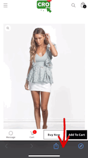
18. Let customers checkout as guest
Many eCommerce stores force customers to create an account before allowing them to complete a purchase. John Cheng, founder and CEO of Baotris said: “A lot of people may see the process of creating an account as an obstacle because they are looking for a fast and easy way to buy the product they want”. While having customer information in an online account makes the checkout process faster for future purchases, asking shoppers to create an account causes 24% to leave without purchasing. It led to increasing the abandonment cart.

So guest or social checkout allows shoppers to complete their purchase without entering unnecessary details, such as their birthdate or password, which helps reduce friction purchase process and fasten conversion steps and optimize the checkout process.
Chapter 8: Improve the Product Page
A decent product page requires a variety of components. Do you maintain the product page? Despite having a good theme or a high-end product, e-stores sometimes lack the most fundamental components on the product page. Customers become frustrated and quit the website as a result of poorly optimized elements.
What therefore should we change to make the product page better?
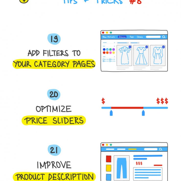
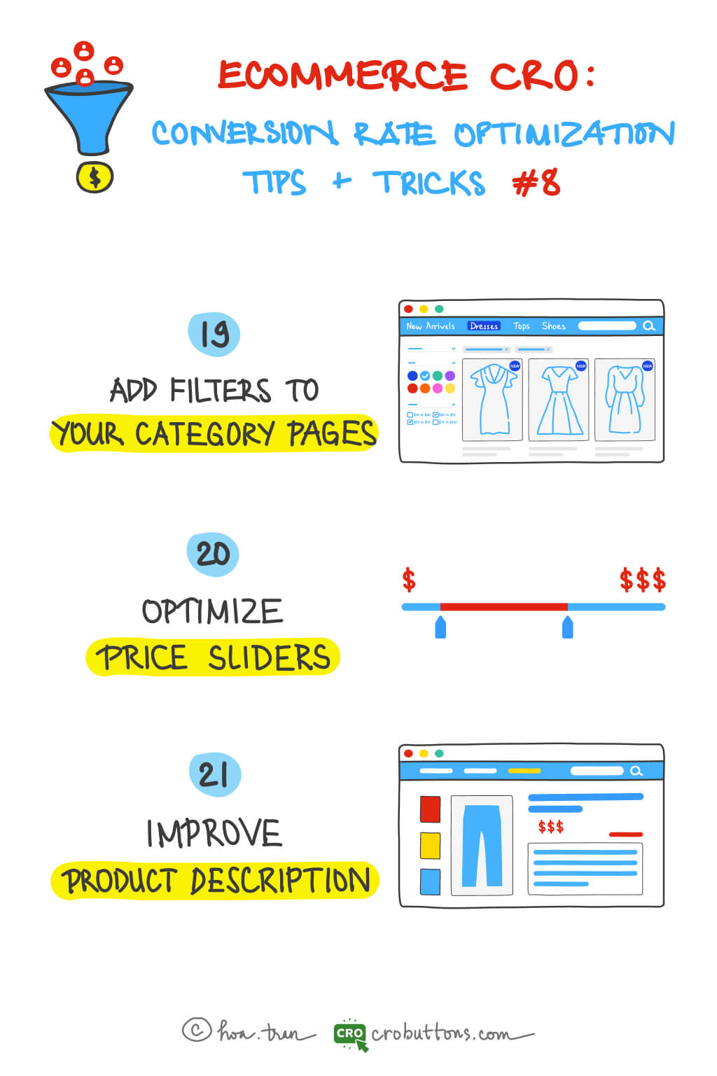
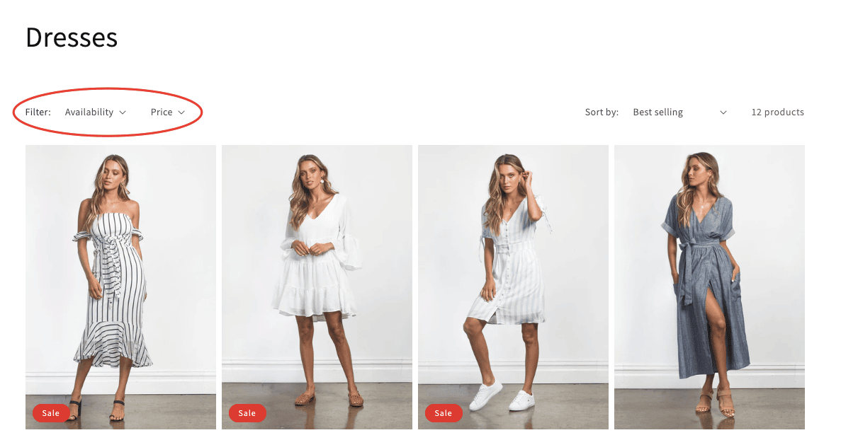
19. Add filters to your category pages
Good filtering is especially needed when an online store offers many different categories or product items, or when an assortment has several attributes and possible combinations. Customers never love scrolling through endless category pages to find the product they want. If your customer can’t find exactly what they’re searching for, they can quickly become frustrated. Even if you have exactly what they want, if they can’t easily find it, they’re simply going to buy it from a competitor that has a better-built site. Even if you don’t have what they’re looking for, they should find this out as quickly as possible. That’s why the filter is necessary.
What is the filter?
Filters are essential tools for effectively refining large amounts of information by providing certain criteria and narrowing down the results by excluding items that do not match the set criteria. It helps streamline navigation on websites with an overwhelming number of products.
Benefits of using filters
- Filters are an integral part of marketing, as well as sales. Improving the site’s filtering system can greatly impact how many products consumers watch and ultimately buy in the online store.
- Providing too many choices can confuse and overwhelm your customers. Filters are undoubtedly important to help customers navigate and direct to the right products with matched desired categories.
- By including search filters in your eCommerce store, you can greatly provide a much better user and customer experience to your visitors than even some multi-million dollar online retailers.
Tips about designing product filters you should take notice of
1. The best location for your filters
When thinking about the placement of your filters, you have two options:
- A horizontal filter bar on top of the page will be more effective in focusing the shopper’s attention and, in many cases, will be more convenient to use.
- A vertical sidebar on the left: is where users are used to finding filters, so it offers a familiar experience and can contain a much larger number of filtering options.
2. Designing a horizontal search bar
You have to pay very close attention to how you design it to keep the customer experience excellent:
- You will have limited space, so you might want to hide some of the filtering options – you can read about how to do it in the next few paragraphs.
- Make sure the drop-down menus don’t automatically disappear when the cursor is not hovering over them.

- Use icons to help shoppers quickly understand the options and to streamline navigation.
3. Make sure the applied filters are obvious
Shoppers should understand exactly which filters are applied and why they are viewing the given set of results. They should be able to easily make changes to the filtering options if they are not satisfied with the results.
You can make applied filters obvious in multiple ways:
- With checked or filled checkboxes.
- Displaying cancellable tags.
- Providing a back arrow for selected subcategories to go back to one level.
- Displaying the currently applied filters in a horizontal bar above the results.
20. Optimize the price slider
Do you know what’s the single biggest factor influencing customer purchasing decisions? According to Retailing Today, 81% of shoppers conduct online research before making big purchases; and the price is the most popular sorting option on the search engine. So we can jump to conclusion that the product price is the biggest factor influencing customer purchasing decisions.
What is the price slider?
You may display a price slider with this sophisticated pricing filter. Customers may use it to filter the product catalog by setting low and high prices. They may do this to rapidly identify items within their price range by setting a price range (minimum price value and maximum price value).

Why do we need the price slider on the product page?
According to Prisync, 60% of consumers consider pricing to be the very first criterion for their buying decision. Every shopper has a price range in mind when shopping for an item. This way, they can quickly see items sorted by their product price – either low to high or high to low. It makes it easier for customers to find what they’re looking for.
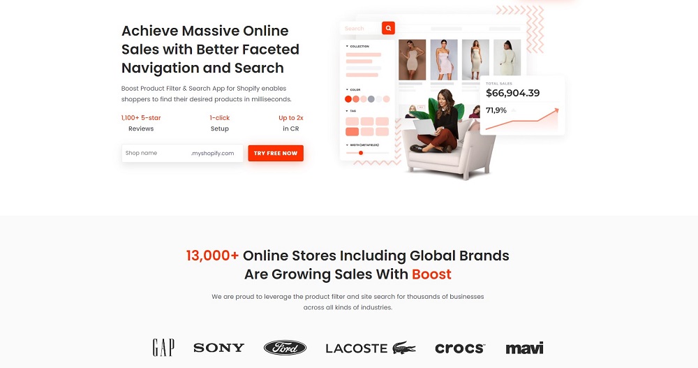
✍️ Tips for Shopify store owners:
Creating advanced product filters and a smart search bar to enhance shopping experiences & boost sales by customizing the filter by tag, meta field, and product options; show auto-suggestion search results with high relevancy.
Especially, it can deliver relevant results with synonyms, stops word & no-search result suggestions. All that things are available on the “Boost Product Filter & Search” app developed by BoostCommerce.
With Boost Product Filter & Search, you can customize the filter trees, and filter options on any page & create a smart search bar easily, which helps shoppers find anything within milliseconds.
21. Improve product description
The product information found on the product page is comparable to that found on the package that was purchased from the retailer. Increased conversion rates are likely to happen as a result of a successful product description that offers visitors useful information to aid in purchasing decisions.
What is the product description?
A product description is the marketing copy that explains what a product is and why it’s worth purchasing. The purpose of a product description is to supply customers with important information about the features and key benefits of the product so they’re compelled to buy.
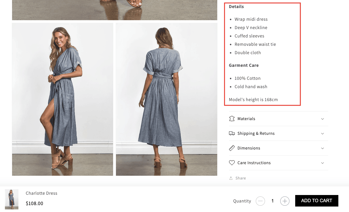
In the description, you need to answer questions customers have about your products:
- What is the product?
- What problems does your product solve?
- What do customers gain from your product?
- What makes it better than the competition?
Why would you improve the descriptions for your products?
When making an online purchase, customers can’t handle your products in the flesh, so they have to make do with a description and imagery — so these better are great! Do you need more reasons to improve your product descriptions? Good product descriptions help you:
- Communicate benefits more clearly
- Establish a voice
- Improve customer experience
- Increase the chance of ranking your product in the search results
- Get higher conversion rates
- Get more return customers/build relationships
- Create trust
“One shopper in a recent study could not find the information he needed in the product description, so he left the site to search Google for more product information. In the course of his search, he found another site with the same product, a more complete description, and a lower price” – NN/g
Tips to have a good description
1. Focus on your ideal buyer
Putting yourself in your audience’s position will help you develop product descriptions. The most effective product descriptions speak immediately and personally to your target market. You converse with them by posing questions and providing answers in this way. When writing a product description, begin by picturing your ideal customer. What type of humor do they enjoy (if any)? What phrases do they employ? Do they have a language they despise? etc.
2. Write the way your target audience wants to read
The Harry Potter books didn’t become popular solely due to the plot. Author J. K. Rowling’s writing style was what first caught everyone’s attention. Harry’s world is detailed and complex, yet the reader understands it. Your visitors should understand what you’re saying, and the best way to ensure that happens is to write for them.
3. Don’t write for search engines (but do)
One of the most important things to remember is that you are writing for humans, not machines. Of course, writing a good product description makes it easier for search engines to understand it, but that shouldn’t be your goal. Your goal is to communicate the product’s value to customers and sell it as a solution.
Chapter 9: Make Your Website More Trustworthy

Establishing trust is crucial in the world of e-commerce and conversions. A report by Salesforce highlights that customers tend to be more loyal to trusted brands, with 95% being more likely to stick to them, while 92% are more likely to make repeat purchases.
A lack of confidence in your website can result in detrimental effects such as low conversion rates, high bounce rates, and frequent shopping cart abandonment. This article offers valuable insights on how to enhance the credibility and trustworthiness of your website to overcome these challenges.
Now, let’s start it!
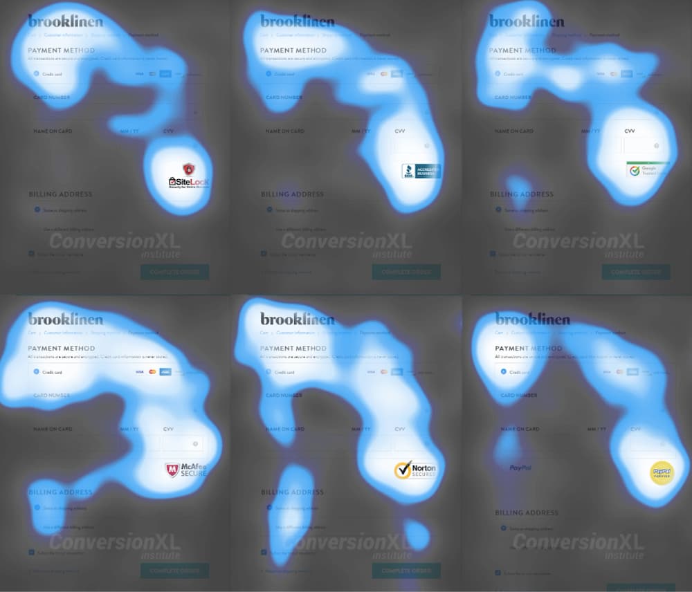
22. Use trust badges
Trust badges could be the key to increasing your eCommerce conversions.
What is the trust badge?
Trust badges are symbols displayed on a website that is meant to instill trust in your potential customers. These trust badges let website visitors know that your page is legitimate and that any data they share will be collected through secure third-party service providers. You can establish trust with prospective customers more quickly with these trust seals, symbols, or icons on your website.

The best types of trust badges
Generally, trust badges used in e-commerce can be classified into five primary types. Each one has a different meaning and is used for a different purpose:
- Security Trust Badges: This badge indicates that your checkout process can be trusted: the information is encrypted and your customer’s credit card information is safe and secure. They are most effective when displayed near your “Add to Cart” buttons and on your checkout page.
- Payment Trust Badges: Certifying that a business accepts widely used forms of payment, such as Visa, Mastercard, American Express, and PayPal. A study conducted by ConversionXL found that when people are familiar with a brand they have a perception of security. “For the most part,” the study said, “greater familiarity also meant a greater feeling of security.”
- Guarantee Trust Badges: Like a “30-day money-back guarantee” icon can be used to allay potential customers’ fears regarding the purchase by providing reassurance and making it easier to turn doubtful visitors into happy customers.
- Shipping Trust Badges: Like “Free Shipping” or “Free Returns” showcase your store policy and excellent customer service and can help you build customer trust. By letting your customers know that they can receive and return any products ordered without any additional fees, you take away some of the perceived risks of ordering from an online store.
- Endorsement trust badges: that provide third-party validation, such as customer testimonials, case studies, online reviews, professional certifications, and B2B customer logos.
Why do you need trust badges on your website?
In a survey conducted by Econsultancy/Toluna, 48% of the participants indicated that trust badges or marks were among the most important things they considered when shopping online.
Naturally, the internet market is online by definition. Frequently, you cannot personally sample these products or services before buying them. This brings up clear problems. Customers will question your service if your web store is not well-known enough for them to believe you. It’s common for individuals to be concerned about having their credit card information stolen or that the items and services they have paid for may never arrive. By addressing their concerns, adding trust badges to your website is one of the finest methods to foster trust and boost sales.
In a study by the Baymard Institute, one of the reasons for abandonment during checkout is customers didn’t trust the site with their credit card information. We’ll be looking at why trust badges are important in increasing conversion rates.

Make sure to leverage trust badges on your website, and use the different types highlight strategically across your website to quickly build trust with your customers, increase conversion rate, and ultimately drive more sales.
23. Use customers testimonials
Before making a purchase, clients consult evaluations and testimonies from previous buyers. They need some reassurance that the purchase will be worthwhile. This is the principle of Social Proof, and it’s one of the reasons why testimonials work so well for boosting conversion rates. Most customers trust reviews and testimonials from other customers as much as recommendations from friends, and much more than claims made by the business itself were founded by Statistics.
It makes logical sense that customers trust other customers more than businesses or marketers and make positive reviews and testimonials as easy to find as possible. Sharing customer reviews aims to attract more potential customers and convert visitors into buyers. Therefore, to effectively carry out this task.
In one study, adding just three lines of testimonials to a landing page increased conversion rates by 34%. In another study, adding testimonials to sales pages for relatively low-priced items increased conversion rates by 190%, while conversion rates for more expensive items increased by 380%.

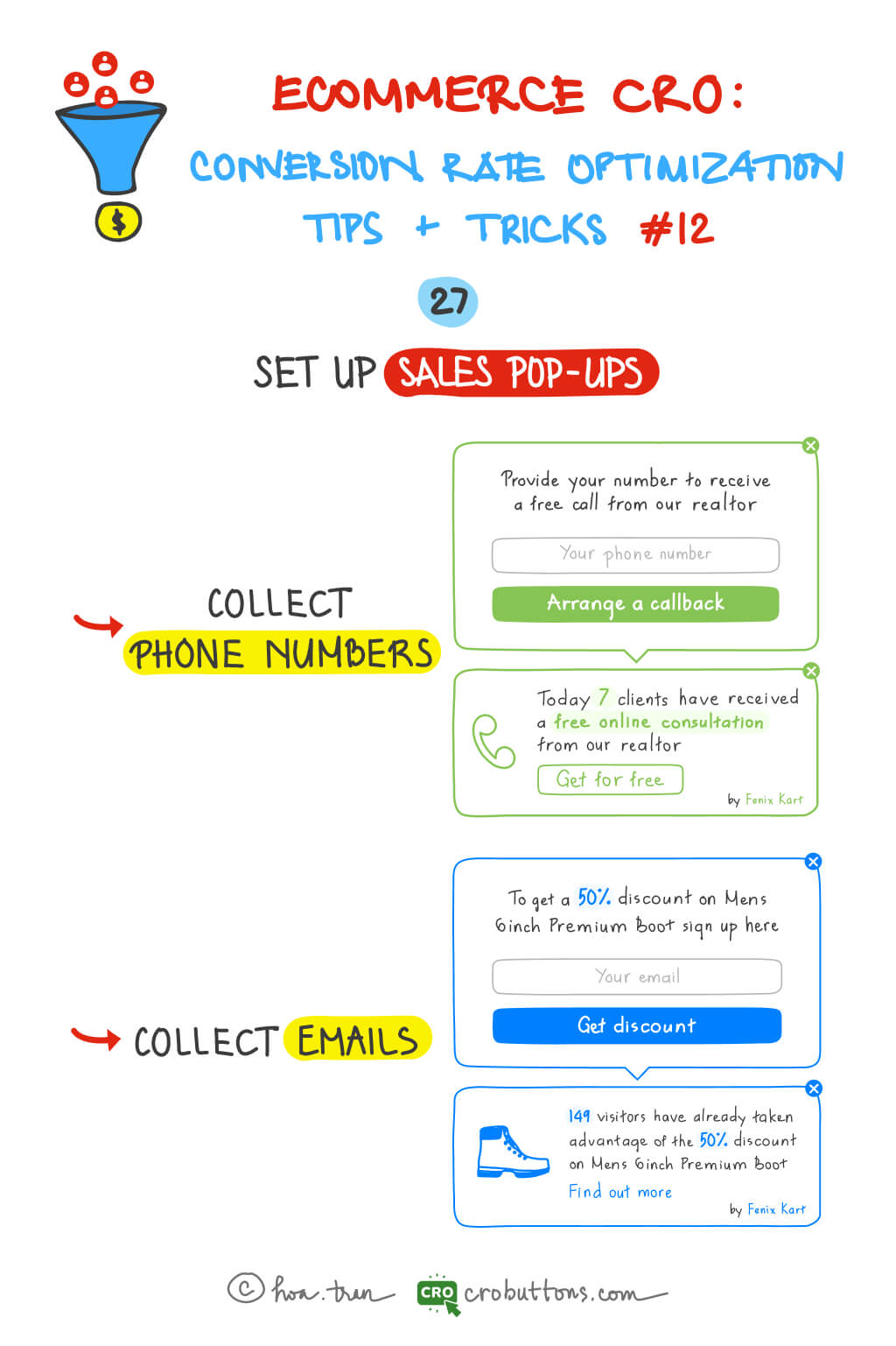
24. Set up sales pop-ups
According to the report, 98% of customers will leave your site without taking any action at all. When people visit a website for the first time, they are often in the analysis mode of whether they should make a basic decision such as buying, registering, renting, etc., or not. When they are in this mode, they need to be ‘promoted’ or ‘encouraged’ to make decisions.
What are sale pop-ups and how does it work?
A Sales Pop is generated by a small piece of Javascript code that is activated when your webpage loads. The code is connected to your database of sales and the selections you have made in the app’s interface. When the page is loaded, the script pulls information from your account, generating a set of notifications that appear in front of the main page. So, websites have achieved significant increases in conversion rates simply by adding Sales Pops.
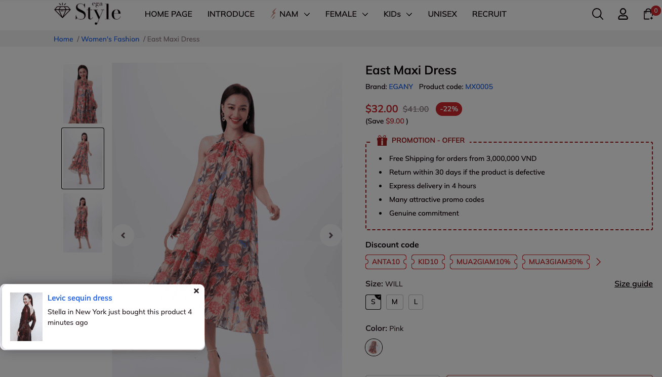

Via: nudgify
Why do you need sales pop-ups on your website?
Automated notifications displayed genuine information in real-time. That makes low-stock messages and countdown timers more believable. When we are uncertain about what to buy, it’s common for us to depend on the influence of friends. Therefore, integrating elements such as rating and recommendation systems, social sharing buttons, and shop-together tools is smart.
- Build trust: Nielsen’s latest Global Trust in Advertising report repeats findings from previous years – people don’t trust advertising, at least not as much as they trust recommendations from friends and consumer opinions expressed online. Adding Sale Pop-ups allows you to display the website’s operation on any page on your site without waiting for shoppers to find product reviews.
- Help visitors make decisions: watching pop-up sales can help visitors make decisions because seeing many activities for a product they are interested in can be enough to stimulate buyers in advance
- Sale pop-ups can increase conversion: you can direct the attention of visitors and direct them to the products you want them to buy or the actions you want them to do.
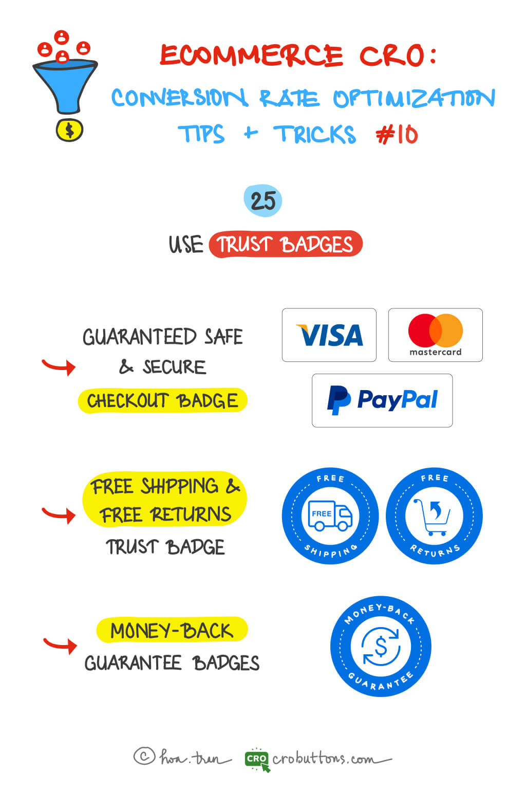
Chapter 10: Trust Badges: How to Build Trust and Boost Ecommerce Conversions
 25. Use trust badges
 25. Use trust badges
The best type of trust badges
Generally, trust badges used in e-commerce can be classified into five primary types. Each one has a different meaning and is used for a different purpose. However, we’ll show you three commonly used badge types in this post.
1. Guaranteed Safe & Secure checkout badge
It is one of the most trusted badge types you can get for your eCommerce store and is the seal you receive when you sign up with a company that provides an SSL certificate. An SSL (Secure Socket Layer) certificate protects the internet connection and all the shared information across that internet connection.

With the information being encrypted and the customer’s credit card information is safe and secure, this badge indicates that your checkout procedure can be trusted. This level of trust can increase your conversion rates. Any potential clients will want to know that they can trust you and that you take the protection of their personal information seriously.
There are other safe checkout badge alternatives available, however, the most trusted and known badges instantly inform your clients that your site is trustworthy. You can get trust badges that are recognized the world over from PayPal and Shopify.
Safe Checkout Badges are most effective when displayed near your “Add to Cart” buttons and on your checkout page.
2. Free shipping and free returns trust badge
With a “Free Shipping” and/or “Free Returns” badge, you can establish trust and safety in your consumers. You may reduce some of the perceived risks of purchasing from an online business by informing your consumers that they can receive and return things bought without paying any extra charges.
Gaining the confidence of your clients is crucial. Offering free shipping and returns communicates to clients that you appreciate their pleasure and satisfaction above all else in addition to your belief in the quality of your items.

This badge may be used in a variety of locations on your website and has additional positioning options. On every “Add to Cart” and “Checkout” page, a Free Shipping and Free Returns badge is advised. It may also be useful on your site, where you should think about putting it in the header, as well as on a specific Shipping and Returns page or your Frequently Asked Questions page.
If you decide to install a money-back guarantee badge, this trust badge is the ideal complement.
3. Money-back guarantee badge
The money-back guarantee badge, maybe the most powerful trust badge of all, completely removes the anxiety and perceived danger of purchasing goods or services online. While this does not address any technological security problems, it does demonstrate to potential consumers that you have their best interests at heart.
![]()
If badges for money-back guarantees are available, wear them proudly. You want to be certain that every consumer notices it and pays attention. It should be located close to the Add To Cart and Checkout buttons, in the same locations as your Safe Checkout Badge.
This is a free trust badge, you can make it yourself so that it matches your branding, or you can find a free downloadable version online and quickly add it to your website.
Where do you put trust badges?
Trust badges may be used throughout your website, but they will have the most impact when consumers may have initial reservations about purchasing from you or are asked to provide personal information. CXL looked into customers’ observational patterns when they were preparing to make online purchases, and it turns out they are quite similar. They search for quick reassurance.
Every checkout option exhibits a similar pattern, as users scan the page in search of instant confirmation they may proceed with the transaction and trust the website. Therefore, you must ensure that they are evident in those tiny instances when faith may falter.
Your homepage is a great place to put trust badges to instill overall confidence and trust in your brand. New users who are searching for your brand will most likely land on this page so it will be important to showcase reviews, awards, or any other badges here.
Chapter 11: How to Use Testimonials to Improve Website Conversion Rates
Most buyers want some guarantee that the goods or services will be worth their money before making a purchase. Customers are increasingly turning to reviews and testimonials from other customers for this assurance. The fact, people are more interested in what strangers say about your company than what you have to say. Authentic testimonials outperform all of your other marketing materials and sales methods. The power of reviews has long been established, with the study of Statista showing specifically how reviews work to influence the purchasing decision.
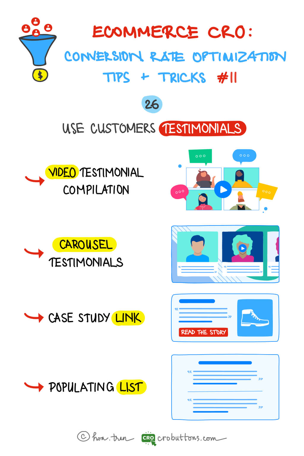
26. Use customer testimonials
What is the video testimonial?
A video testimonial is a video of a satisfied customer or client praising a business. They discuss how that company’s product or service helped them in solving an issue. They might talk about themselves, how they use the product or service, and what they enjoy about the product.
Why you should have video testimonials on your website?
The main reason customers relate to testimonials is that they are supplied by real people, and video may fully demonstrate this point. Seeing the face and body language, and hearing the voice will make the speaker far more credible. And the willingness to be on camera shows they mean what they’re saying.
Highlighting someone’s real experience with your product is a fantastic way to appeal to prospective customers. With the introduction of video testimonials, businesses may now reach a larger audience of potential consumers.
Types of customer testimonials
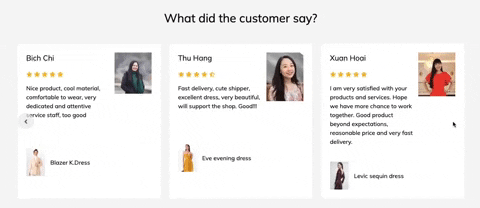
The use of testimonials on eCommerce websites can greatly impact a company’s success and credibility. To meet the diverse needs of different businesses, there is a wide range of testimonial types available. The following are a few of the most commonly used testimonials:
Carousel testimonials: A carousel testimonial is a rotating display of customer reviews or testimonials on a website. It typically appears as a slideshow on the homepage or a product page and allows visitors to scroll through a series of quotes or statements from satisfied customers. Carousel testimonials can be a powerful tool to showcase social proof and help build trust and credibility with potential customers. They can be used to highlight the positive experiences of customers with the company or its products, and to highlight the benefits and unique features of the products.

Case study link: A case study testimonial is a customer telling the world that they enjoyed your product or service, the results they experienced were dramatic, and they recommend your services to others. Not just any quote pulled from an interview is going to work well as a testimonial in your case study. A case study examines your consumers’ experiences in depth and delivers a lengthier, more complete testimonial. On the landing page, let’s highlight a particularly moving customer story in a case study, encouraging visitors to discover more with a prominent link. This sort of Social Proof is ideal for more expensive and long-lasting items or services, which clients often take longer to examine.

Populating list: Populating list is a form of a comprehensive list of all testimonials. If you have a long list of relatively short reviews or testimonials, use a populating list to make these stand out. Testimonials are isolated from other parts and presented on the landing page. Although users may only read a handful of these testimonials, the unending list of Social Proof is certain to enhance landing page conversion rates.
Populating can also help:
- Increase relevancy by mentioning particular client key problems.
- Drive conversions, as consumers who read testimonials, are 58 percent more likely to convert
- Showcase important features in an easy-to-read format.
Furthermore, you should consider utilizing this method to display client testimonials:
- It may appear to conflict with the preceding statement. While your testimonials should always retain a tight focus and avoid becoming overly wordy, they should also include enough information to seem genuine.
- Including too much information will weary the reader and cause them to click away.
- Our online attention span is only 8 seconds, and testimonials, like the rest of your website content, rely on that short attention span.
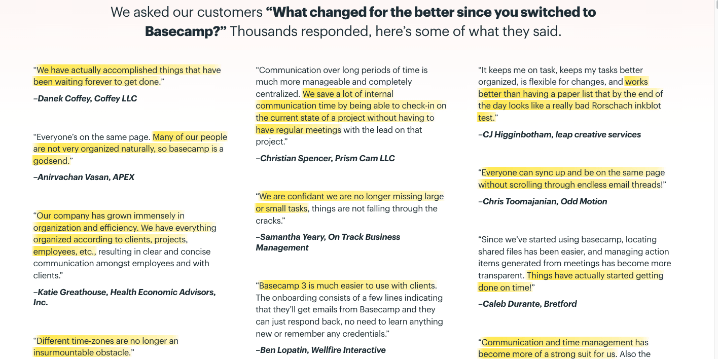
Tip: If you have longer testimonials, highlight the most essential keywords in bold or highlight them to guide the reader’s attention.
Chapter 12: Increase Your Ecommerce Sales with Sales Pop-Ups
When individuals first visit a website, they often find themselves in a state of evaluation where they assess whether they should take a critical step such as making a purchase, signing up, or hiring a service. In this stage, it is crucial to provide gentle nudges or encouragement to help them make that final decision.
If you have a significant number of website visitors but struggle to engage with them, implementing a pop-up subscription form can be an effective solution. This form enables users to leave their email addresses, allowing you to expand your mailing list, foster relationships with your audience via email, and streamline the purchasing process.
27. Set up Sales Pop-ups
What is the sales pop-up?
A pop-objective up is to push visitors to make speedier decisions, such as signing up for a monthly newsletter, completing a purchase, providing their phone number or email address to obtain a discount, and so on.
There are several kinds of pop-ups that businesses may use to meet their marketing goals. Some pop-ups are intended to simply provide information, while others are intended to drive sales and increase conversions. The sort of pop-up you pick will depend on your unique promotional methods and the actions you want visitors to take.
One of the key features of a pop-up is the call to action (CTA). This is a statement or button that motivates visitors to take the desired action, such as “Sign Up Now” or “Get a Discount”. A well-crafted CTA can have a significant impact on conversion rates and can help businesses achieve their marketing goals.

Transform Your Website into a Lead Generation Machine with Phone and Email Pop-Ups
Assuming, your customers are in the first stages (Top of the Funnel) of your conversion funnel. At times, customers may remain uncertain about their product search when browsing your website. At this moment, a pop-up notification regarding a free consultation call can be extremely useful.
The pop-up serves as a reminder for the customer to seek assistance and gain more information about the products or services offered on the website. With the convenience of a free consultation call, customers can have all their questions answered and feel more confident in making a purchase.
The sales pop-up not only promotes purchase activities but also provides excellent customer service, thereby improving the overall customer experience on the website.
A study conducted by a company on their blog revealed that their inline email form was hindering their conversion rates. The form would disappear as soon as the user began typing in their email, causing frustration and hindering the conversion process. However, the company made a simple yet effective change by dimming the inline field and keeping the words “Enter your email” slightly visible. This small change resulted in a remarkable 36% improvement in their conversions, demonstrating the importance of paying attention to even the smallest details in the conversion process.
The Advantage of These Pop-ups
The feature of today’s pop-up is unusual in that it combines the functionality of the exit intent pop-up with the email pop-up.
When you first visit the website, a friendly pop-up will display in the bottom left corner of your screen (or anywhere you want). This pop-up can provide several incentives, like discounts, coupons, free delivery, or a free consultation call.
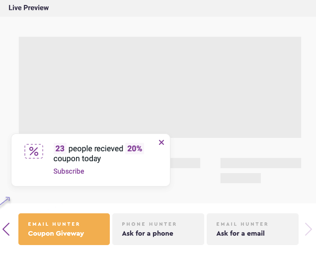
Only when you click to get more information about the promotion program will another pop-up display, prompt you to provide your email address or phone number.
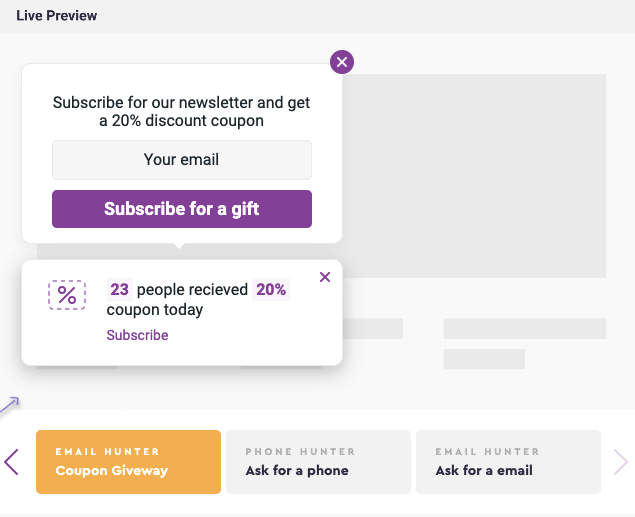
By implementing this pop-up, your company may profit from important client data collection as well as a higher conversion rate. Your customers also don’t be annoyed by a huge pop-up.
Chapter 13: Increase Website Engagement and Conversion Rates
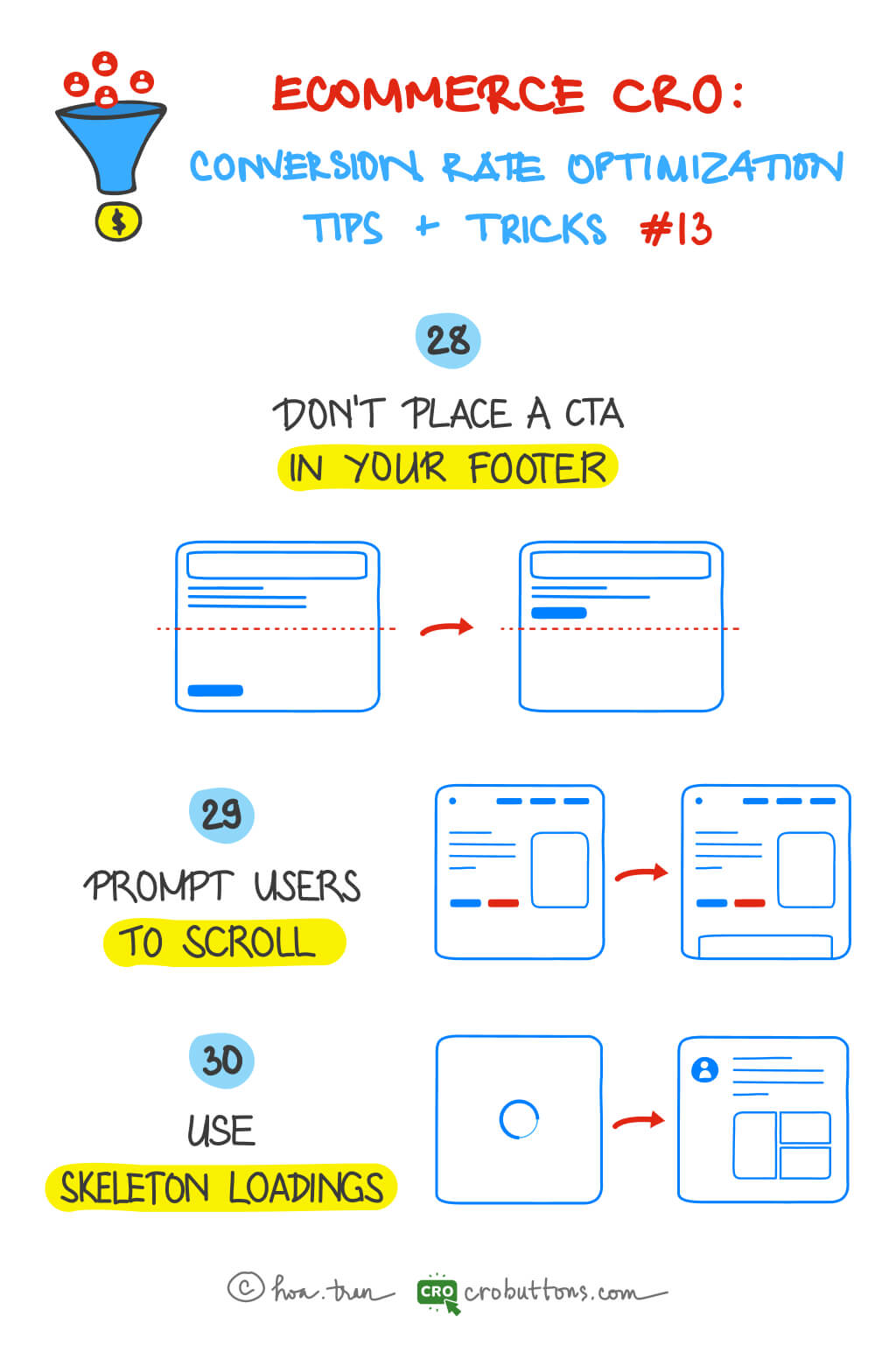
28. Don’t Place the CTA In Your Footer
Why footer is not an effective location for CTAs?
When it comes to website design and conversion optimization, one of the least successful places to place the Call-to-Action (CTA) button is the footer.
According to NN Group, the information towards the top of the screen received more attention than the information towards the bottom. More than 65% of the viewing time above the fold was concentrated in the top half of the viewport.

The footer of a website ranks as one of the lowest converting locations for a CTA for a few reasons:
- Visitors must read/scroll to the bottom to see it: The footer is typically situated at the bottom of a web page; visitors are unlikely to scroll down to the absolute bottom of the page to look for something. Let’s strive to convert your visitors into leads as quickly as feasible.
- It is surrounded by several other navigation links and buttons — competing for attention: The bottom of a website is frequently crammed with information and links that might redirect users’ attention away from the Call-to-Action (CTA) button, limiting its efficacy. This amount of content in the footer may overload visitors, making it difficult for them to discover and focus on the CTA, reducing its odds of eliciting desired actions from visitors.

By putting the CTA button in the footer, it may not obtain the visibility and prominence needed to compel visitors to take action, resulting in a low conversion rate.
The alternative locations for CTA buttons
Don’t be concerned! A Call-to-Action (CTA) button can be placed in a variety of places on a website to increase its exposure and impact:
- Above the fold: Placing the CTA button above the fold, or at the top half of the screen, boosts its visibility and accessibility to visitors without needing them to scroll down the page.
- Inline: Inline CTAs appear in the body text of a blog post as anchor text or a form field. They work effectively because the reader may be primed with relevant material before you ask for any kind of action. Moreover, inline CTAs are less invasive and do not distract your reader as much as huge pictures or buttons. If your content is lengthy, use inline CTAs to break up the text. One at the beginning, middle, and end.
- Popup: Popups, while contentious, push your visitors to take action in some way. It compels your visitor to take action and pay attention to you. Whether it’s clicking through to whatever you’re giving or clicking the “X” to shut the window. It breaks your visitor’s trance and forces them to pay attention.
These are just a few examples of alternate CTA placements; the optimum location will be determined by your website’s individual goals and target audience. When determining where to position your CTA, consider aspects such as the CTA’s purpose, the user’s journey through the site, and the site’s style and layout.
29. Prompt Users To Scroll
Why do we have to prompt people to scroll??
It allows users to interact with the information and explore the site’s many areas. Scrolling, when done correctly, may generate a sense of discovery and keep users interested, resulting in more time spent on the site and a higher possibility of them doing a desired action, such as making a purchase or signing up for a newsletter.
Scrolling may also assist visitors to comprehend the value and benefits of a product or service by displaying extra information, pictures, and testimonials. This fosters confidence and trustworthiness, increasing the likelihood of the visitor doing the desired action.
Furthermore, companies may better regulate the flow of content and steer the user’s trip across the site by encouraging users to scroll. This can assist direct the visitor’s attention to certain locations, such as the CTA, and enhance the likelihood that they will do the intended action.

Techniques to encourage scrolling
1. Provide interesting content right from the beginning: You must produce material that engages your visitors by delivering fascinating facts and attractive visuals (users pay close attention to images and pictures that contain relevant information) to engage and encourage visitors to keep scrolling, ultimately increasing their chances of taking the desired action.
2. Using arrows or “scroll prompt”: Simply remind consumers that the majority of the material is located below the fold. A small visual signal, such as an arrow pointing off-screen or the words “scroll down,” might alert readers that the majority of the material is located below.
3. Keep navigation options consistently visible: If the navigation bar disappears when users scroll down, they will have to scroll back up when they reach the bottom of the page. Typically, this behavior perplexes and annoys users. The obvious answer to this problem is to use a sticky navigation menu that displays the current location and stays in the same position on the screen at all times.
30. Use Skeleton Loading
What is a skeleton screen?

Oh, there is no problem with your internet connection. This is simply a mock-up of the skeleton screen!
A skeleton screen is an animated placeholder that resembles the layout of a website while data is being loaded. It involves displaying a simplified representation of the page’s layout, such as a series of gray boxes that match the size and shape of the expected content, to give users an indication that something is loading.
Benefits of using skeleton loading
Using skeleton loading can offer several benefits for a website:
- Improved user experience: Skeleton loading gives users an indication of what is to come while the content is being loaded, instead of displaying a blank screen or a loading spinner, which can be frustrating for users. This can result in a better user experience and increase engagement. The issue with using a loading spinner is that it does not indicate how long the loading process will take. Similarly, skeleton loading may not offer a solution to this problem, but it does present a visually interesting alternative for visitors to view while they wait. Right?
- Reduce bounce rate: The percentage of visitors that depart a website after reading only one page is known as the bounce rate. Skeleton loading can assist to minimize the bounce rate and encourage users to explore additional pages on the site by keeping them engaged and interested.
- Faster Load Time Perception: Skeleton loading can also aid in reducing the perceived load time for users. Users are more likely to perceive that the site is loading fast if some information is displayed, even if it is only momentary.
- Improved User Feedback: Skeleton loading can provide immediate feedback to users, letting them know that the site is actively working to load the content they have requested. This can improve the overall user experience and increase user satisfaction.
Chapter 14: Optimize empty shopping cart
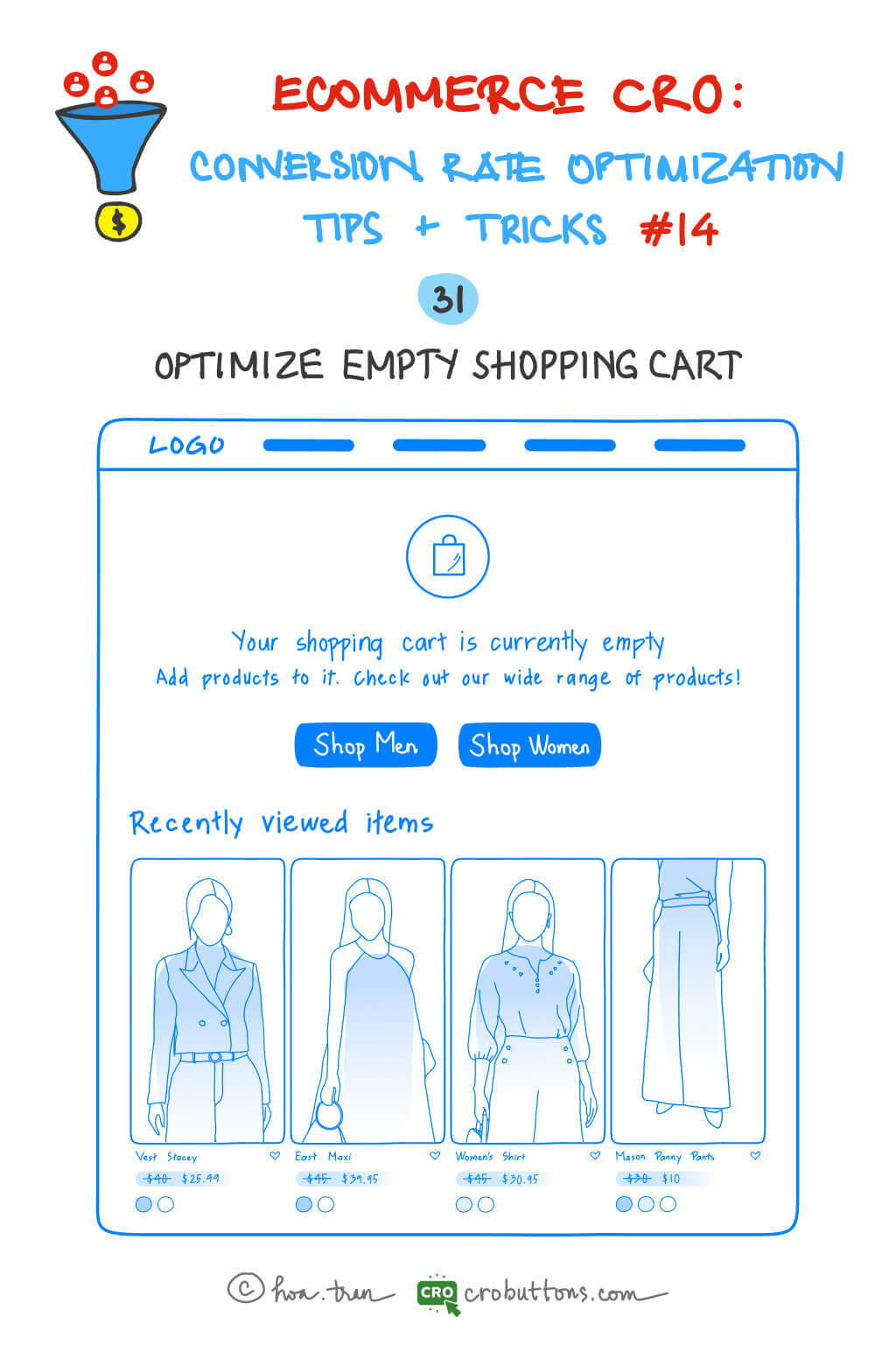
31. Optimize Empty Shopping Cart
Shopping carts that are left empty may be extremely inconvenient for both e-commerce enterprises and customers. A long checkout procedure, a lack of trust in the website, excessive delivery prices, and restricted payment alternatives are all examples. A confused or overpowering website design might also result in abandoned shopping carts. Businesses may take proactive actions to improve the consumer experience and prevent shopping cart abandonment by identifying the elements that contribute to empty shopping carts.
Changing the design of e-commerce websites and shopping cart pages takes care of many of these issues.
1. Empty shopping cart
It is critical to address the issue of an empty shopping cart since it can have a negative influence on the user experience and eventually result in a decline in conversions. Rather than merely showing a notice stating that the basket is empty, it is essential to actively connect with the user and give a clear and effective solution. To encourage customers to add things to their cart, provide shopping instructions and a compelling call to action. You may also improve the customer experience by providing product recommendations based on their browsing history or highlighting your store’s unique selling qualities that set it apart from rivals.
2. Mini shopping cart
When faced with an empty shopping cart, it’s important to provide users with more than just a simple notification of its emptiness. Instead, consider offering shopping instructions and a clear call to action that encourages them to fill it. Utilizing a mini shopping cart is certainly convenient for keeping track of expenditures and purchased items, but it should not be seen as a replacement for the full-page cart.
The mini cart can serve as a helpful tool for monitoring purchases, but making purchasing decisions with just a mini cart can become overwhelming for shoppers. To enhance the shopping experience, consider including a link within the mini cart that takes users directly to the full page cart rather than straight to checkout. A mini cart may be used to validate that a product has been put into the cart without switching to a new tab.
3. Full page cart
When users reach the cart page, they make their final purchase choice. Shoppers add things to their carts so they may examine or compare the items they’ve chosen, see if the purchase total is within their budget, or if they qualify for free delivery, and so on. So, create your cart page in such a way that it supports your customers in making purchasing decisions.

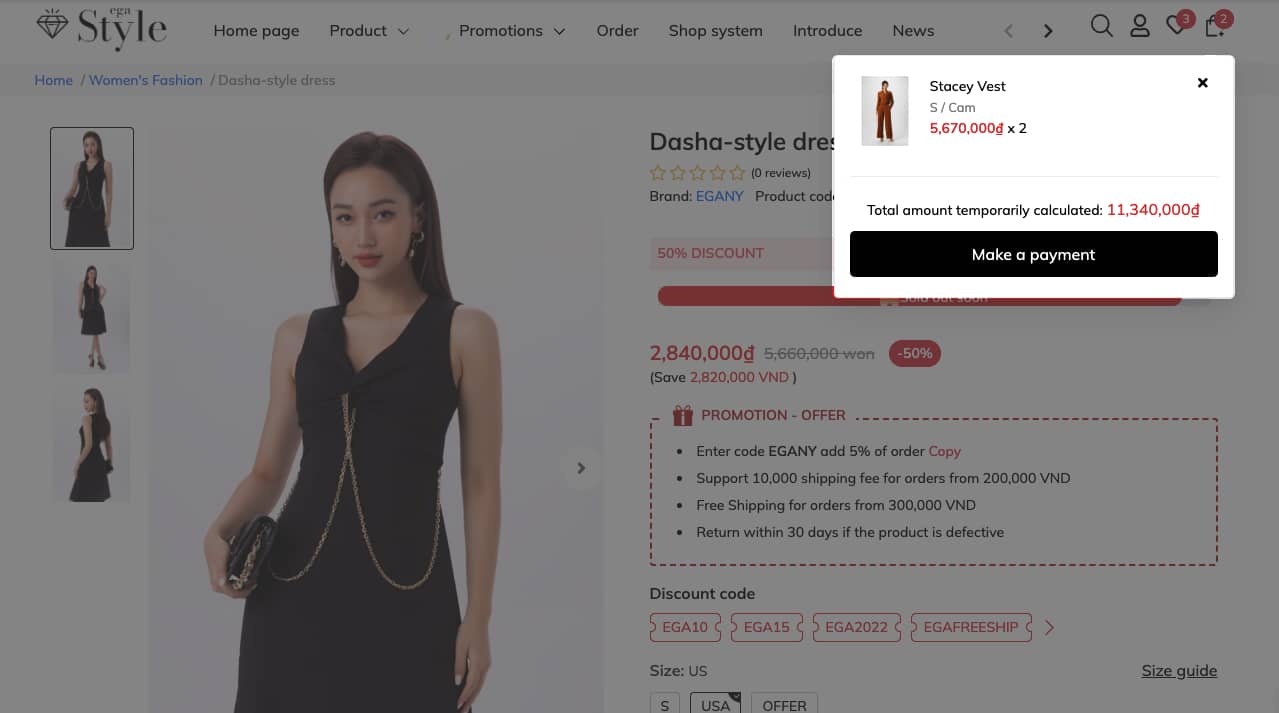
Chapter 15: Add mini shopping cart
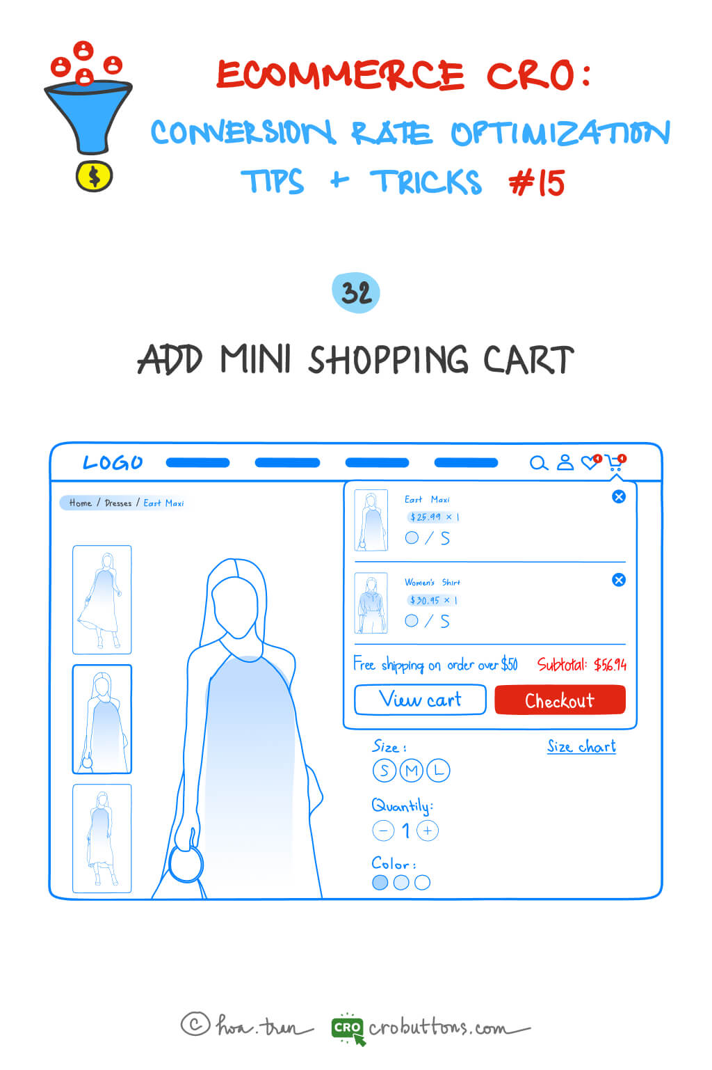
32. Add Mini Shopping Cart
A mini shopping cart is a shortened and smaller form of a standard shopping cart that is frequently shown in the website’s header or sidebar. One of the primary advantages of a tiny shopping cart is that it allows consumers to quickly and easily examine the contents of their current cart without leaving their current page. This is especially helpful for customers who want a simplified and quick browsing experience. Users can immediately view the things they’ve added to their cart as well as the overall cost of their order by hovering over the cart icon, providing them with the information they need to make smart purchasing decisions.
Aside from the convenience factor, another advantage of a small shopping cart is that it takes up less screen space than a full-sized shopping cart. This means it is less obtrusive and does not interfere with the browsing experience of users.
Users are frequently brought to a new page or overlay when using a full-sized shopping cart, which can disrupt their browsing experience and make it more difficult to browse the site. A small shopping cart, on the other hand, is constantly displayed and does not force consumers to leave their current website. This allows customers to continue exploring and finding things of interest without having to worry about losing their existing basket contents.
In addition to these advantages, a small shopping cart can assist minimize cart abandonment and enhance conversions. Users are less likely to forget about their order or abandon their cart before completing their transaction if the items in their basket and the total order amount are visible reminders.
This increases the possibility that consumers will complete their transactions, resulting in more sales and revenue for the ecommerce site. In general, a well-designed mini shopping cart may be a valuable tool for enhancing the user experience and increasing conversions on an e-commerce website.
Chapter 16: Use pop-up recommendations to increase your AOV
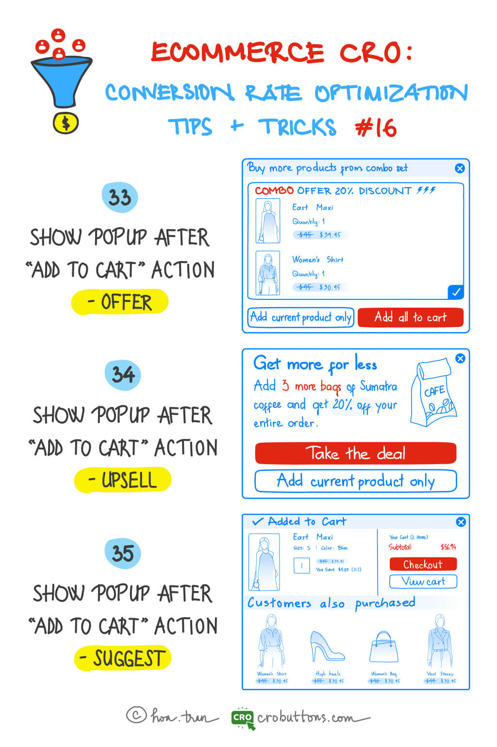
Increasing your average order value (AOV) as an e-commerce business is critical to generating revenue growth. There are several approaches and phases to implementing AOV boosting measures for your website. Using pop-up recommendations right after a client adds a product to their cart is one efficient technique to enhance AOV.
33. Show Popup After “Add to cart” Action – Offer
An “offer” popup is a sort of recommendation that gives clients a unique deal or incentive to make a purchase. These pop-ups appear when a consumer adds products to their cart and are intended to encourage the client to complete their purchase. For example, a business may offer a discount or free shipping for orders above a certain amount. The idea behind “offer” pop-ups is to give customers an irresistible incentive, a chance to choose a better deal, encouraging them to add more things to their cart and boost their AOV.
Here are some tips you should take notice of when building an “offer” pop-up
- When creating offer pop-ups, it’s important to make the benefits of the offer clear and easy to understand.
- The offer should be prominently displayed on the pop-up, so customers can quickly understand what they’re getting.
- Using eye-catching graphics or bright colors to grab the customer’s attention and make the offer stand out from the rest of the page.
- Setting a time frame for the offer creates a sense of urgency. According to a report, 60% of millennial consumers said they make a reactive purchase after experiencing FOMO (fear of missing out), most often within 24 hours. By setting a deadline, customers will feel compelled to finish their purchase before the offer expires if a deadline is imposed.

Setting a time frame for the offer creates a sense of urgency
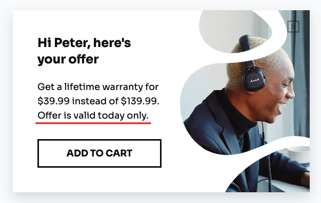
It’s also worth mentioning that the timing of the offer pop-up is critical. It’s preferable to show the offer pop-up soon after the buyer adds an item to their cart, while the offer is still fresh in their memory. Yet, it is critical not to show the pop-up too quickly, as this might be perceived as forceful or hostile.
34. Show Popup After “Add to cart” Action – Upsell
An “upsell” pop-up is a type of recommendation that offers customers the opportunity to purchase a higher-priced or upgraded version of the item they’ve added to their cart. These pop-ups are triggered after a customer has added an item to their cart, making them more likely to consider an upsell offer while they are still in the shopping mindset.
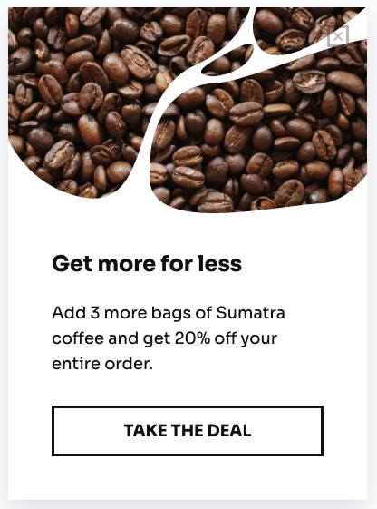
I might be small, but I’m mighty – Upsell pop-up
The key factor of this pop-up is to provide customers with personalized recommendations based on their interests and browsing history. Though, it can increase the chances of a successful upsell. For example, if a consumer has shown a desire for a specific brand or type of goods, an upsell popup may offer them a more expensive version of that same brand or style. This can be an effective method of increasing the value of each transaction and boosting AOV.
Upsell pop-ups can enhance customer experience by assisting them in finding things that better meet their needs, in addition to increasing AOV. A customer, for example, may be unaware of a more complex version of the product they added to their cart, but an upsell popup might emphasize its features and advantages. This can improve the customer’s buying experience and boost the possibility of repeat business.
To create an effective upsell pop-up, businesses should keep up these things
- Making the upsell offer relevant to the customer’s interests but have more benefits: It’s the key to a successful upsell. When you upsell, you are selling the benefits of the upsell.
- Using persuasive language to encourage customers to upgrade their purchase: Create a sense of urgency by using language that implies scarcity or time-sensitive offers. For example “Limited time offer – Upgrade now and save 20%!”. Use persuasive language to offer exclusive deals or incentives to upgrade the purchase, such as “Upgrade now and receive a gift worth $50!”
- It’s also important to set a time frame for the upsell offer to create a sense of urgency and avoid making the popup too pushy or aggressive.
35. Show Popup After “Add to cart” Action – Suggest
A “suggest” popup is a type of recommendation that offers customers relevant and complementary products to the ones they have added to their cart. You can make assumptions about their interests and recommend items even if they’re not directly connected to their purchases. For example, if a customer adds a shirt to their cart, a suggest pop-up may appear recommending a matching tie or a pair of pants that would complete the outfit.
While the “suggest” and “upsell” popups both serve the role of proposing other things once a consumer has added a product to their cart, there is a significant distinction between them. The upsell popup promotes a more costly or improved version of the item the consumer just purchased to their cart, whereas the “suggest” popup suggests things that are connected to the one that was just added. You can consider “suggest” pop-ups as a form of cross-selling.
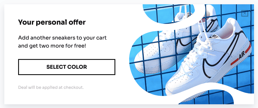
Suggestion popups, like upsell popups, require meaningful recommendations relating to the goods that users are interested in. Businesses must evaluate their consumers’ purchase history and browsing activity to understand their preferences and requirements to achieve this. This data may then be used to recommend goods that are likely to be of interest to the user, so improving their entire purchasing experience.
Suggestion popups, in particular, can be presented on the checkout page after customers have picked up their goods and are about to finish their purchase. Nevertheless, when employing recommend popups on the checkout page, it’s crucial to prevent disrupting clients during their checkout procedure while making sure that the popup does not interfere with their payment process.
Social proof may also be used by businesses to persuade customers to make extra purchases. Customer reviews or ratings of the proposed product might give social validation and boost the customer’s confidence in their buying choice.
Chapter 17: How to Increase The Checkout Conversion Rate
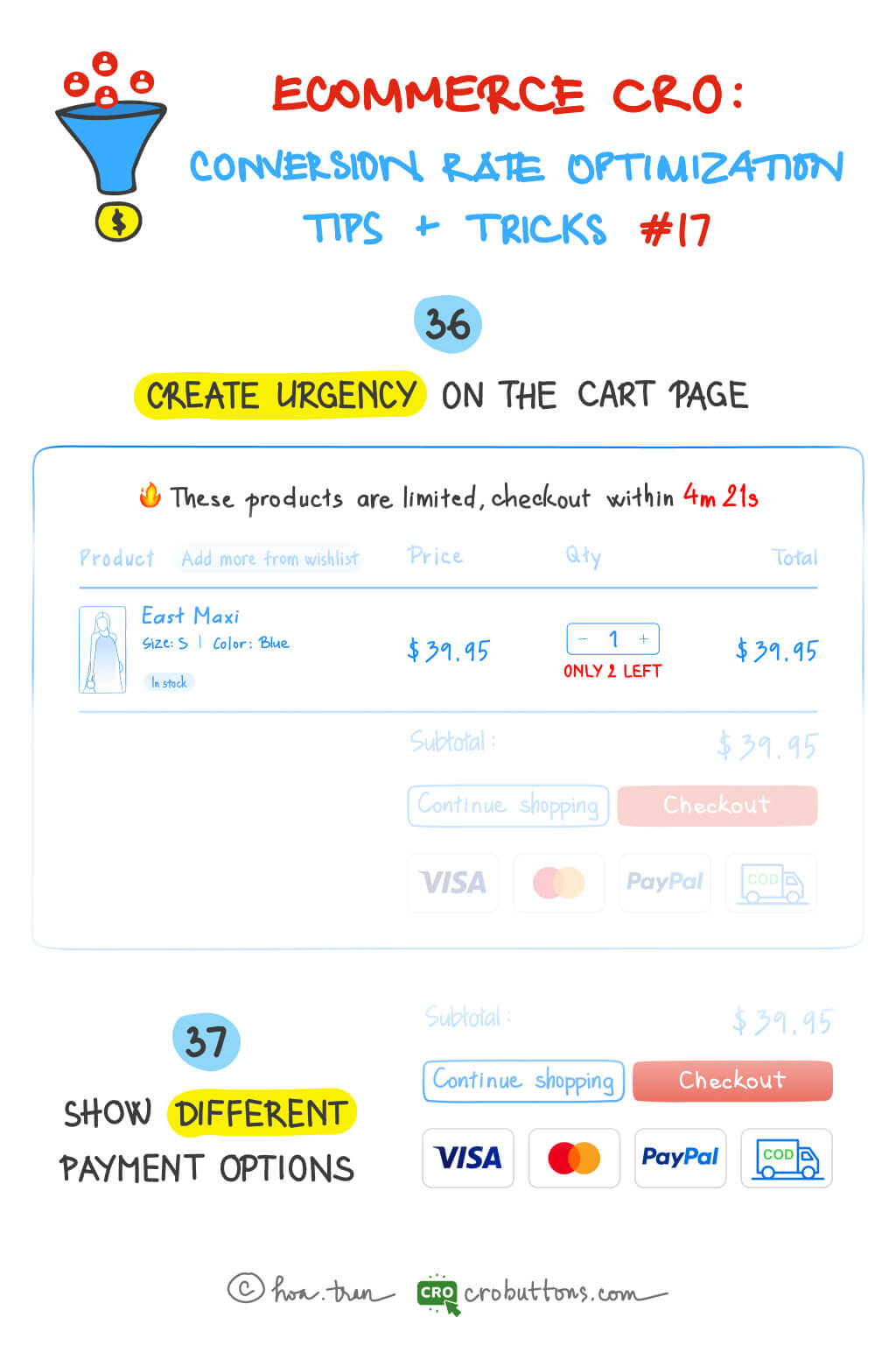
36. Create Urgency On The Cart Page
Urgency refers to the feeling that time is running out, and that visitors need to act quickly to avoid missing out on a good deal. By creating urgency, you can motivate visitors to complete their purchases rather than leaving the items in their cart and potentially forgetting about them.
There are various techniques for rendering the cart page more urgent. Offering limited-term incentives, such as a discount that expires in a set length of time, is an effective strategy. This generates a sense of urgency among visitors since they are aware that they must move fast in to take advantage of the offer before it expires. Let’s try out limited-time offers with a countdown timer and evaluate how well they work.
When a countdown timer is presented on your website, this approach will be considerably more successful. The countdown timer creates an irresistible desire to add the product to the cart, especially when the deal is paired with the “Limited quantities” note.
A countdown timer may be able to boost conversions from 3.5% to 10%, according to WordStream.
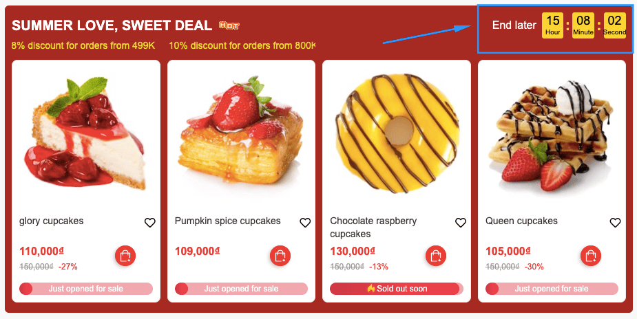
In addition to limited-time offers paired with a countdown timer, you can also create urgency by using low-stock alerts. Low-stock alerts are automatic notifications reminding your brand that it’s time to reorder a certain product or SKU variant. They inform visitors that there are only a limited number of items left in stock, which creates a sense of urgency by highlighting that the items may sell out soon.
37. Show Different Payment Options
When you have persuaded people to buy your items using the urgency technique, they will continue to the payment stage. This is the point at which it is decided whether or not the customer’s order is completed. Shoppers might abandon their cart if their preferred payment method is not accepted by you.
A report “Reasons for Abandonments During Cart & Checkout” by Baymard found that 9% of US online shoppers have abandoned a cart because the online store didn’t have enough payment methods.

Consumers have varied payment method preferences, and providing a range of options might make it easier for them to finish their orders, such as:
- Credit/Debit cards and PayPal
- Cash on Delivery (COD)
- Mobile payments
No matter which payment type(s) you offer, there will be advantages and disadvantages to each. Therefore, it is advisable to carefully consider it.
Regardless of the payment choices available, each online business must provide an easy and safe payment. It is critical to choose a dependable and trustworthy payment gateway that can handle transactions smoothly while protecting clients’ sensitive information. Furthermore, putting SSL encryption on your website helps improve payment security and protect against any cyberattacks. Displaying trust badges and security seals may be an effective approach to signal to clients that your website is reputable and that their payment information is secure. By implementing these actions, you can provide your consumers with a seamless and secure payment experience, which may lead to improved confidence and sales for your company.
Chapter 18: 3 Ways to Get Customers to Add More Products to the Cart
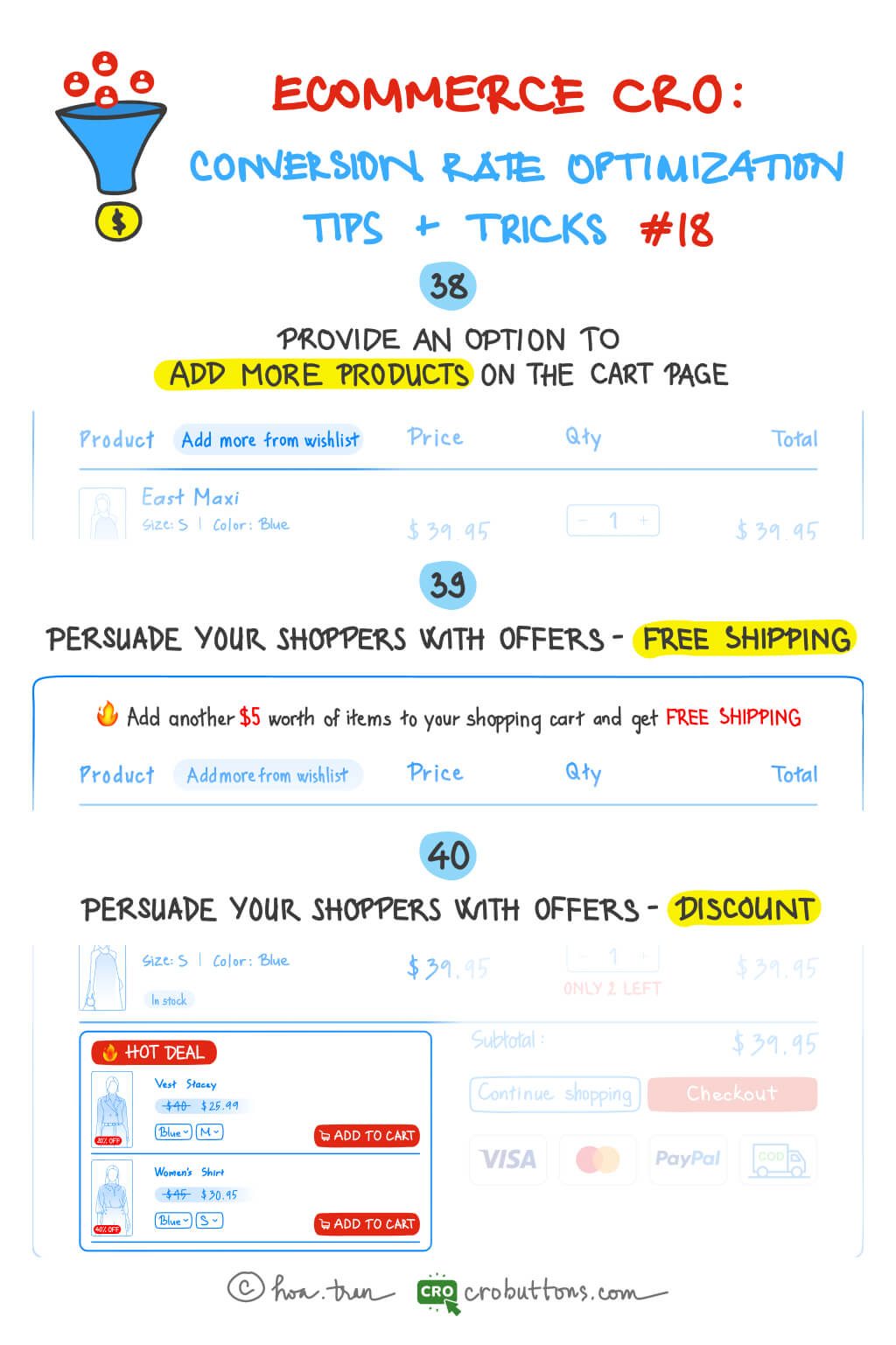
38. Provide An Option To Add More Products To The Cart Page
Users are frequently brought to a new page or overlay when clicking the “Continue Shopping” button, which can disrupt their purchase experience and make it more difficult to check the products they added. A drop-down menu with a list of recently viewed products and recommended items, on the other hand, is constantly displayed and does not force consumers to leave their current website. This way, customers can easily find products they’re interested in and add them to their cart without the need to navigate back to the product pages.
Another way to provide an option for customers to continue shopping is by including product recommendations directly on the cart page. For example, you can display related products or popular items that customers may be interested in. This can help customers discover new products and add them to their cart. However, it’s important to make sure that the recommendations are relevant and not too overwhelming. Displaying too many recommendations or unrelated products can be distracting and overwhelming for customers.
By carrying out this way, you can improve your customer’s shopping experience by creating smooth one-page ordering. Instead of navigating to single product pages, your customers can shop directly from the product table view.
39. Persuade Your Shopper With Offer – Free Shipping
While your customers are on the cart page, you may entice them to add more things to their cart by offering something. For example, if you provide free shipping on orders over a specific amount, or for a limited time only, you might remind your customers how much more they need to spend to qualify for that offer.

Using a progress bar allows you to be more creative in how you announce free shipping offers to your consumers. Customers are more likely to notice your shopping cart page if it is more vivid, intuitive, and engaging. Check out our previous article on progress bars for more inspiration on how to implement this tactic effectively.

If you’re interested in having a progress bar like this on your website, don’t hesitate to contact CRO Button for consultation and support. Your website will look much more professional with our help.
40. Persuade Your Shopper With Offer – Discount
To make the discount more enticing, consider setting a deadline for the offer or requiring a minimum purchase amount to qualify. Customers may start to experience FOMO (fear of missing out) and want to buy discounted items before the promotion ends.
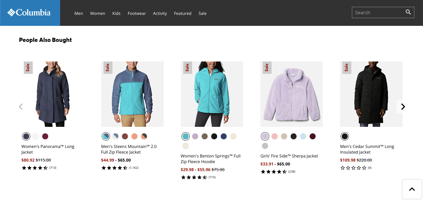
Urgency is one of the most amazing and fast-acting techniques in intensifying the fear of missing out, realizing that this offer will soon expire will be a powerful incentive for them to complete the purchase immediately.
Therefore, you must present offers that end within a specific period to trigger “FOMO” in your customers’ subconscious and encourage them to complete the purchases immediately before they expire. You can also display the discounted price prominently on the product page, so shoppers can see the savings they’ll receive.
Chapter 19: Homepage – Announcement Bar and Discount Pop-up Codes
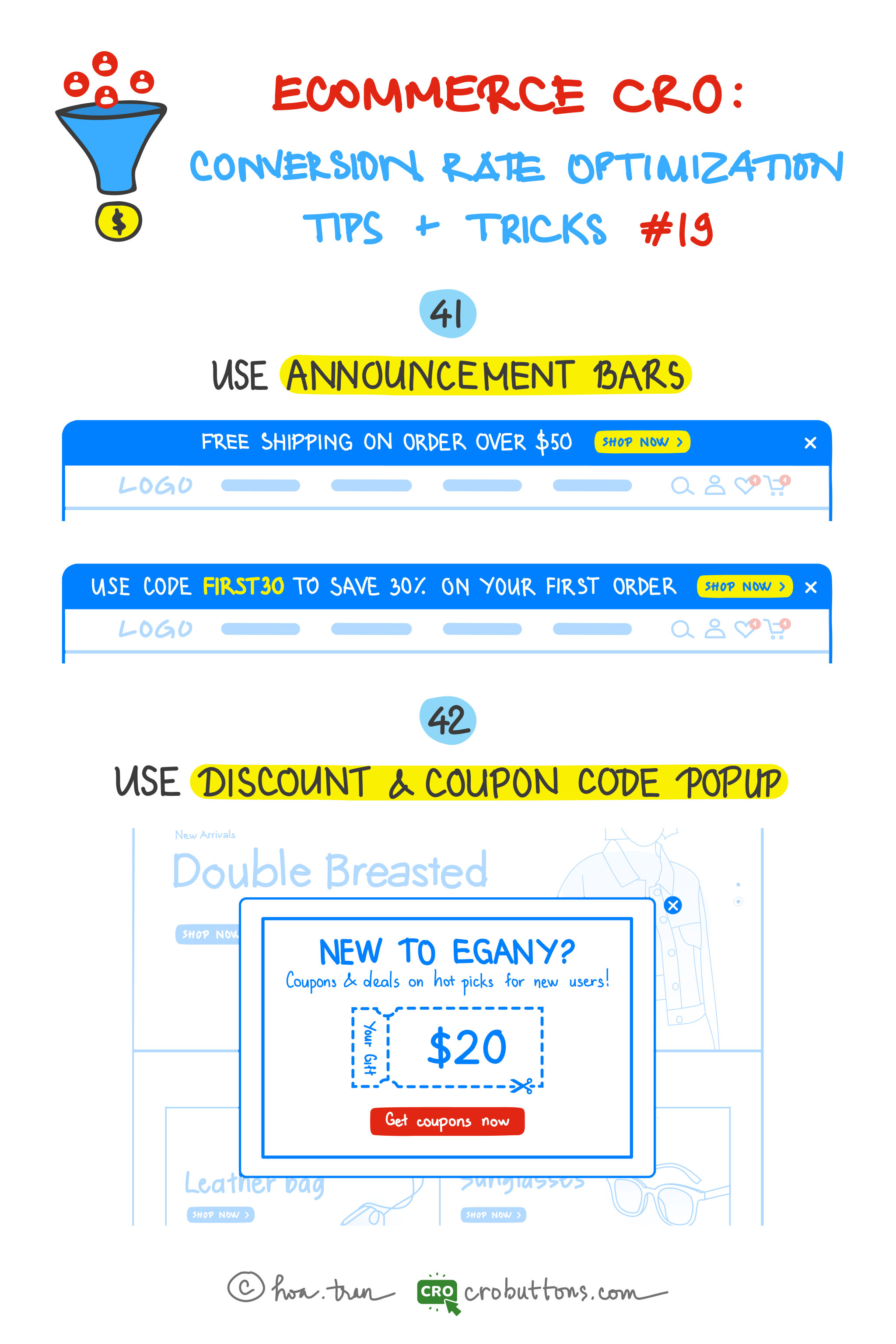
41. Use the Announcement Bar
What is the announcement bar?
Announcement bars go by a variety of names—welcome header bars, hello bars, floating bars, notification bars—but they all fundamentally imply the same thing: a one- or two-sentence notice at the top of the homepage.

In many situations, the announcement bar appears above the navigation, making it the first thing visitors see. You may even have announcement bars move dynamically as users scroll, keeping your CTA visible at all times.
What content should appear on the announcement bar?
There are tons of different ways to use announcement bars to achieve your marketing objectives. But here are some of our favorite, and most effective, examples:
- Announce new products
- Share industry/company news
- Display updated shipping information
- Link to new blog posts
- Grow email subscriber list
- Share promo codes
- Grow social media following
- Promote sales and discounts
- Display sale countdowns
- Promote upcoming webinars
- Announce new whitepapers
Announcement bar best practice
- Make it actionable: When it comes to your website’s announcement bar, don’t settle for a simple “hello.” Instead, use it as an opportunity to prompt visitors to take a specific action. This is the first CTA visitors will see on your site; make sure it’s worth their time.
- Avoid annoying users: Visitors can choose to close your announcement bar using the “X” button. To prevent the bar from repeatedly appearing and causing frustration, ensure that your website’s code keeps the announcement bar hidden when users navigate to another page. Failure to do so may result in annoyance and a negative user experience.

- Keep it current: Regularly update your announcement bar. If visitors see the same notification each time they visit your site, they will eventually ignore it, even if the material is updated.
- Be mobile-friendly: Test your announcement bar on tablets and smartphones to make sure everything looks right and functions correctly. As you know, 3/4 of online purchases today are made on mobiles. Assist your customer with a pleasing mobile shopping experience by implementing some tips here.
- Keep it short: You only need one or two phrases. Remember, it’s a CTA, so keep it brief.
- Repeat: Repeat the same information from your announcement bar on your homepage and internal pages. Lilach Bullock found that repeating messages helped her convert 57% of her website visitors.
42. Use Discount & Coupon Code Pop-up
Popups have become an increasingly popular tool for website owners to capture their visitors’ attention and guide them toward their desired actions. A popup is a type of interface that appears suddenly in the foreground, usually in a small box window, as the visitor lands or scrolls on a site. Its objective is to display information related to the website and encourage visitors to take specific actions. While there are many different types of pop-ups, in this section, we’ll focus specifically on discount and coupon code pop-ups and explore how they can be a powerful tool for boosting your website’s conversion rates.
What is the discount & coupon code pop-up?
Coupons and discounts pop-ups are a particular type of online pop-up that shows visitors a special promotion, discount, or coupon code as they browse your website. These pop-ups aim to persuade site users to make a purchase or carry out a certain action by providing them with a discount or promo code.
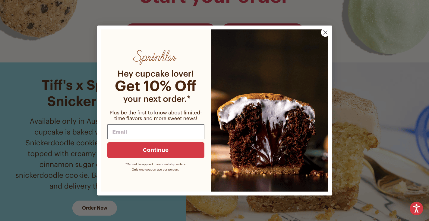
At CRO Buttons, we specialize in providing website solutions to help your business grow. With our expertise, we can help you create a customized announcement bar that perfectly fits your needs, making everything simpler and more streamlined for you. Check it out!
What justifies the use of discount and coupon pop-ups on the Homepage?
According to MarketingProfs, 57% of US online shoppers who used a coupon code said that they would not have bought the item(s) if they had not received the discount.
Discounts are a tried-and-tested way to get window shoppers thinking about buying. But it’s not just the anecdotal evidence we rely on: ecommerce research gives us these insights into what customers think.

The following advantages are provided by posting special deals and coupons on the homepage:
- Increase sales: Coupon code pop-ups can entice customers to purchase by offering discounts or promotions. This can help increase your overall sales and revenue.
- Improve conversion rates: By displaying a coupon code pop-up on your homepage, you can encourage visitors to take action and make a purchase. This can help improve your website’s conversion rates.
- Build customer loyalty: Offering discounts and promotions to your customers can help build their loyalty to your brand. By making them feel appreciated and valued, they are more likely to return to your website in the future.
- Stand out from competitors: Using coupon code pop-ups can help your website stand out from competitors by offering unique deals and promotions. This can help attract new customers to your website and set you apart from other businesses in your industry.
Announcing your store’s available promotions and coupons to customers can be achieved through an announcement bar, but it is not as effective as using a pop-up for the homepage. Why? Discount and coupon code pop-ups are more noticeable than announcement bars. They grab the customer’s attention and encourage them to take immediate action.
Pop-ups are a great way to capture visitors’ attention and encourage them to purchase on your website. However, not all pop-ups are created equal. To ensure that your pop-ups are compelling, there are several key factors to keep in mind:
- Make sure that the pop-up is visually appealing and fits with the overall design of your website.
- Communicate the value proposition of your offer, whether it’s a discount code or free shipping.
- Use persuasive language and create a sense of urgency to motivate customers to take action.
- Test different variations of your pop-up to see what works best for your audience
Chapter 20: Homepage: Increase Your Website Conversion Rate through On-Site Search Optimization
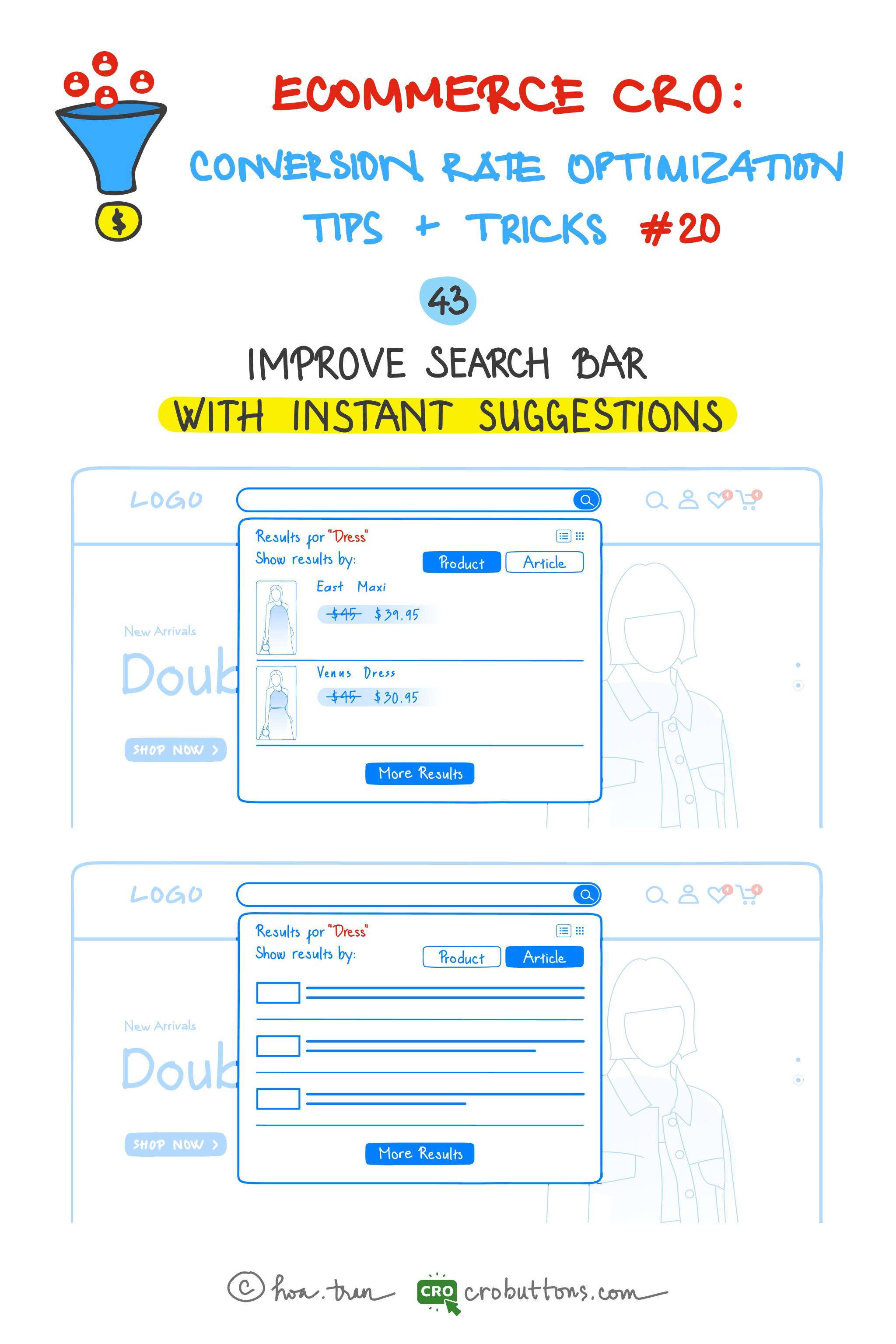
43. Improve the Search Box with Instant Suggestions
What is the instant suggestion?
Instant suggestions—also known as autocomplete or autosuggest—are a helpful tool that improves the user experience by suggesting possible search phrases or item names as users begin to type in the search field. By removing the need for visitors to fill out whole search queries, this feature may drastically improve the search experience on your website and cut down on both search time and effort.
Furthermore, by offering relevant choices, quick suggestions may considerably increase the accuracy of search results, particularly for complicated product names or words that consumers might have trouble remembering or writing.
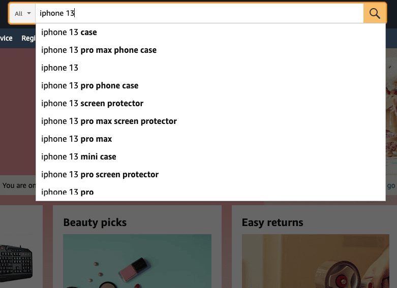
The importance of implementing instant suggestions cannot be overstated, as it can significantly impact the success of your website. Reducing the time and effort required for users to search can improve user engagement, increase conversions, and ultimately drive sales. Therefore, incorporating this feature on your search bar can be a powerful tool in your efforts to optimize your website’s user experience.
How to optimize your search box for maximum visibility and usability?
Let your shoppers hunt for products, not for your search box. Make your search box stand out so that people can easily find it.
To ensure your website visitors can quickly and easily find what they are looking for, optimizing your search box is essential. Here are some tips on how to optimize your search box for maximum visibility and usability:
- Sitesearch elements: Avoid making your search box hard to find by only using a submit button without the text field or only using a text field without the submit button. Make sure both elements are present and visible to users.
- Placement of the search box: Consider placing your search box in a consistent location on all pages except the checkout page. Popular positions include the top right, the top center, or the main menu. Avoid placing it near other elements such as email signup boxes.
- Size of the text field: A longer search field will allow users to see what they are typing and reduce errors. Make sure the text field can hold at least 30 characters. You can also use your Site search data to determine the optimal character limit based on what your shoppers are searching for.
- Contrast: Ensure the input field color does not make it difficult for users to understand where to type in their search term. Increase the contrast between the site header, text field, and search button to make the search box more prominent relative to other elements on the page.
How to implement instant suggestions on your search bar?
1. Place text in the search box to encourage searchers
Simply designing and placing a search box isn’t enough. Adding some text to the box is essential for eCommerce.
Display some meaningful text in the search bar and have it disappear when you click so that people may type their search queries without becoming confused. If consumers do not find the desired product in the search results, they may try an alternative search phrase. Keep their prior search word in the search field so they don’t have to input it all over again.

There’s more: You can even provide the visitor with additional information in the search field. If your search can handle product codes and catalogue numbers, make that clear from the start. This will expedite the search process and improve the user experience. You may, for example, include anything like “Input product, code, or brand”.
2. Auto-suggest
Search engines anticipate searches as they are typed. By offering auto-suggest versions for particular inquiries, you may direct visitors to the most popular and relevant products.
If submitted queries don’t have an exact match, the least you can do is show potential matches. This may well be what the user was looking for.
A dropdown with common searches will help reduce typos and avoid a no results found state. It’s even better if you suggest a few best-fit products along with thumbnail images and prices of the products suggested. Land the shopper on the individual product page if he clicks on any product suggestion.

3. Error-tolerant user journey
A prerequisite for site search usability is a strong error tolerance for typos.
If someone searches for a brand name (even if misspelled), they should never end up on a 0-results page. Brand names like “blackberrie” for Blackberry, “nice” instead of Nike, or product names like “games board” instead of “board games”, colors like “balck” or “wite” instead of “black” and “white” should not result in 0-search results.
The Baymard Institute found some pretty startling stats about this. “34% of the top 50 e-commerce sites, don’t return useful results when users misspell a single character during the search for a model number in the product title.”
Lower sales hurt, but 0-results pages might affect your site’s traffic in other major ways:
- Users will be less likely to return to a shop where they can’t find what they want to buy. It’s simply frustrating.
- They will also spend less time on your site and might have a higher bounce rate, which can decrease your overall site stats and negatively affect your Google ranking.
By adding to the list of possible words with alternative spellings you can start to see a new light.
Losing money in so many different ways is mind-blowing, don’t let it happen!
4. Scoped search
The scope of a search function can vary depending on the size and complexity of an ecommerce store. While smaller stores with a limited range of products may not require a search function with a narrow scope, larger stores with a wide variety of products must prioritize allowing users to search within specific categories.

This not only provides users with more targeted search results but also helps to prevent confusion and frustration caused by inadvertently searching within the wrong category. By defaulting the search scope to the entire store, you risk overwhelming users with too many results that aren’t relevant to what they’re looking for.
Therefore, it’s essential to ensure that your search function is configured to provide users with the most relevant search results possible, by allowing them to easily refine their search scope based on their specific needs.
Chapter 21: Homepage: The “Buy The Look” Feature

44. Use The Lookbook Feature
What is the lookbook?
A lookbook is a collection of carefully curated images that showcases a business’s products in a visually appealing way. It’s a tool that fashion retailers, designers, and e-commerce websites use to provide customers with an immersive and inspiring shopping experience. Lookbooks typically feature high-quality photographs that show off products creatively and artistically, such as by displaying outfits or creating a specific mood or theme.
The primary purpose of a lookbook is to inspire customers and make it easier for them to visualize how products can be styled and paired together. This helps create a multi-dimensional shopping experience beyond simply displaying individual products on a website. Lookbooks can be created for a particular season or occasion, such as a holiday or a new product launch, and are often used in conjunction with marketing campaigns to showcase new collections or highlight trending styles.

Why you should have the lookbook on your website?
One of the main benefits of using a lookbook is that it provides customers with inspiration and ideas for how to wear or use the products. Instead of simply showcasing individual products on separate pages, lookbooks allow retailers to present them in the context of a full outfit or collection. This helps customers visualize how the product would look in real life, and how it could be styled with other items.
Furthermore, lookbooks provide businesses with an opportunity to cross-sell or upsell products. By showcasing products together in a lookbook, businesses can encourage customers to purchase more items by demonstrating how they can be used or styled together.
With the “Buy The Look” feature, businesses can take it one step further and allow customers to purchase all the items together with a single call to action. This streamlines the buying process for customers, making it easier for them to purchase the entire look rather than having to navigate to different product pages to add each item to their cart.
What is the “Buy The Look” feature?
“Buy The Look” is a feature that allows customers to purchase an entire outfit or collection with just one click. By displaying products together in a lookbook or a curated collection, businesses can show customers how items can be styled together and inspire them to make a purchase. With a “Buy The Look” call-to-action, customers can easily add all the items to their cart at once, streamlining the buying process and enhancing the customer experience.
This feature is especially useful for fashion retailers who want to showcase their products in a cohesive and visually appealing way. By using models styled with a range of accessories and showcasing products together in a lookbook or a collection, businesses can show customers the potential of each item and inspire them to create their unique looks.
Additionally, the “Buy The Look” feature is an excellent approach to recommending products and encouraging customers to make multiple purchases at once.
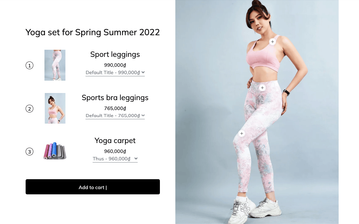
Implementing the ‘Buy The Look’ Feature: Steps to Follow
As an online retailer, you’re always striving to make the shopping experience as effortless and enjoyable as possible for your customers. One way to do this is by implementing the “Buy The Look” feature, which simplifies the purchasing process by allowing shoppers to buy a complete outfit or a hand-picked selection of products in one fell swoop. But how do you go about integrating this game-changing feature into your e-commerce platform? Fear not, because we’re here to guide you through the necessary steps.
Step 1: Create a lookbook
This is the feature’s base, and it shows buyers how the goods may be worn together in a visual depiction. Professional photoshoots in which models wear entire ensembles fashioned with your items, or using product photographs and styling them together using software, can be used to create the lookbook.
You may assist clients picture how they can dress the things they want to buy by displaying them in a full ensemble. It also allows them to view the full look in one location, rather than having to browse numerous product sites to discover each piece. This will save them time and raise the chance that they will purchase the full outfit.
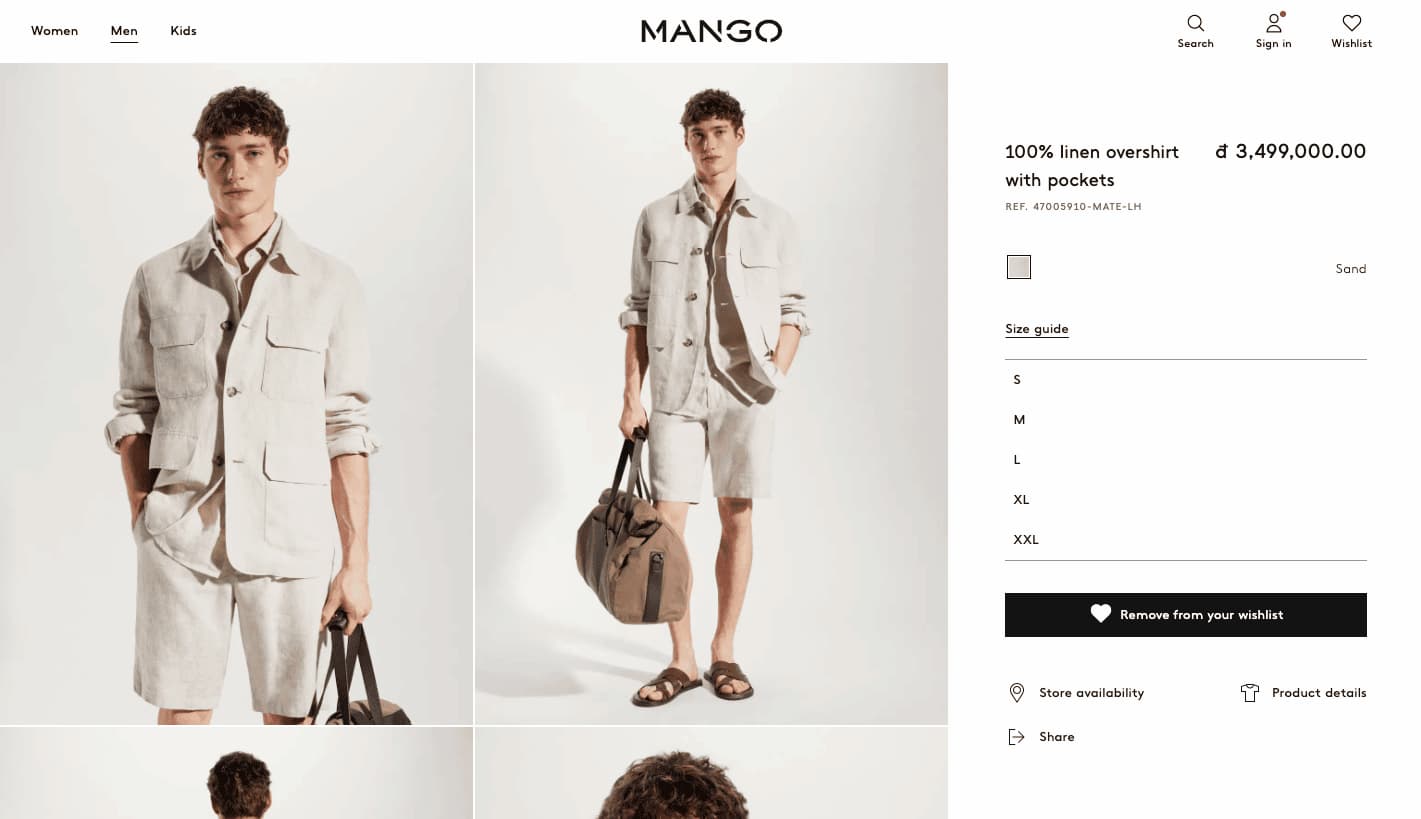
For example on the Mango. Although the overshirt is the main focus of the website, it is featured with other items such as shorts, shirts, sandals, and bag to make a full look. Customers may see how they can style the overshirt with other appropriate things.
In the future, we may write an article about how to develop a pretty lookbook, which may be a helpful guide for anybody who wants to improve the aesthetic of their online store and provide an interesting shopping experience for their customers.
Step 2: Link products to the look
Once you have created your lookbook, you need to link each product to the corresponding outfit in the look by displaying them separately or in a dedicated section. This is where the “Buy The Look” feature comes in.

By adding clickable links to the product pages or using a pop-up window that displays the products when the customer clicks on the outfit, you can make it easy for customers to purchase the entire outfit with one click.

Linking the products to the corresponding outfit also helps customers navigate to the product pages of the items they are interested in purchasing. It reduces the time and effort required to find each item and helps increase the chances of a successful purchase.

Step 3: Add a “Buy The Look” button
The “Buy The Look” button completes the feature’s implementation. It should be added to the look or product pages, and it should automatically add all of the items in the outfit to the customer’s cart. This button eliminates the need for customers to visit various product pages to add each item to their basket, resulting in a more smooth and simple shopping procedure.
The “Buy The Look” button may be customized to your brand’s aesthetics and strategically positioned on the page to draw the customer’s attention. Customers should understand that clicking this button will add all of the things in the outfit to their cart, so they know what to expect when they click it.
Step 4: Promote the feature
Once you have implemented the “Buy The Look” feature, it’s crucial to promote it to your customers. You can do this through social media posts, email campaigns, and by featuring it prominently on your website. You can also offer incentives to customers who use the feature, such as a discount on the total purchase or free shipping.
Chapter 22: Homepage: A Guide to Essential CTA Buttons for Your Website
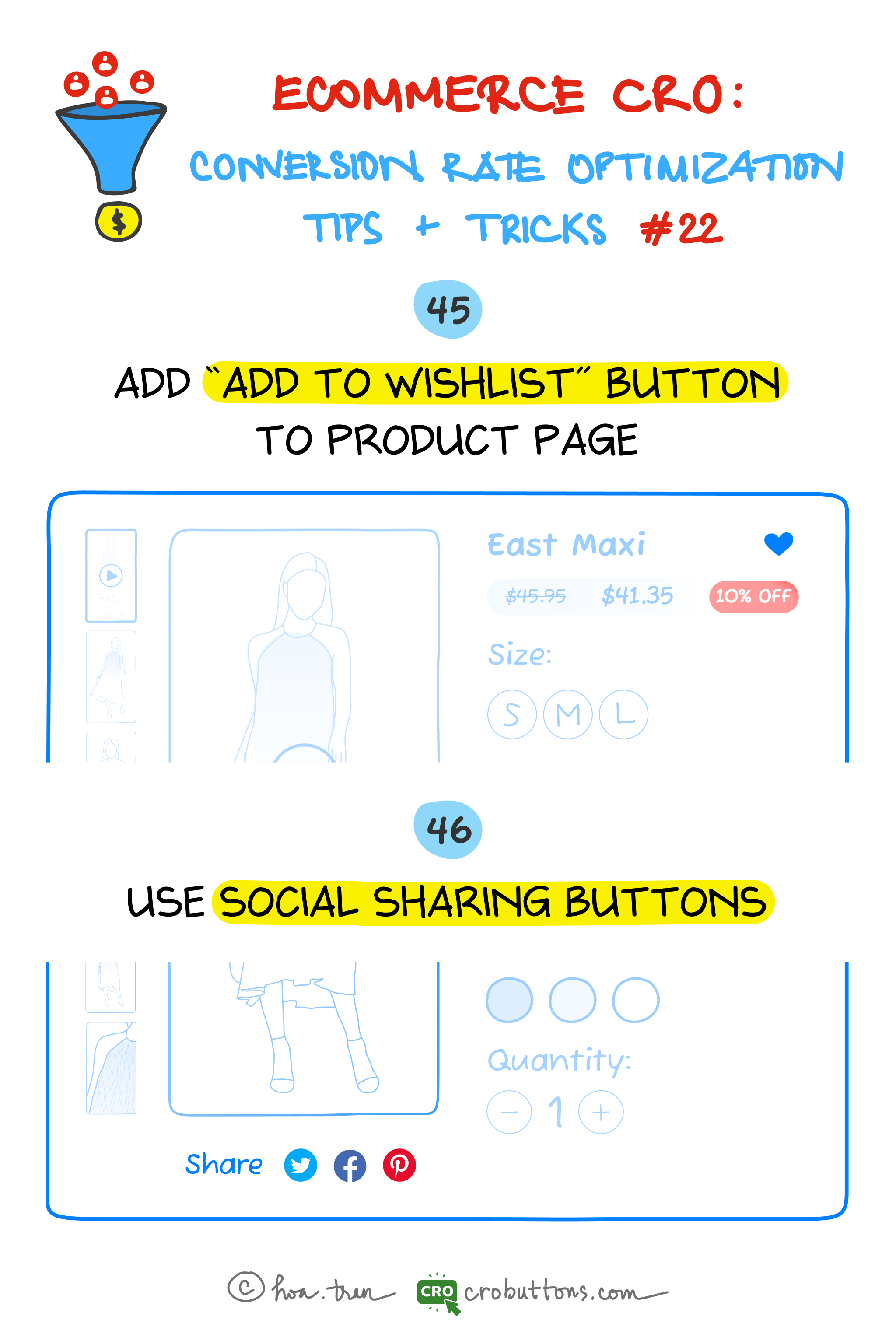
45. Add the “Add To Wishlist” Button To The Product Page
What is the “Add to wishlist” button?
A wishlist permits clients to create customized assortments of items they need to purchase and save them in their customer accounts for future reference.
Sometimes a visitor browses the ecommerce product page and then leaves without buying anything. Even when they are willing to buy, in most cases, they tend to forget where they saw the product. Wishlist will be a great tool for such users. It helps them maintain an eye-catching list of things on your website and then come back to complete the purchase. In many cases, users just need to dump products into their wishlist, then wait for the sale, and the coupon before buying them.

The benefits of a wishlist
Firstly, it improves the user experience by allowing them to save products they are interested in without feeling pressured to make an immediate purchase. This way, users can take their time and return to the website to view their saved items at a later time, reducing the friction of committing to a purchase decision.
Additionally, the “Add to Wishlist” feature can increase engagement by encouraging users to return to the website to view their saved items, which can lead to further exploration and ultimately increase the likelihood of making a purchase. This increased return visit frequency can help to build brand loyalty and increase the chance of future conversions.
Furthermore, when users share their wishlist items on social media, it can drive additional traffic to the website and increase exposure for the products listed on the wishlist
What distinguishes the ‘Add to Wishlist’ button from the ‘Add to Cart’ one?
On an e-commerce platform, the “Add to Wishlist” and “Add to Cart” buttons perform different functions.
The “Add to Wishlist” button allows a customer to save a product they are interested in for future reference. It’s a way to keep track of items that they may want to purchase later or are considering buying in the future. The wishlist feature allows customers to create a list of products they like without having to commit to a purchase right away.
On the other hand, the “Add to Cart” button allows the customer to add the product to their shopping cart and initiate the checkout process. This indicates that the customer intends to purchase the product, and the item will be held in their cart until they complete the checkout process. However, please note that if you do not complete the checkout process, the items in your cart may be removed after a certain period or when you log out of the website.
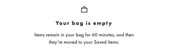
The business may choose to have either one of the buttons or both the “Add to Cart” and “Add to Wishlist” buttons. However, having both buttons provides more flexibility for customers and helps businesses cater to different purchasing preferences. The “Add to Cart” button is ideal for customers who are ready to purchase, while the “Add to Wishlist” button enables customers to create a list of products they are interested in without the pressure of making an immediate decision. This can lead to increased customer engagement and higher conversion rates for the business.
The ways to implement “Add to Wishlist” buttons on product pages
With the perfect plugin, adding the wishlist feature to your website is not a big hassle. This section will look at many approaches to integrating “Add to Wishlist” buttons on product pages, such as location, design, and functionality. Businesses may enhance their “Add to Wishlist” option by taking these things into account to deliver a seamless and successful user experience for their consumers.
1. Placement
The placement of the “Add to Wishlist” button is critical to its effectiveness. It should be located in a prominent position on the product page, ideally near the “Add to Cart” button. However, it’s important to avoid placing it too close to the “Add to Cart” button, as this could lead to confusion for customers. It’s also essential to ensure that the button is not hidden from other page elements, such as images or descriptions.

Businesses may improve the user experience by allowing customers to add things to their wishlist without leaving the homepage. Whenever a consumer falls in love with a product on the site at first sight, they should be able to add it to their wishlist with a single click on the heart icon or any other conspicuous CTA button immediately where they view the product. Businesses may boost user satisfaction by introducing this feature, which provides a smooth and simple method for customers to manage their favorite items.
2. Design
To make the “Add to Wishlist” button stand out, businesses should consider using a distinctive design that catches the customer’s attention. This can be achieved by using a different color or icon for the button then the rest of the page elements. Another option is to make the button larger than other elements on the page. However, it’s important to maintain consistency with the website’s overall design to avoid confusion for customers.
3. Functionality
The “Add to Wishlist” button should be easy and intuitive to use. Customers should be able to add products to their wishlist with just one click, without having to fill out any additional information.
It’s also essential to provide functionality for customers to manage and organize their wishlist, such as the ability to add notes or tags to each product.
Additionally, businesses can consider offering a “view wishlist” button or link on the page, allowing customers to quickly access and review their saved products.

46. Use Social Sharing Buttons
What are social share buttons and how do they impact conversions?
Social sharing buttons are little icons on a website that allows visitors to quickly share its content on their social media networks. Customers may share their ecommerce purchases on Facebook, Twitter, Pinterest, and other sites by using social share buttons. The majority of online shoppers also use at least one form of social media, so these buttons create a free promotion for an online store.
When users share a website’s content, it can reach their followers and friends, who may not have been aware of the website before. This can increase the website’s exposure and ultimately result in more traffic and potential customers. Additionally, social sharing buttons can help to improve a website’s search engine rankings, as social signals are one of the factors that search engines consider when ranking websites.

The benefits of the social sharing buttons
As shoppers often use social media platforms to bookmark their favorite products or share their recent purchases with their social circle, businesses can leverage this trend by adding social sharing buttons on product pages.
By making social sharing a secondary call to action, businesses can not only provide customers with an easy way to spread the word about their products but also generate greater exposure through customers sharing their products. This can ultimately lead to higher conversion rates and increased brand awareness, making social sharing an essential tool for any modern business.
Tips for implementing social sharing buttons on your website
Choosing which social networks to integrate into an online store
Online store owners have a variety of social networks to choose from for sharing, but not all platforms are equally relevant. For instance, Facebook and Pinterest are highly visual networks, with some customers using Pinterest as a digital wish list.
As of Q4 2022, Facebook is the largest online social network in the world with roughly 2.96 billion monthly active users – Statista
However, LinkedIn isn’t as applicable for this feature as product posts don’t align with how most members use the platform. Moreover, Google Plus has far fewer users than Facebook and Twitter, meaning shared items are unlikely to receive as much attention. By restricting social sharing buttons to Facebook, Twitter, and Pinterest, customers are less likely to get distracted by clutter on product pages.
Promoting social sharing for business growth
Businesses can also provide incentives for sharing. For example, offering a discount or freebie to customers who share their purchases on social media can encourage them to share and increase brand exposure. Additionally, businesses can consider creating shareable content such as blog posts, videos, or infographics to make it easier for customers to share.
Placement
To maximize the effectiveness of social sharing buttons, their placement is crucial. They should be positioned prominently on the page so that users can easily see and access them. A good practice is to place them near the product images, which are the center of attention for shoppers. Another option is to include social sharing buttons at the bottom of the product description or alongside the “Add to Wishlist” and “Add to Cart” buttons.
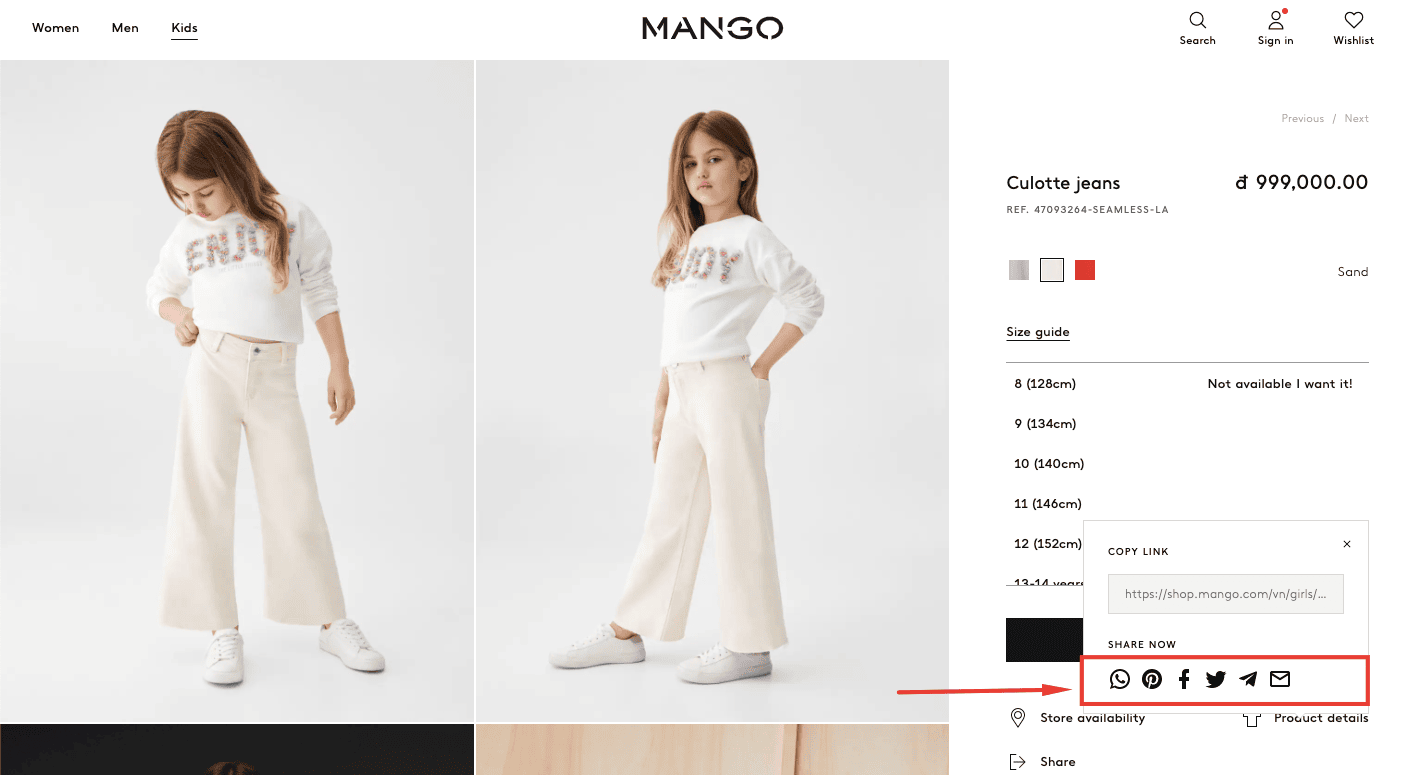
Chapter 23: Homepage: Boosting Sales with Cart Pop-Up Reminders

What is a cart pop-up reminder?
A cart pop-up reminder is a feature on e-commerce websites that displays a pop-up message reminding the customer about the items in their shopping cart. This reminder is designed to reduce cart abandonment rates by prompting the customer to return to their cart and complete the checkout process.
Solutions for cart reminders
Save the contents of an abandoned cart in case the consumer returns in a few days. On the cart page, specify how long you will keep their selection. People will probably forget their choice when they return to your website. Greet the shopper with prior session goods, as well as changes in price or availability, so that the consumer is not shocked to encounter unexpected things during checkout.
In this article, we discussed a pop-up that is displayed immediately when customers access the website. Its purpose is to encourage customers to complete their purchases and reduce cart abandonment rates. Therefore, it is unnecessary to go through the steps of identifying its location since we already know it is placed on the homepage.
However, it is important to ensure that the pop-up is strategically placed on the homepage for maximum effectiveness. One way to achieve this is by placing it in a prominent location, such as in the center of the page or at the top of the page where it is easily visible to customers.
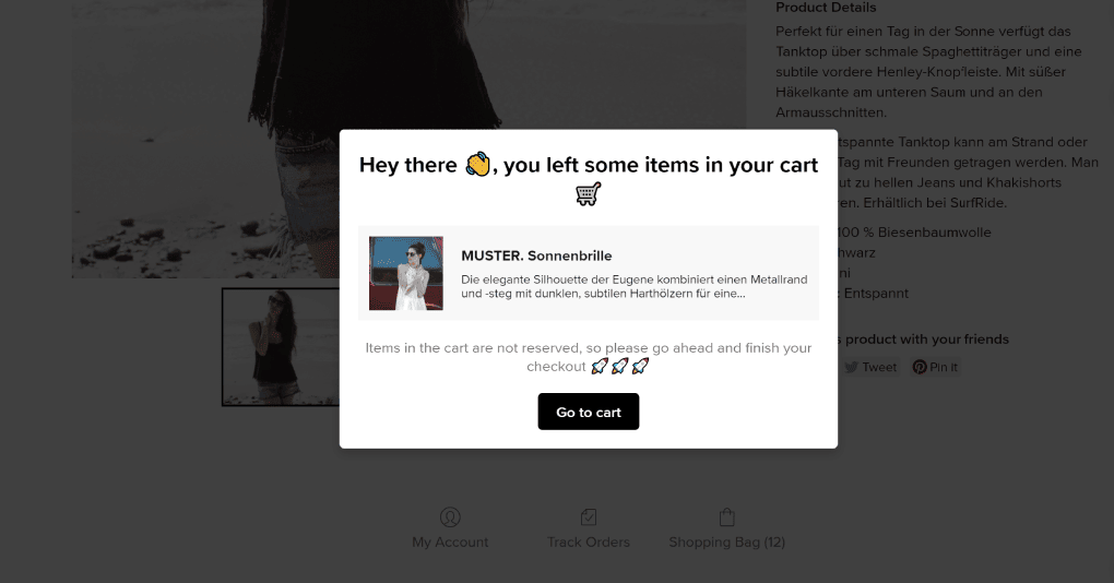
Additionally, it should be designed to be visually appealing and attention-grabbing, using contrasting colors or animations to draw customers’ attention to it. The wording of the pop-up should also be clear and concise, reminding customers of the items in their cart and encouraging them to complete their purchases. By carefully designing and placing the pop-up on the homepage, we can effectively encourage customers to complete their purchases and reduce cart abandonment rates.
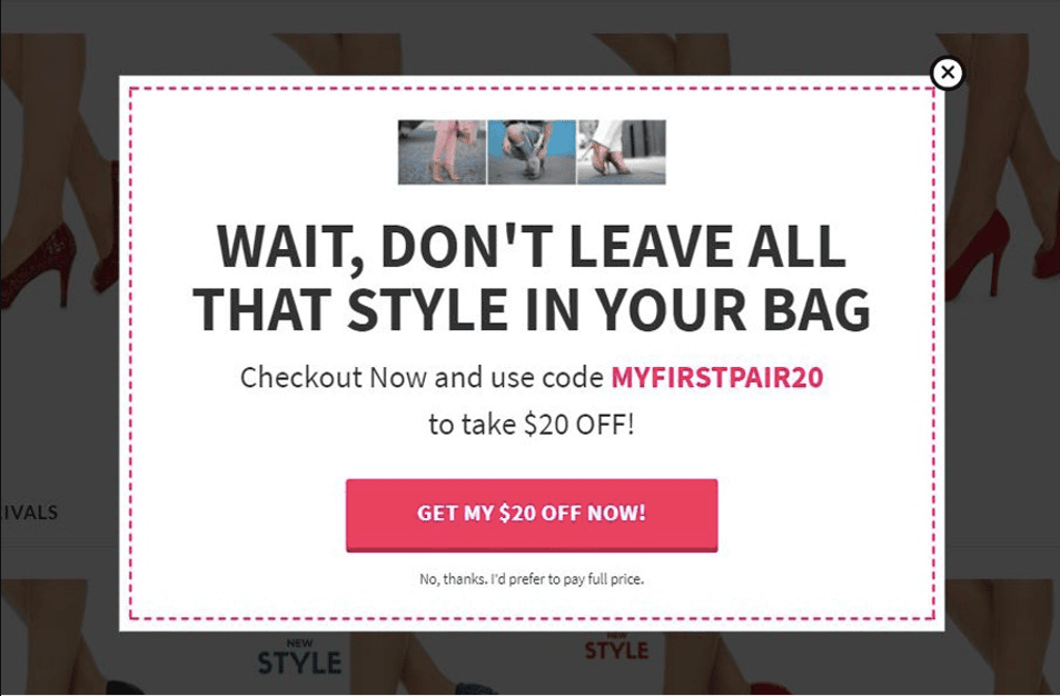
In addition to using pop-up reminders, another effective strategy to reduce cart abandonment is to develop promotions and incentives that encourage customers to complete their purchases.
For example, offering free shipping for orders over a certain amount or providing a discount code for first-time customers can be a powerful motivator to finalize a purchase. Additionally, creating a loyalty program that rewards repeat customers with exclusive discounts or early access to new products can also help increase customer retention and reduce cart abandonment rates. When developing promotions and incentives, it’s important to consider the target audience and their preferences, as well as the overall brand image and messaging.
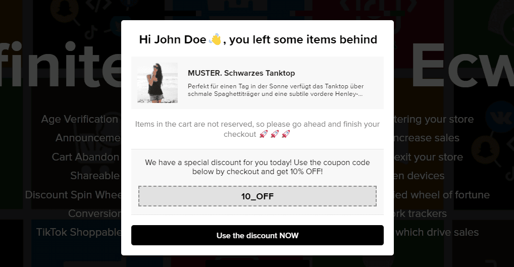
Implementing cart reminder pop-ups
Once you’ve identified the optimal timing and placement for your pop-ups, it’s time to implement them on your website:
- The first step is to design the pop-up itself, which should be eye-catching and communicate the message that the customer has items in their cart that need to be checked out.
- You should also include a clear call-to-action, such as “Proceed to Checkout” or “View Cart“, to make it easy for customers to take the desired action.
- Next, you’ll need to choose the right software or tool to display your pop-ups. Many e-commerce platforms have built-in pop-up tools, but you may need to use a third-party tool or hire a developer to create a custom solution.
- Once you’ve implemented your pop-ups, be sure to track their effectiveness using metrics such as click-through rates and conversion rates. This will help you refine your strategy over time and ensure that you’re getting the most out of your cart reminder pop-ups.
(to be continued)
What Do You Think?
We’d love to hear what you think about our ECommerce CRO guide.
Specifically, what’s the #1 technique you’re gonna use in your store?
We plan to add more helpful tips to the guide soon.
Get the Shopify store optimized for more sales with CRO Buttons