Your website’s homepage is the first port of call for many potential customers, and a well-designed search bar can be the key to unlocking a goldmine of conversions. By providing users with a quick and easy way to find what they’re after, you can improve their overall experience on your site, and that, my friend, is worth its weight in gold.
In this blog post, we’ll be diving deep into the realm of the search box, an integral part of any website, and giving you some top tips on how to optimize it. We’ll even show you how to use instant suggestions to help users find products that may be as rare as a hen’s teeth. With these strategies up your sleeve, you’ll be able to improve your website’s search functionality, ensuring your users have a ball while searching for their desired products, and ultimately increasing your chances of raking in the dough.
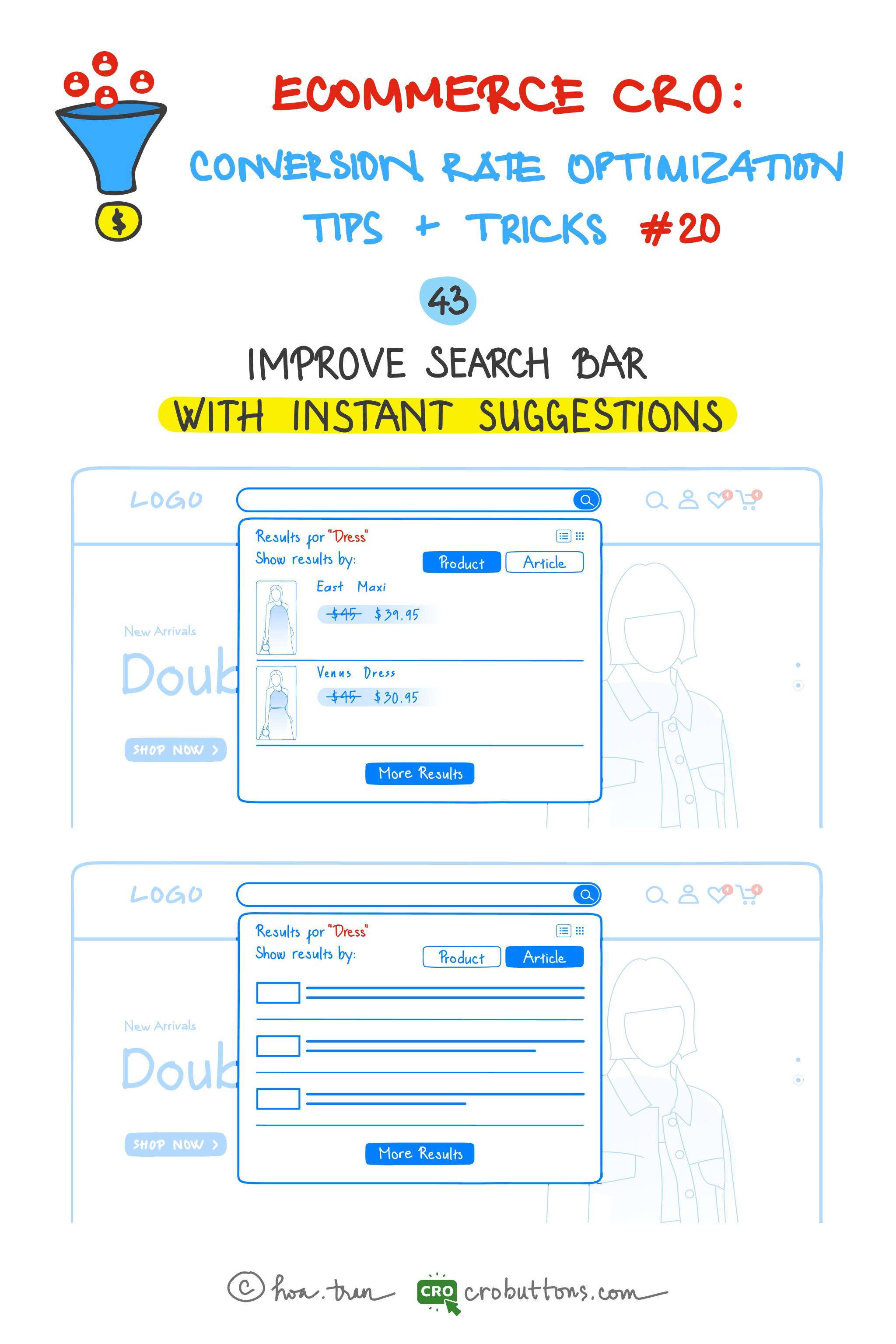
43. Improve the Search Box with Instant Suggestions
The search box has often been seen as a passive element that cannot increase conversion rates as actively engaging elements such as pop-ups or announcement bars can. However, business owners can now increase conversion rates and average order value (AOV) through the search box.
What is the instant suggestion?
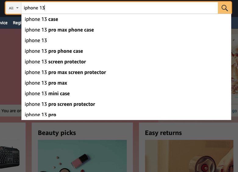
Instant suggestions—also known as autocomplete or autosuggest—are a helpful tool that improves the user experience by suggesting possible search phrases or item names as users begin to type in the search field. By removing the need for visitors to fill out whole search queries, this feature may drastically improve the search experience on your website and cut down on both search time and effort.
Furthermore, by offering relevant choices, quick suggestions may considerably increase the accuracy of search results, particularly for complicated product names or words that consumers might have trouble remembering or writing.

The importance of implementing instant suggestions cannot be overstated, as it can significantly impact the success of your website. Reducing the time and effort required for users to search can improve user engagement, increase conversions, and ultimately drive sales. Therefore, incorporating this feature on your search bar can be a powerful tool in your efforts to optimize your website’s user experience.
Why Does Instant Search Matter in Ecommerce?
The better the Site Search experience you offer, the more time and money shoppers will spend on your site. It’s as simple as this – all your visitors want is a more responsive site search experience.
A study examining 21 eCommerce websites concluded the following: user-friendly site search experiences lead to higher conversion rates. When site search was used, the conversion rate increased from the websites’ average of 2.77% to 4.63%. That’s an 80% increase.
Instant search is a feature that provides users with immediate search results and suggestions as they type their query into the search bar. This not only helps users find what they’re looking for more quickly and easily, but it can also lead to increased sales and revenue for ecommerce businesses.
The instant search can help users discover products they may not have been aware of before. The search suggestions can include related or complementary products, which can pique the user’s interest and lead to a successful sale. On the other hand, a slow or ineffective search function can lead to frustration and even cause users to leave the website, resulting in lost sales and revenue.
Therefore, ecommerce businesses need to invest in instant search to ensure a positive user experience and increase the likelihood of a successful sale. By providing users with immediate and relevant search suggestions, ecommerce businesses can improve their website’s usability and ultimately boost their bottom line.

How to optimize your search box for maximum visibility and usability?
Let your shoppers hunt for products, not for your search box. Make your search box stand out so that people can easily find it.
To ensure your website visitors can quickly and easily find what they are looking for, optimizing your search box is essential. Here are some tips on how to optimize your search box for maximum visibility and usability:
- Sitesearch elements: Avoid making your search box hard to find by only using a submit button without the text field or only using a text field without the submit button. Make sure both elements are present and visible to users.
- Placement of the search box: Consider placing your search box in a consistent location on all pages except the checkout page. Popular positions include the top right, the top center, or the main menu. Avoid placing it near other elements such as email signup boxes.
- Size of the text field: A longer search field will allow users to see what they are typing and reduce errors. Make sure the text field can hold at least 30 characters. You can also use your Site search data to determine the optimal character limit based on what your shoppers are searching for.
- Contrast: Ensure the input field color does not make it difficult for users to understand where to type in their search term. Increase the contrast between the site header, text field, and search button to make the search box more prominent relative to other elements on the page.
How to implement instant suggestions on your search bar?
It isn’t enough to simply have a solution when it comes to site search; you also need to concentrate on keeping up with your competitors.
20% of search users submit another query after their initial search and 21% simply leave the website on the spot out of frustration.
We gathered all of the industry’s best practices and are sharing them with you here to ensure that your site produces better results.
Place text in the search box to encourage searchers
Simply designing and placing a search box isn’t enough. Adding some text to the box is essential for eCommerce.
Display some meaningful text in the search bar and have it disappear when you click so that people may type their search queries without becoming confused. If consumers do not find the desired product in the search results, they may try an alternative search phrase. Keep their prior search word in the search field so they don’t have to input it all over again.

There’s more: You can even provide the visitor with additional information in the search field. If your search can handle product codes and catalogue numbers, make that clear from the start. This will expedite the search process and improve the user experience. You may, for example, include anything like “Input product, code, or brand”.
Auto-suggest
Search engines anticipate searches as they are typed. By offering auto-suggest versions for particular inquiries, you may direct visitors to the most popular and relevant products.
If submitted queries don’t have an exact match, the least you can do is show potential matches. This may well be what the user was looking for.
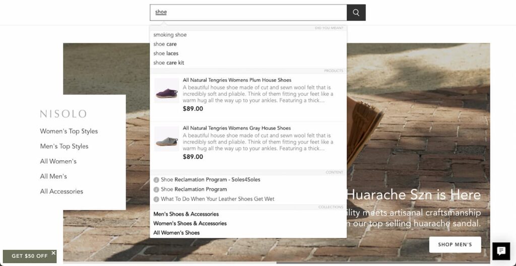
A dropdown with common searches will help reduce typos and avoid a no results found state. It’s even better if you suggest a few best-fit products along with thumbnail images and prices of the products suggested. Land the shopper on the individual product page if he clicks on any product suggestion.

Error-tolerant user journey
A prerequisite for site search usability is a strong error tolerance for typos.
If someone searches for a brand name (even if misspelled), they should never end up on a 0-results page. Brand names like “blackberrie” for Blackberry, “nice” instead of Nike, or product names like “games board” instead of “board games”, colors like “balck” or “wite” instead of “black” and “white” should not result in 0-search results.
The Baymard Institute found some pretty startling stats about this. “34% of the top 50 e-commerce sites, don’t return useful results when users misspell a single character during the search for a model number in the product title.”
Lower sales hurt, but 0-results pages might affect your site’s traffic in other major ways:
- Users will be less likely to return to a shop where they can’t find what they want to buy. It’s simply frustrating.
- They will also spend less time on your site and might have a higher bounce rate, which can decrease your overall site stats and negatively affect your Google ranking.
By adding to the list of possible words with alternative spellings you can start to see a new light.
Losing money in so many different ways is mind-blowing, don’t let it happen!
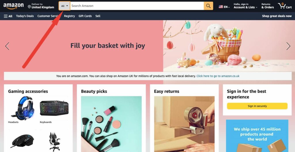
Scoped search
The scope of a search function can vary depending on the size and complexity of an ecommerce store. While smaller stores with a limited range of products may not require a search function with a narrow scope, larger stores with a wide variety of products must prioritize allowing users to search within specific categories.

This not only provides users with more targeted search results but also helps to prevent confusion and frustration caused by inadvertently searching within the wrong category. By defaulting the search scope to the entire store, you risk overwhelming users with too many results that aren’t relevant to what they’re looking for.
Therefore, it’s essential to ensure that your search function is configured to provide users with the most relevant search results possible, by allowing them to easily refine their search scope based on their specific needs.


