A decent product page requires a variety of components. Do you maintain the product page? Despite having a good theme or a high-end product, e-stores sometimes lack the most fundamental components on the product page. Customers become frustrated and quit the website as a result of poorly optimized elements.
What therefore should we change to make the product page better?
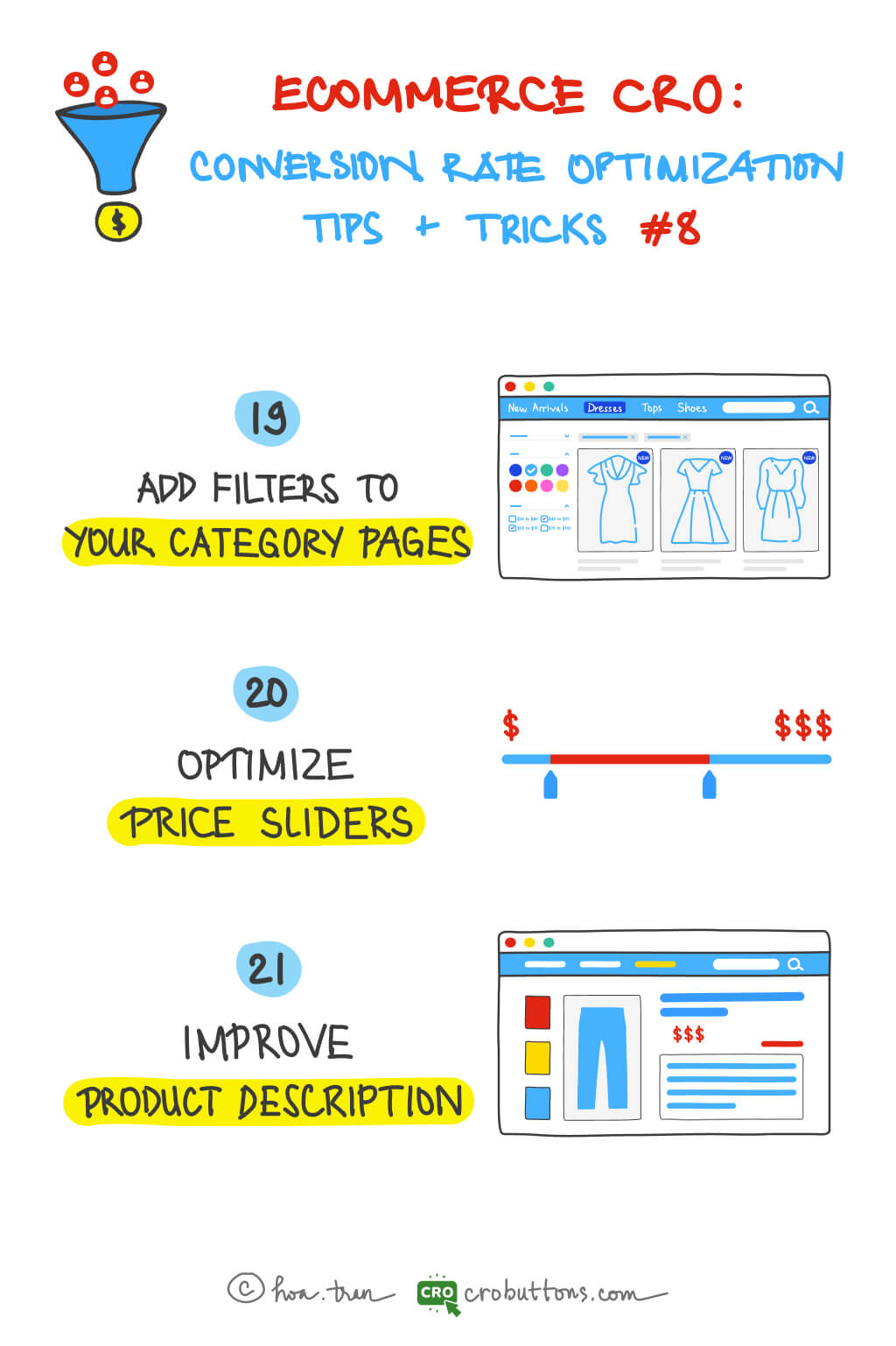
19. Add filters to your category pages
Good filtering is especially needed when an online store offers many different categories or product items, or when an assortment has several attributes and possible combinations. Customers never love scrolling through endless category pages to find the product which they want. If your customer can’t find exactly what they’re searching for, they can quickly become frustrated. Even if you have exactly what they want, if they can’t easily find it, they’re simply going to buy it from a competitor that has a better-built site. Even if you don’t have what they’re looking for, they should find this out as quickly as possible. That’s why the filter is necessary.
What is the filter?
Filters are essential tools for effectively refining large amounts of information by providing certain criteria and narrowing down the results by excluding items that do not match the set criteria. It helps streamline navigation on websites with an overwhelming number of products.
Benefits of using filters
- Filters are an integral part of marketing, as well as sales. Improving the site’s filtering system can greatly impact how many products consumers watch and ultimately buy in the online store.
- Providing too many choices can confuse and overwhelm your customers. Filters are undoubtedly important to help customers navigate and direct to the right products with matched desired categories.
- By including search filters in your eCommerce store, you can greatly provide a much better user and customer experience to your visitors than even some multi-million dollar online retailers.
Tips about designing product filters you should take notice of
1. The best location for your filters
When thinking about the placement of your filters, you have two options:
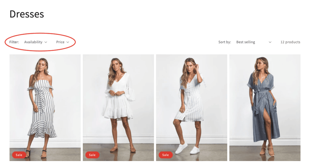
- A horizontal filter bar on top of the page will be more effective in focusing the shopper’s attention and, in many cases, will be more convenient to use.
- A vertical sidebar on the left: is where users are used to finding filters, so it offers a familiar experience and can contain a much larger number of filtering options.

2. Designing a horizontal search bar
You have to pay very close attention to how you design it to keep the customer experience excellent:
- You will have limited space, so you might want to hide some of the filtering options – you can read about how to do it in the next few paragraphs.
- Make sure the drop-down menus don’t automatically disappear when the cursor is not hovering over them.
- Use icons to help shoppers quickly understand the options and to streamline navigation.
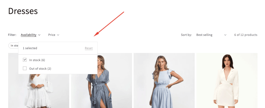
3. Make sure the applied filters are obvious
Shoppers should understand exactly which filters are applied and why they are viewing the given set of results. They should be able to easily make changes to the filtering options if they are not satisfied with the results.
You can make applied filters obvious in multiple ways:
- With checked or filled checkboxes.
- Displaying cancellable tags.
- Providing a back arrow for selected subcategories to go back to one level.
- Displaying the currently applied filters in a horizontal bar above the results.
20. Optimize the price slider
Do you know what’s the single biggest factor influencing customer purchasing decisions? According to Retailing Today, 81% of shoppers conduct online research before making big purchases; and the price is the most popular sorting option on the search engine. So we can jump to conclusion that the product price is the biggest factor influencing customer purchasing decisions.
What is the price slider?
You may display a price slider with this sophisticated pricing filter. Customers may use it to filter the product catalog by setting a low and high price. They may do this to rapidly identify items within their price range by setting a price range (minimum price value and maximum price value).
Why do we need the price slider on the product page?
According to Prisync, 60% of consumers consider pricing to be the very first criterion for their buying decision. Every shopper has a price range in mind when shopping for an item. This way, they can quickly see items sorted by their product price – either low to high or high to low. It makes it easier for customers to find what they’re looking for.
✍️ Tips for Shopify store owners:
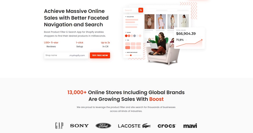
Creating advanced product filters and a smart search bar to enhance shopping experiences & boost sales by customizing the filter by tag, meta field, and product options; show auto-suggestion search results with high relevancy.
Especially, it can deliver relevant results with synonyms, stops word & no-search result suggestions. All that things are available on the “Boost Product Filter & Search” app developed by BoostCommerce.
With Boost Product Filter & Search, you can customize the filter trees, and filter options on any page & create a smart search bar easily, which helps shoppers find anything within milliseconds.
21. Improve product description
The product information found on the product page is comparable to that found on the package that was purchased from the retailer. Increased conversion rates are likely to happen as a result of a successful product description that offers visitors useful information to aid in purchasing decisions.
What is the product description?
A product description is the marketing copy that explains what a product is and why it’s worth purchasing. The purpose of a product description is to supply customers with important information about the features and key benefits of the product so they’re compelled to buy.
In the description, you need to answer questions customers have about your products:
- What is the product?
- What problems does your product solve?
- What do customers gain from your product?
- What makes it better than the competition?
Why would you improve the descriptions for your products?
When making an online purchase, customers can’t handle your products in the flesh, so they have to make do with a description and imagery — so these better are great! Do you need more reasons to improve your product descriptions? Good product descriptions help you:
- Communicate benefits more clearly
- Establish a voice
- Improve customer experience
- Increase the chance of ranking your product in the search results
- Get higher conversion rates
- Get more return customers/build relationships
- Create trust
“One shopper in a recent study could not find the information he needed in the product description, so he left the site to search Google for more product information. In the course of his search, he found another site with the same product, a more complete description, and a lower price” – NN/g
Tips to have a good description
1. Focus on your ideal buyer
Putting yourself in your audience’s position will help you develop product descriptions. The most effective product descriptions speak immediately and personally to your target market. You converse with them by posing questions and providing answers in this way. When writing a product description, begin by picturing your ideal customer. What type of humor do they enjoy (if any)? What phrases do they employ? Do they have a language they despise? etc.
2. Write the way your target audience wants to read
The Harry Potter books didn’t become popular solely due to the plot. Author J. K. Rowling’s writing style was what first caught everyone’s attention. Harry’s world is detailed and complex, yet the reader understands it. Your visitors should understand what you’re saying, and the best way to ensure that happens is to write for them.
3. Don’t write for search engines (but do)
One of the most important things to remember is that you are writing for humans, not machines. Of course, writing a good product description makes it easier for search engines to understand it, but that shouldn’t be your goal. Your goal is to communicate the product’s value to customers and sell it as a solution.


