
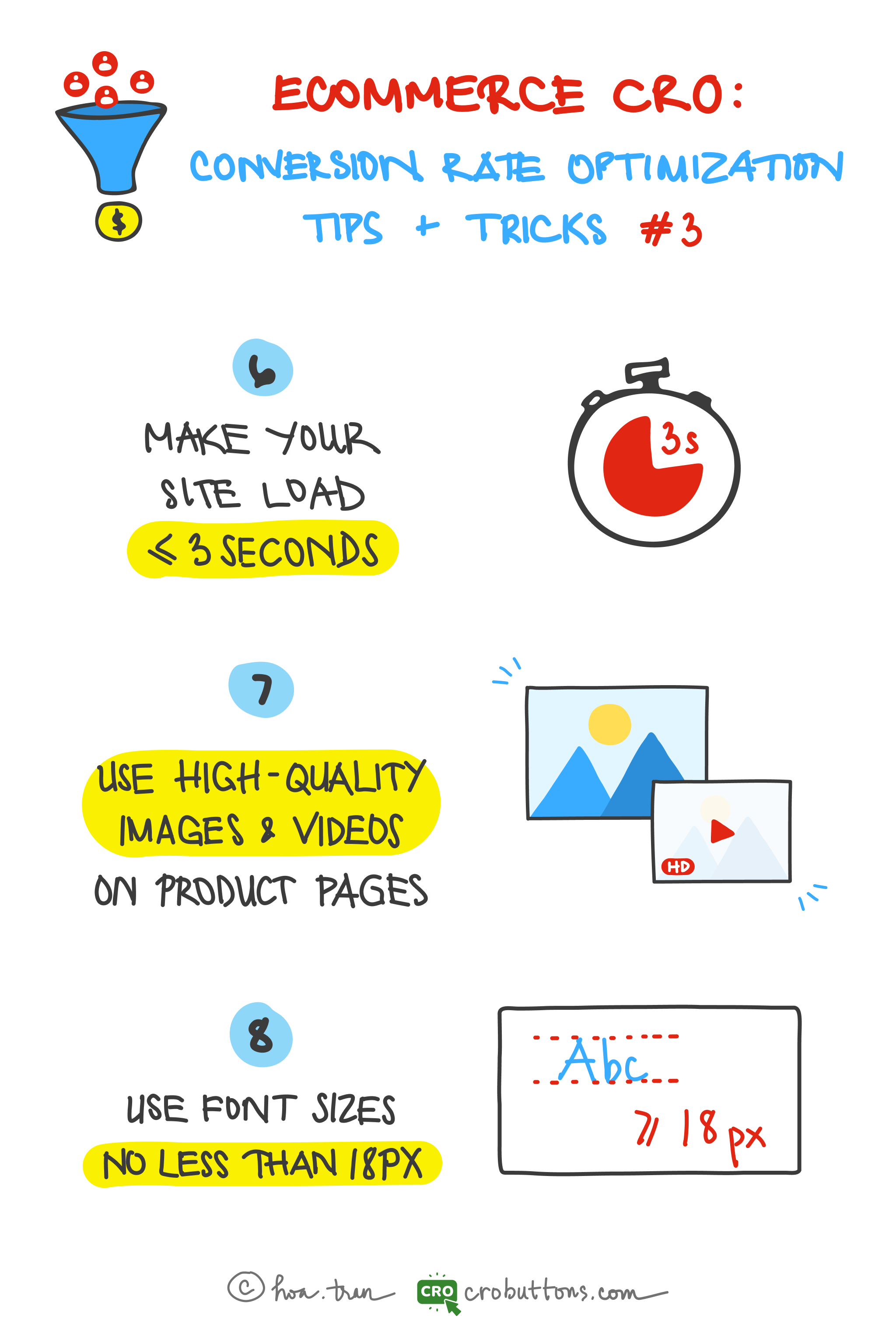
6. Make your site load approximately 3 seconds
Today, Page Speed is one of the most important metrics to keep your eye on. It directly impacts user experience, conversion rates, and search engine optimization.
What is page speed?
As the term suggests, Page Speed is a measurement for identifying how fast the content on specific page loads. This metric combines various elements loading on your websites such as images, videos, graphics, CSS, HTML, Javascript, and server response time.
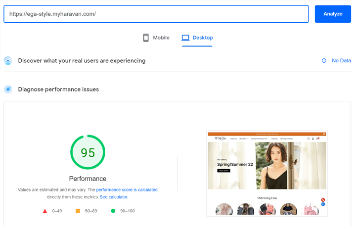
The metrics scores and the performance score are colored according to these ranges:
- 0 to 49 (red): Poor
- 50 to 89 (orange): Needs Improvement
- 90 to 100 (green): Good
Ideally, you want to be “in the green”
Why is Page Speed Important?
Websites with faster Page Speed provide a seamless user experience. On the contrary, websites with longer load times tend to have high bounce rates and reduced average page time.
A fast website provides a much better user experience than a slow one. Research has shown time and again that a slow website gets fewer conversions, and the user doesn’t read or engage as much on slower sites. That in itself should be enough reason to make sure the speed of your site is as good as can be.
According to unbounce.com:
When it comes to waiting for pages to load, most consumers think they’re more patient than they are.
Nearly 70% of consumers admit that page speed impacts their willingness to buy from an online retailer.
Although they know it’s important, the majority of marketers aren’t making page speed a priority.

The faster your website’s load time, the happier users will be. A faster website will have higher conversion rates and an overall better user experience.
Here are some handy site-speed tools to help you ensure that your site stays blazingly fast:
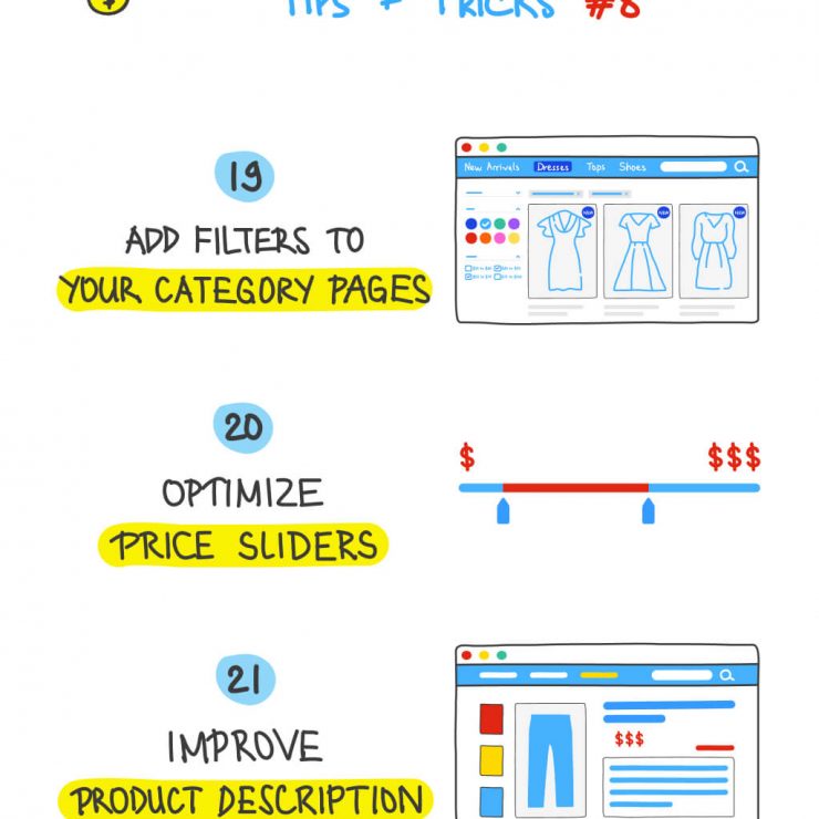
- Google’s PageSpeed Insights
- Pingdom’s Website Speed Test
- GTmetrix’s Website Speed and Performance Optimization
7. Use high-quality images and videos on product pages
Most people don’t understand how images influence user behavior. They think images are just for decoration. As you know, customers can’t physically verify the product when shopping online. So they must place absolute reliance on images and videos on the website to get the closest look of the items.
According to social media expert Jeff Bullas
“67% of consumers say the quality of a product image is ‘very important’ in selecting and purchasing a product” in an eCommerce site. It’s even “more important than product-specific information (63%), a long description (54%) and ratings and reviews (53%)”

What defines a high-quality image?
The three main components are sharpness, relevance, and speed.
- Sharpness: Your website instantly loses credibility when it showcases blurry or skewed images. So highest resolution photos are the ones you want to be sure to use for digital designs because you want users to see crisp, clear images.
- Relevance: The image should reflect the topic of the post, or have illustrative purposes within the article, of course. Simply put, if you’re purchasing food, don’t insert a picture of clothes.
- Speed: We learned about page speed’s importance at the beginning of this chapter. Thus creating an important balance between the image’s quality and size. The bottom line is, one should aim for the smallest image size possible without losing image quality.
Why is having high-quality images important?
High-quality images and videos provide a better user experience
Most people are likely to stay on the website with comprehensive and supplemental images that connect to what they were researching. Furthermore, high-quality images allow the users to make an informed opinion about the value of your site. So it is almost common sense that the better quality images you have on your website, the better the experience for any user visiting your site.
High-quality images help improve website SEO
Although search engine bots can not see the images on your website, they are capable of reading tags, captions, alt text, and another textual context for an image. Make sure the alt text and keywords for the image are directly related to the image. And the file name for the image should be descriptive of the image. So it is important to have high-quality images to draw the user in and keep them there, thus reducing the bounce rate.
High-quality images improve the conversion rate
High-quality photography supplies you with more visits by increasing the quality of your user engagement. Therefore because of this, users are more likely to spend longer on your website means you have a longer period to sell your products/services through both content and images.
However, remember to compress images and videos before uploading to increase the page speed. Here are some tools for you to do it:
8. Use font no less than 18px
Why we should use a font of no less than 18px?
Words must be the first means that help your readers understand what you want to convey. So if the font size is too small, readers will have to strain to read the text, which causes their eyes to fatigue. On the other hand, if the font size is too big (making the line length too short), readers are forced to jump to the next line of text – is also hard on the eyes!
In The Effect of Font Size and Line Spacing on Online Readability, UX researchers at Carnegie Mellon University and Spain’s Universitat Pompeu Fabra discovered that 18-point font sizes are the best for UX readability as well as comprehension in the body text of pages.
The truth is most visitors don’t even actually read word-by-word of the copy on your site. They usually skim the pages looking for highlighted keywords, meaningful headings, short paragraphs, and a scannable list. That’s why you need to advance the readability of your post by making fonts bigger and don’t use less than 18-point font sizes in the body text of your pages
How to choose the acceptable font size?
The font size must also be large enough to be easily read. However, we have to consider endless screen sizes, large and small!
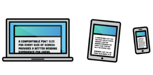
For large screens, your base font size should be in the range of 18px to 26px.
Larger font sizes on smaller screens create an uncomfortable reading experience because lines of text get cut off too quickly. The font size needs to be reduced on the smallest screens (mobile devices) to keep the line length of the text in that desired 45–80 characters per line range. In this way, visitors will not be shocked when suffering the website.