
In a recent post, we mentioned tips to optimize the cart and checkout page. The CTA button (such as add-to-cart, Buy now) and the size chart are simple website elements that can transform your online conversion rate. Your shoppers may not remember what your button looks like or says, but an effective button can inspire a click and lock in their internal commitment to buy. Even the smallest design changes can turn casual browsers into buyers.
This article will show you some information and tactics to increase conversion rates with the CTA button and size chart.
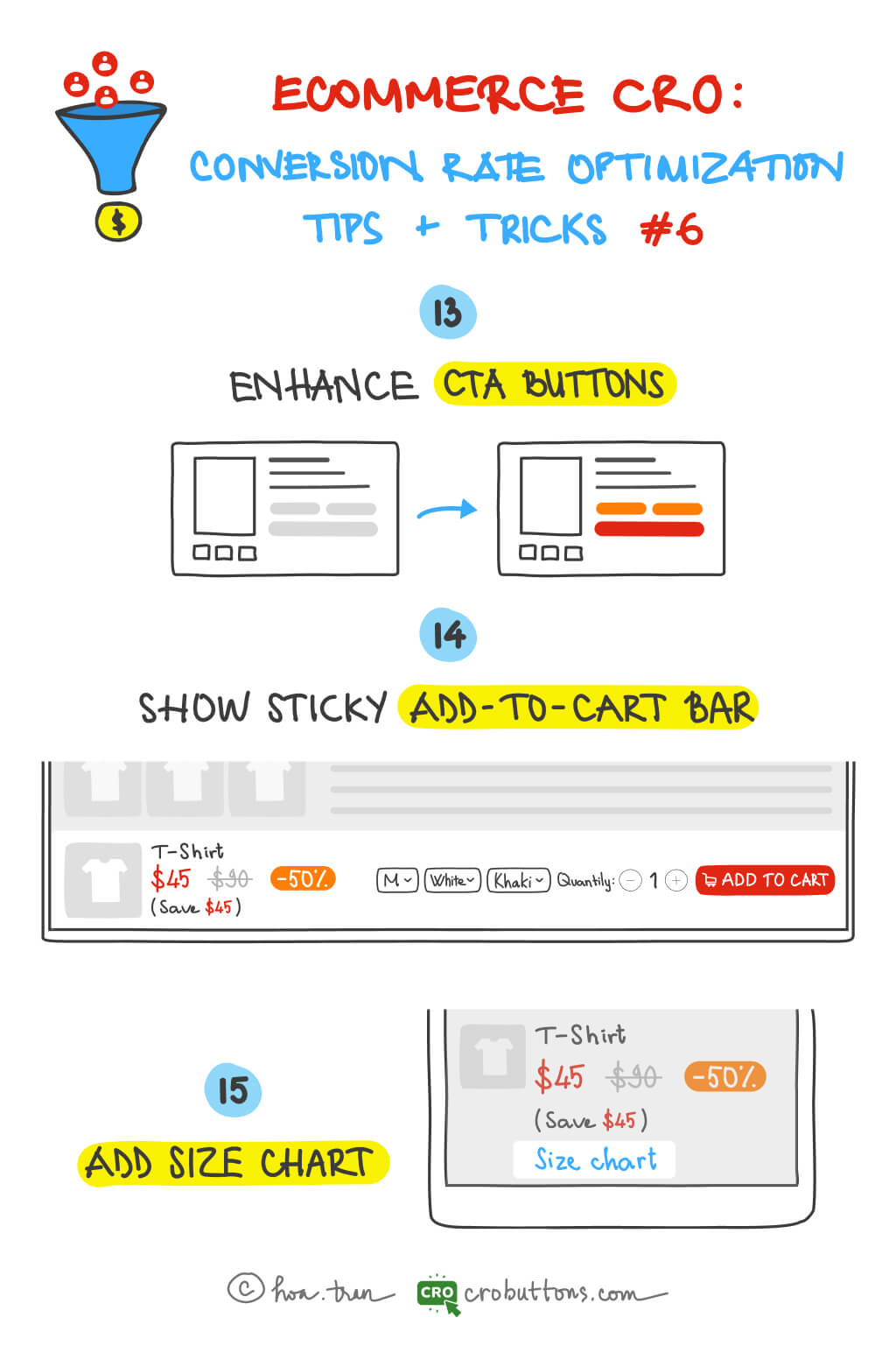
13. Enhance the CTA (call-to-action) button
What is the CTA button?
CTA stands for call-to-action. CTAs are the buttons throughout a site that tell your customers what to do, where to click, and what to buy. The recommended action can be direct — buy this product, add to cart, or simply an innocuous newsletter subscription sign-up button. It has a very specific goal: to get your web visitor clicking and completing a conversion.
Why CTA is important?
CTAs and sales funnels go hand in hand. The calls to action serve as transitions between the phases of the buyer’s journey. They instruct the user on what to do next, prompting them to take immediate action.
According to Unbounce, more than 90% of visitors who read your title also read your CTA content. Many people depend upon the CTA at the end of the page to take the next step. So omitting the CTA can confuse readers and hurt your chances of sealing the conversion. CTA buttons make it easy for customers to do what you want them to do. That’s good for them and good for business.
How to make a CTA more effective?
There is no exact science on how to make a CTA more effective. But even though there’s no “right” way to craft your calls-to-action, there are a few best practices.
Select your button color wisely
To stay consistent with the rest of your online store, the color of your add-to-cart button should match your brand colors. However, it’s important to select a shade (or even a gradient) that makes it stand out. For example, the website uses black add-to-cart buttons on top of its white background. This creates the contrast needed to draw shoppers’ eyes toward the button.

Consider a Button Hover Effect
Responsive buttons — those that change colors or move when you hover over them — can draw even more attention to your CTA. Beyond getting more eyes on your button, these hover effects can indicate to shoppers that your button is usable and will take them to the next step in the buying process if they click.
The “call to action” button quality does not just depend on changes in button colors. Colors play no role when buttons are not made prominent and well-located.
Button Placement
Customers should never have to hunt for a button. Generating a smooth shopping experience with the support of CTA buttons will conclusively guarantee a boost in conversions.
According to UX veterans at the NN Group, customers don’t scroll much below the fold, people engage 84% more with things above the fold
“Above the fold” may be an old newspaper term, but it is still alive and well in the digital marketing space. In general, you want to have your CTA land above the fold – meaning a customer won’t have to scroll through the page to find the button. On the other hand, important vital information should always be kept above the fold.
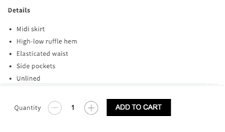
14. Show sticky Add-to-cart bar
What is the sticky bar?
A sticky bar is a horizontal bar that you can “stick” to the top or bottom of a page on your website.

Why we should use the sticky bar for the web store?
When the content of the product is long, users often find it hard to click add to cart button because it is at the beginning of the page. This plugin will solve the issue by adding a sticky cart at the top or bottom of the page. It also helps visitors who use mobile devices easily add a product to the cart. The smaller screen on mobile devices, the harder to find CTAs like the add-to-cart button, so making the add-to-cart button sticky could improve user experience.
Growth Rock has surveyed
The sticky Add to Cart Button Gets More Orders by 8%
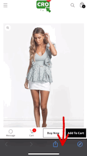
15. Add size chart
The main reason why customers are afraid to shop at the store or make online purchases is the matter of sizing. Many items require a fit of one type or another – sleeping bags, fishing rods, furniture… all need to fit the buyer. The instructions for choosing the ineffective size can make customers disappointed when making a conversion decision because they are not sure whether the items want to suit them or not. So, if we have such a small link of the size chart that does make a significant difference in conversion rate, that would tell us that the size guide link may have relative importance for certain apparel eCommerce sites.
Placement of the size chart
Growth Rock recently ran an AB test about the “Size Guide”: a 21% increase in conversions, and a 22% increase in AOV when they moved the size guide up above the size dropdown.
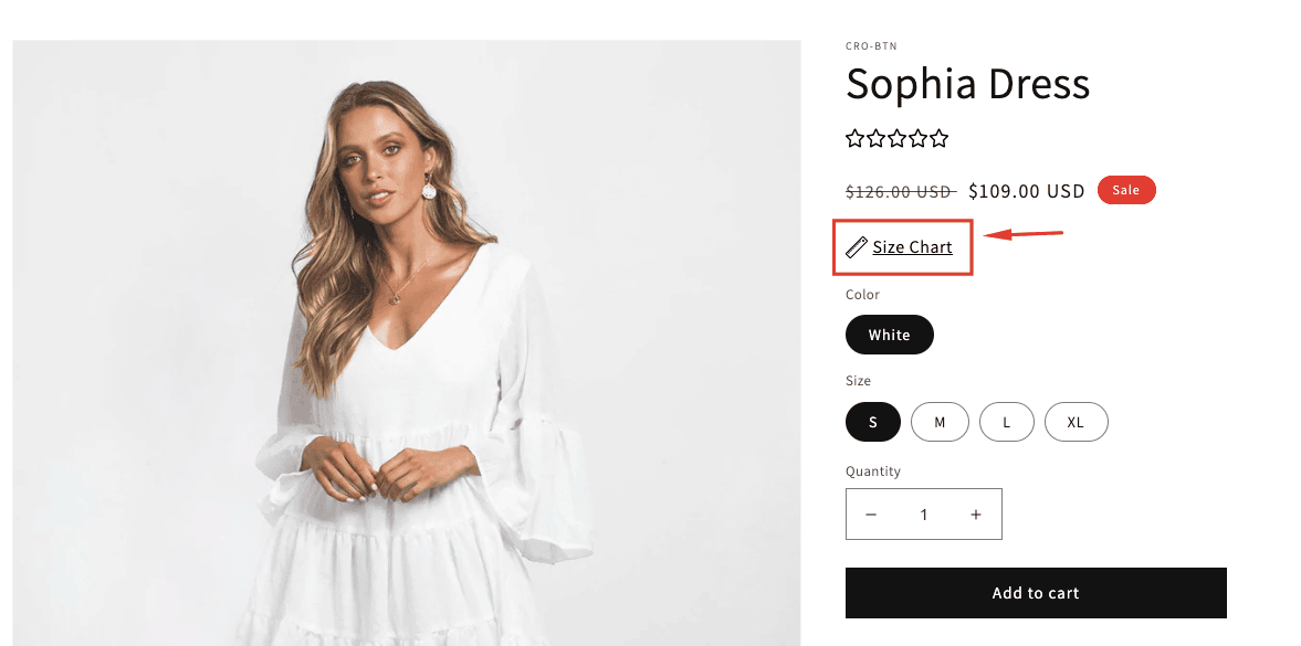

Why is the sizing chart so important?
- Well-crafted online sizing charts add to the user experience (UX) on your website, and happy customers are repeat customers
- Accurate sizing guides help make sure the buyer gets the desired fit: One of the common reasons why customers are skeptical about their online purchases is the inability to try the products before their purchase. With an ideal product size chart, you can keep your customers informed about the size and fit of a product.
- Online sizing charts help you get sales you might otherwise lose: A size chart will eliminate all the confusion, rendering real-time information to the customers. When a user has a sufficient idea of what the size is and whether it is for a flat or a curvy body, they can decide better
Currently, the sticky bar and the size guide are available on the CRO Buttons (Shopify App Store)