You never get a second chance to make a first impression
First impressions matter; for any online store, the homepage is the first thing a customer sees when they click on a link to your website. This makes it an ideal opportunity to catch their attention with promotions, important announcements, and updates about your business, such as upcoming sales, featured products, and discount codes. Using this space effectively is important to engage customers and encourage them to explore your website further.
This is the first in a series of blogs about how to enhance conversion rates on your website’s homepage. This post will go over two prominent conversion rate optimization strategies: an announcement bar and discount and coupon code pop-ups. Let’s check it out!
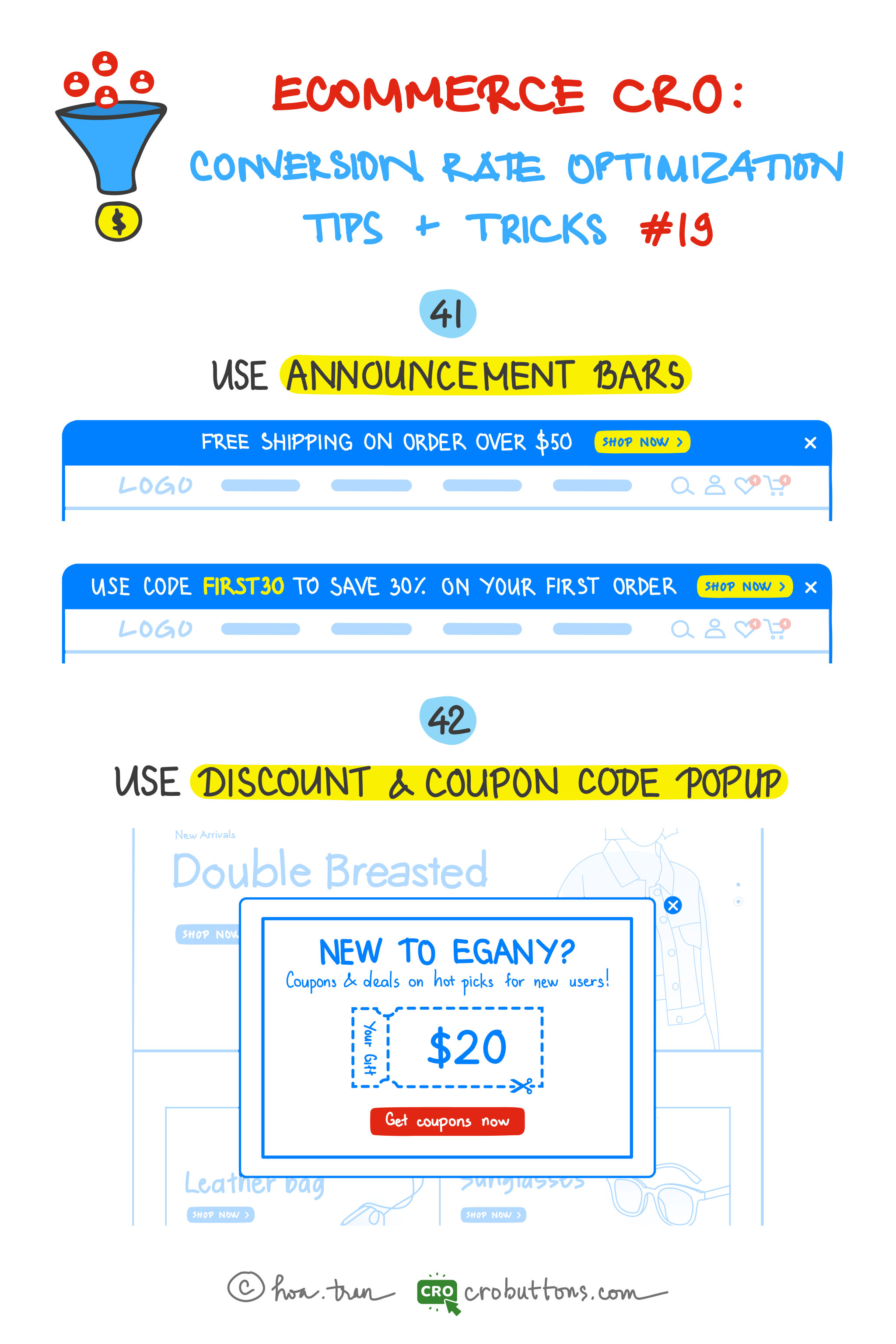
41. Use the Announcement Bar
Because an announcement bar occupies your website’s most precious real estate, you have a fantastic chance to provide valuable information to clients before they even look at the rest of your content.
What is the announcement bar?
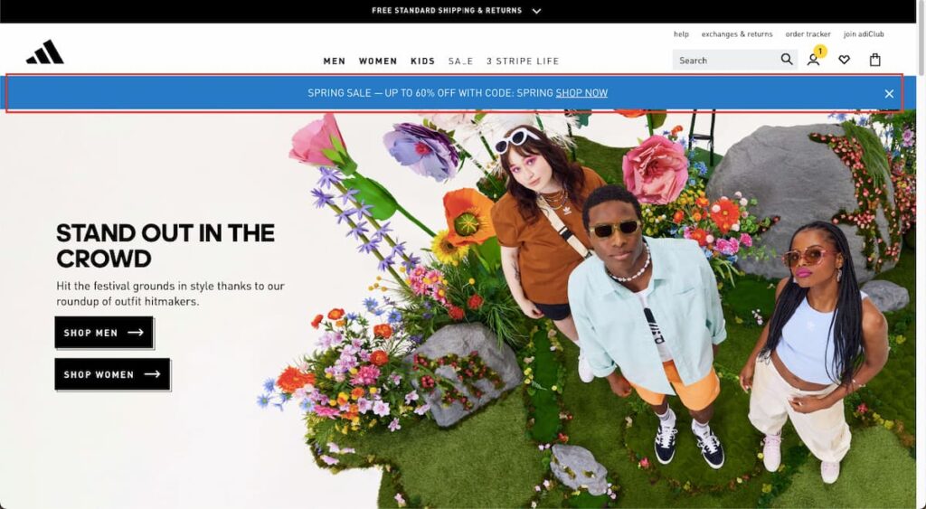
Announcement bars go by a variety of names—welcome header bars, hello bars, floating bars, notification bars—but they all fundamentally imply the same thing: a one- or two-sentence notice at the top of the homepage.
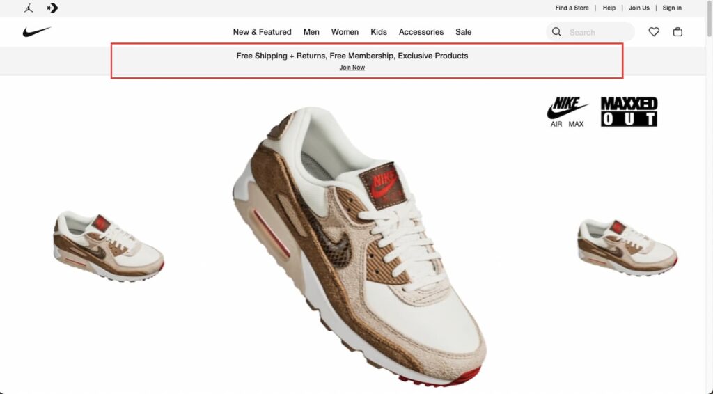
In many situations, the announcement bar appears above the navigation, making it the first thing visitors see. You may even have announcement bars move dynamically as users scroll, keeping your CTA visible at all times.
Several website owners believe that announcement bars are an efficient way to communicate essential messages to their audience without resorting to more obtrusive approaches such as pop-ups or full-page advertisements.
Why should you care about announcement bars?
Customers read in a very predictable way known as the F-shaped pattern. This online reading pattern entails users reading horizontally over the top of the page, then moving down to their next horizontal movement, and scanning the material vertically. So, visitors first see the content across the top of your website. This content could be your logo in the header, a blog title, or…an announcement bar.
One of the most attractive benefits of using announcement bars is their non-intrusive nature, as they take up a mere 5% of the page and don’t require any interaction from visitors, making them a perfect fit for those who want to avoid interfering with their browsing experience. This is a big plus since visitors won’t feel the urge to give it the boot, unlike those pesky pop-ups, and may end up engaging with it for an extended period without even batting an eye.
Announcement bars offer a great deal of flexibility, as you can include not only static text but also compelling call-to-action buttons and handy form fields, all of which can be added directly to the bar, making it easier than ever for visitors to take action.
Finally, implementing announcement bars is a walk in the park. With a straightforward plugin, you can add them to your website and update them as frequently as you’d like with minimal hassle.
At CRO Buttons, we specialize in providing website solutions to help your business grow. With our expertise, we can help you create a customized announcement bar that perfectly fits your needs, making everything simpler and more streamlined for you. Check it out!
What content should appear on the announcement bar?
There are tons of different ways to use announcement bars to achieve your marketing objectives. But here are some of our favorite, and most effective, examples:
- Announce new products
- Share industry/company news
- Display updated shipping information
- Link to new blog posts
- Grow email subscriber list
- Share promo codes
- Grow social media following
- Promote sales and discounts
- Display sale countdowns
- Promote upcoming webinars
- Announce new whitepapers
Announcement bar best practice
While you may put whatever you want in your announcement bar, you want the content to be useful to you and your customers, especially because it is in such a prominent area. Therefore, let’s go through some ground principles for making your announcement bar as effective as possible.
Make it actionable
When it comes to your website’s announcement bar, don’t settle for a simple “hello.” Instead, use it as an opportunity to prompt visitors to take a specific action. This is the first CTA visitors will see on your site; make sure it’s worth their time.
Avoid annoying users
Visitors can choose to close your announcement bar using the “X” button. To prevent the bar from repeatedly appearing and causing frustration, ensure that your website’s code keeps the announcement bar hidden when users navigate to another page. Failure to do so may result in annoyance and a negative user experience.
Keep it current
Regularly update your announcement bar. If visitors see the same notification each time they visit your site, they will eventually ignore it, even if the material is updated.
Be mobile-friendly
Test your announcement bar on tablets and smartphones to make sure everything looks right and functions correctly. As you know, 3/4 of online purchases today are made on mobiles. Assist your customer with a pleasing mobile shopping experience by implementing some tips here.
Keep it short
You only need one or two phrases. Remember, it’s a CTA, so keep it brief.
Repeat
Repeat the same information from your announcement bar on your homepage and internal pages. Lilach Bullock found that repeating messages helped her convert 57% of her website visitors.
42. Use Discount & Coupon Code Pop-up
Popups have become an increasingly popular tool for website owners to capture their visitors’ attention and guide them toward their desired actions. A popup is a type of interface that appears suddenly in the foreground, usually in a small box window, as the visitor lands or scrolls on a site. Its objective is to display information related to the website and encourage visitors to take specific actions. While there are many different types of pop-ups, in this section, we’ll focus specifically on discount and coupon code pop-ups and explore how they can be a powerful tool for boosting your website’s conversion rates.
What is the discount & coupon code pop-up?
Coupons and discounts pop-ups are a particular type of online pop-up that shows visitors a special promotion, discount, or coupon code as they browse your website. These pop-ups aim to persuade site users to make a purchase or carry out a certain action by providing them with a discount or promo code.
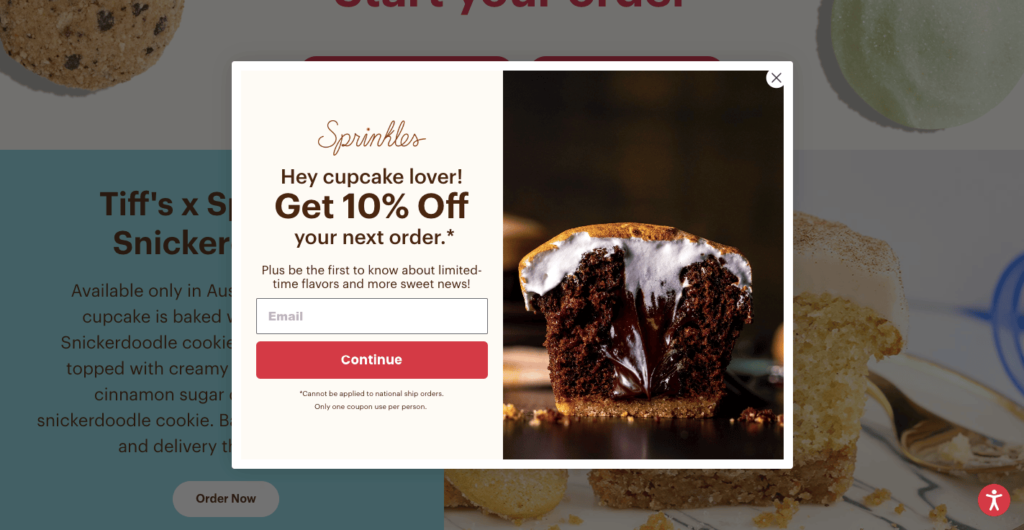
What justifies the use of discount and coupon pop-ups on the Homepage?
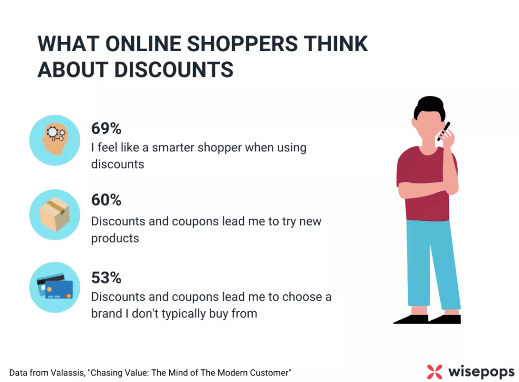
According to MarketingProfs, 57% of US online shoppers who used a coupon code said that they would not have bought the item(s) if they had not received the discount.
Discounts are a tried-and-tested way to get window shoppers thinking about buying. But it’s not just the anecdotal evidence we rely on: ecommerce research gives us these insights into what customers think.
The following advantages are provided by posting special deals and coupons on the homepage:
- Increase sales: Coupon code pop-ups can entice customers to purchase by offering discounts or promotions. This can help increase your overall sales and revenue.
- Improve conversion rates: By displaying a coupon code pop-up on your homepage, you can encourage visitors to take action and make a purchase. This can help improve your website’s conversion rates.
- Build customer loyalty: Offering discounts and promotions to your customers can help build their loyalty to your brand. By making them feel appreciated and valued, they are more likely to return to your website in the future.
- Stand out from competitors: Using coupon code pop-ups can help your website stand out from competitors by offering unique deals and promotions. This can help attract new customers to your website and set you apart from other businesses in your industry.
Announcing your store’s available promotions and coupons to customers can be achieved through an announcement bar, but it is not as effective as using a pop-up for the homepage. Why? Discount and coupon code pop-ups are more noticeable than announcement bars. They grab the customer’s attention and encourage them to take immediate action.
Pop-ups are a great way to capture visitors’ attention and encourage them to purchase on your website. However, not all pop-ups are created equal. To ensure that your pop-ups are compelling, there are several key factors to keep in mind:
- Make sure that the pop-up is visually appealing and fits with the overall design of your website.
- Communicate the value proposition of your offer, whether it’s a discount code or free shipping.
- Use persuasive language and create a sense of urgency to motivate customers to take action.
- Test different variations of your pop-up to see what works best for your audience
Conclusion
In conclusion, implementing discount and coupon code pop-ups on the front page of your website may be an effective strategy for boosting revenue and enhancing user engagement. You may drive customers to act and make a purchase by providing enticing and pertinent discounts, utilizing persuasion tactics, and fostering a feeling of urgency. Although not all pop-ups are made equal, testing several iterations will help you determine which ones are most effective for your audience. By keeping these pointers in mind, you may produce successful pop-ups that increase conversions and expand your business.
