The share of mobile ecommerce sales in total ecommerce sales has increased a whopping 39.1 percent from its 52.4 percent market share in 2016 to the current 72.9 percent market share.
Put another way, 3/4 of online purchases today are made on mobiles.
If your store is not mobile-friendly, how can your customers complete their shopping on their phones? Your store assistant refuses to help the customer, so they have to leave immediately.
Don’t let this happen. Be helpful. Assist your customer with a pleasing mobile shopping experience. But how to do it effectively? You’ll benefit from the following advice! Let’s dig into it!
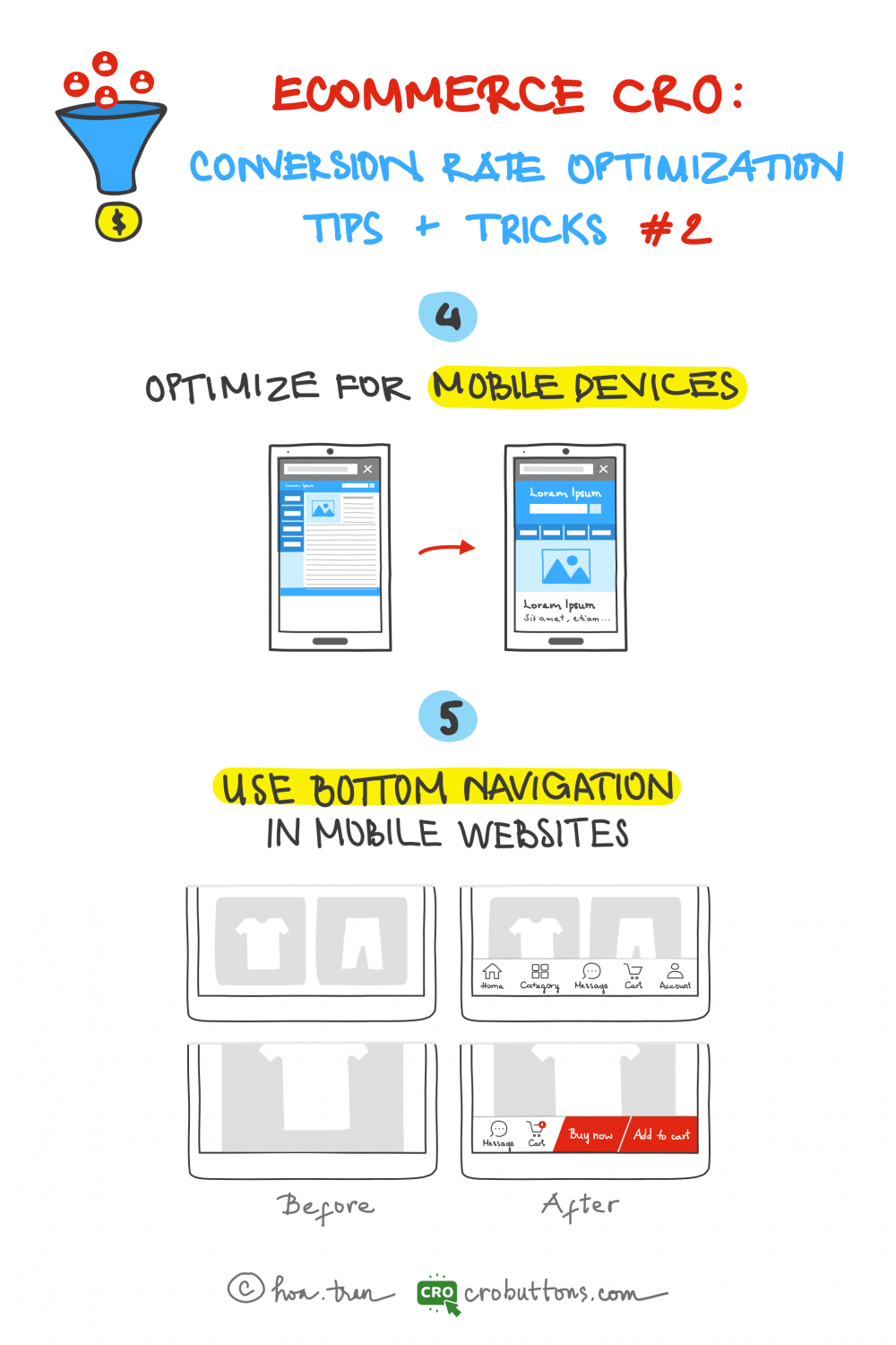
4. Optimize For Mobile Devices
Mobile responsiveness
Mobile responsiveness is one of the most important factors to consider when optimizing an eCommerce website for mobile devices. Whatever device the user is using, a mobile-responsive website is made to automatically change its layout and style to match the screen size. This ensures a smooth user experience.
US mcommerce statistics show a constant increase in the number of people jumping onto the mobile shopping train. In 2020 there were 167.8 million mobile shoppers stateside, which is around 60% of the entire US population. Mobile shoppers are defined as people who have bought at least one thing using a mobile device via an app or a website.
Cre: Freepik
With consumers increasingly purchasing online via mobile devices, it is more crucial than ever for eCommerce enterprises to have a mobile-responsive website. The key to obtaining mobile responsiveness is to use responsive design techniques like flexible grid systems and dynamic image scaling, which allow the website to alter its layout depending on the device’s screen size. By adopting these approaches, eCommerce businesses can guarantee that their website delivers an excellent viewing experience for clients, whether they are using a smartphone, tablet, or desktop computer.
Speed Optimization
Furthermore, ensure that your site is quick enough for people to navigate. Website speed is an important factor when optimizing an eCommerce website for mobile devices, since visitors anticipate quick load times, particularly when purchasing on the move. Customers are more likely to quit a website that takes too long to load, which not only annoys consumers but also leads to lower conversion rates.
To optimize website speed on mobile devices, eCommerce businesses should focus on: reducing the size of their web pages and images, using a fast hosting service, and minimizing the use of heavy plugins, etc. Additionally, it is important to implement browser caching, which allows the website to store commonly used elements in the user’s browser, reducing the amount of data that needs to be loaded each time the website is accessed.
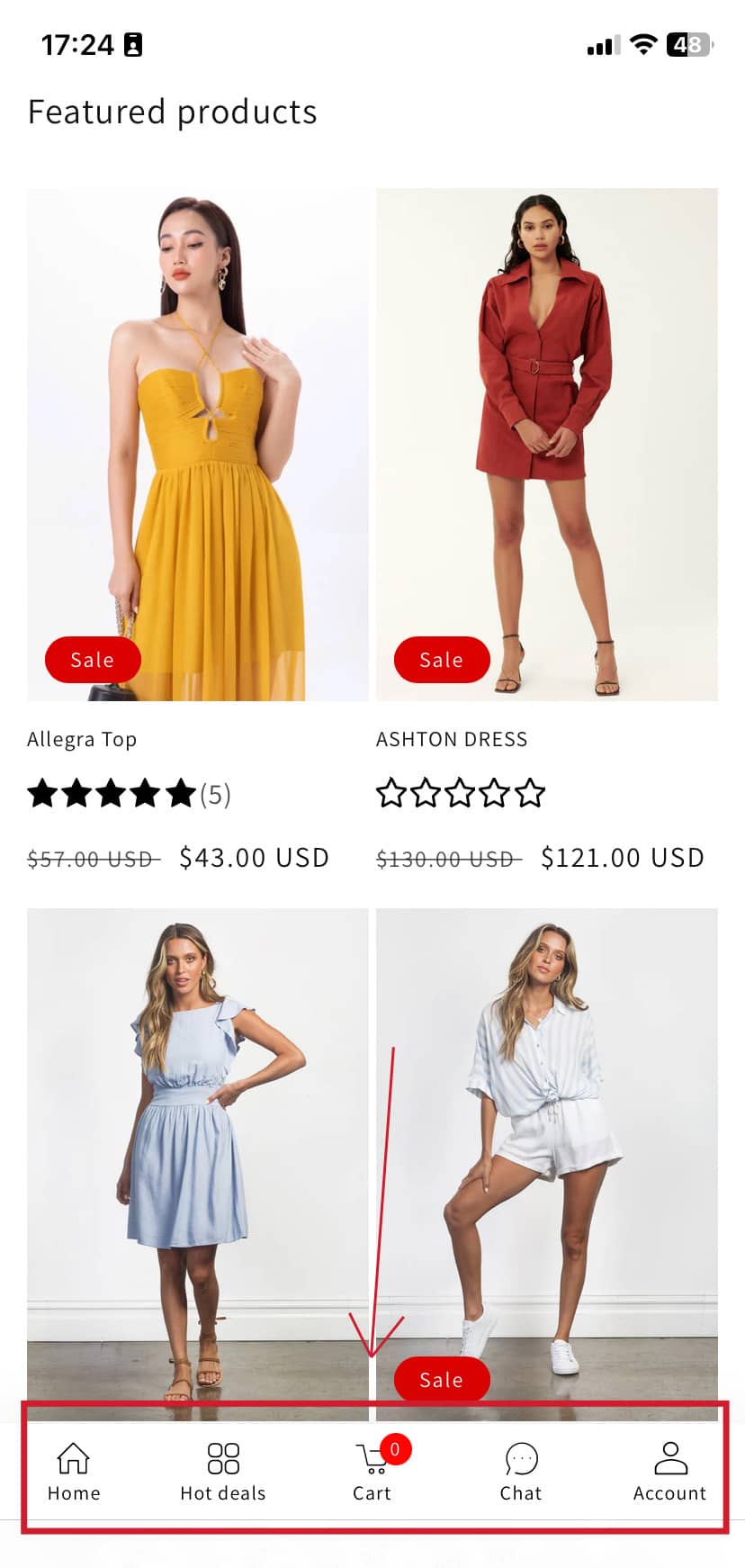
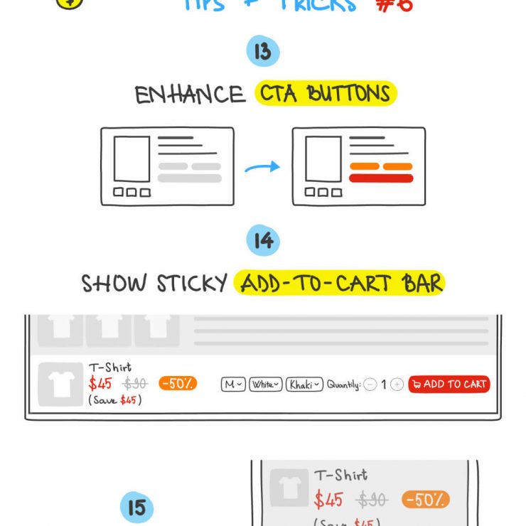
5. Use Bottom Navigation In Mobile Website
Creating a satisfying mobile experience is critical for gaining people within your app. Among the most effective ways to improve the user experience on a mobile eCommerce website is through the use of bottom navigation. By placing your most critical actions and navigation links near the bottom of the screen, you will significantly improve user experience, especially as smartphones become larger.
What is the bottom navigation?
Bottom navigation, also known as tab navigation, is a user interface design pattern in which navigation links or CTA buttons (Add to cart, Email, Phone,…) are placed towards the bottom of the screen for simple access with a single thumb touch. This form of navigation is very useful for mobile websites since it eliminates the need for visitors to scroll up and down the page, making it easier for them to discover what they are searching for.
Web developers creating a responsive mobile experience on the web opt to hide all navigation elements within a hamburger button. However, as smartphone screens become larger by the year, it becomes unfavorable for the end-user since it necessitates a greater interaction cost, making the app more complex to use.
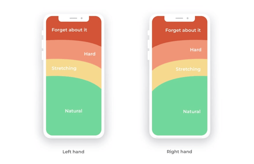
Everyone prefers to use their thumbs to navigate on the phone. And our thumbs are not growing like the screen sizes each year. There is a good reason why apps like Uber, Amazon, Facebook, and Instagram have bottom navigations. Your mobile web store is not an exception.
Thumb-reachable area on a smartphone screen – via dev.to
Furthermore, there are various benefits to adopting bottom navigation on a mobile ecommerce website:
Improved user engagement:In the A/B test found that the sticky “Add to Cart” button gets more Orders by 8%. Bottom navigation allows consumers to easily access different areas of the website, increasing the chance of conversion and user engagement.
Simplified navigation structure: Bottom navigation simplifies the website’s general navigation structure, making it easier for users to discover what they’re searching for.
Consistent user experience: eCommerce organizations may deliver a smooth user experience and boost brand awareness by employing a similar layout and placement of bottom navigation across all pages of their website.
Best practices for implementing bottom navigation
Firstly, it is important to keep the number of links or CTA buttons to a minimum, typically no more than 5-7, to avoid overwhelming the user.
Second, it is critical to utilize labels that are concise and clear and appropriately reflect the content of each part. Furthermore, visual signals like color and iconography should be used to highlight the presently chosen link, making it easier for visitors to understand where they are in the navigation hierarchy.
Finally, consistent layout and positioning across all sections of the website are advised to give a consistent user experience and promote brand identification.
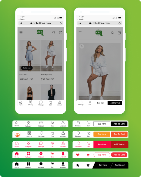
Amazingly, CRO Buttons brings the footer navigation for your Shopify online store. We transform your web into an app-like experience, after a few clicks. Several available themes are ready for you to use on your website. And you can make your shop as convenient as big e-commerce sites such as Shopee, Lazada, Flipkart, Shein…
Let’s enable and customize your web store with CRO Buttons