The technique of upgrading elements on a website to enhance conversions is known as landing page optimization. Conversion rate optimization (CRO) includes landing page optimization.
Optimizing a landing page guarantees that the visitors that arrive at that landing page convert at the highest rate. Landing page optimization can help you reduce customer acquisition costs, increase client acquisition, and maximize the value of your ad spend.
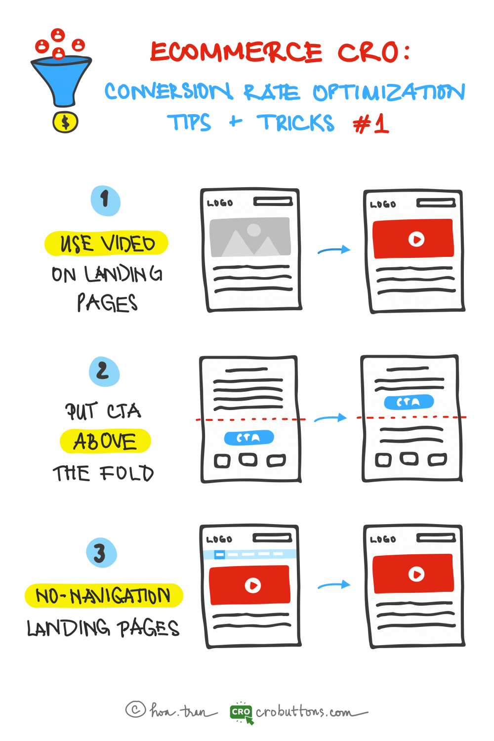
The three ideas below will serve as a start to a series of articles on conversion optimization published by the CRO Button team. We hope you find this material useful. And now, let’s get started!
Use Video On Your Landing Page
90% of information transmitted to the brain is visual, and visuals are processed 60,000X faster in the brain than text – Zabisco
Video is a far better story-telling medium than most traditional text-based marketing applications. Video enables you to powerfully connect, convert and cultivate leads.
How video can enhance the user experience?
When you navigate a landing page, there is usually a lot of text to read. This is because landing pages are essentially sales sites that want you to click on the call-to-action button right on the page or click through to the main page for the actual purchase.
The excessive amount of text can be overwhelming and monotonous for viewers, leading to feelings of boredom and eye strain. To tackle this issue, it’s recommended to utilize videos as a means of communicating information in a more engaging and visually appealing manner. Not only do videos help to hold the viewer’s attention, but they also offer a dynamic and interactive experience that keeps them interested and invested in the content. By using videos, the information can be effectively conveyed in a way that is both entertaining and informative, making it easier to attract and retain the viewer’s attention on the website for an extended time.
A single minute of video is worth about 1.8 million words – Forrester

Diode Digital reported that when compared to text and print media (combined), video promotion is 600% more effective. In addition, the same report also states that before reading any text, 60% of website visitors would rather watch a video when available. This is valuable stuff if you are looking to relate to consumers and create engaging content that leads those consumers to buy what you are selling. Now get this.
Benefits of using video on the landing page
Compared to traditional landing pages that primarily utilize text and images, video landing pages possess a multitude of benefits that sets them apart. Utilizing videos on landing pages provides a unique opportunity to not only capture the attention of visitors but also to effectively convey information and create an engaging and memorable experience. Here are a few of the key benefits:
1. Increases conversion rate
The report showed that including a video on your landing page can increase conversions by more than 80%. That’s not up for debate. Since video on the landing page makes your product or service appear engaging, increasing the likelihood that your visitors will stay engaged and finally convert. Videos allow you to engage with customers more efficiently and convey information about your products and services.
2. Increase credibility
Think With Google found that nearly 50% of internet users watched videos of a product or service before checking out a store. Videos help you show and explain your product or service to potential customers. It’s beneficial if your product is complex and cannot be easily explained in words. Moreover, people can see how your product works before they buy it. They are also more likely to remember what they see in a video than what they read in a paragraph.

3. Increases retention and engagement
Retention, by definition, is the fact of keeping something in one’s memory. On average, people have spent 2.6X more time on web pages with video than those without. By integrating auditory and visual aspects, videos attract visitors to remain on your landing page longer. People will commonly scan a block of text to save time but will watch a movie in its entirety.
It may be logical to assume that people spend more time on video landing pages because longer videos take time to run. However, the same study found that the page with the longest average time had only about one minute of video in total.
The best tactics for setting up videos
Keep it short
People are easily distracted, and there’s plenty of content on the Internet. A 2019 research study suggested that the abundance of information narrowed the global attention span. Hence, it makes sense to keep your videos short and put the main marketing message at the beginning.

Add a call-to-action (CTA) to your video
Your landing page video should have a CTA of some kind, either a lead generation form or buttons like “Buy Now,” “Sign Up,” “Download Now,” and so on.
Visitors should be persuaded to perform the required action both during the video’s course and at the conclusion. Think carefully while creating your outro since it should inform viewers what you want them to do next.
Add captions or on-screen text
When video and text are both available on the same page, 72% of consumers prefer video to learn about a product or service. (Wyzowl)
Video captions and on-screen text help clarify what’s being said. They’re placed seamlessly and unobtrusively within the video. Captions also help capture the non-English speaking audience and enable you to follow accessibility guidelines. Discovery Digital Networks also found that captioned videos were responsible for an average increase of 7.32% in views.
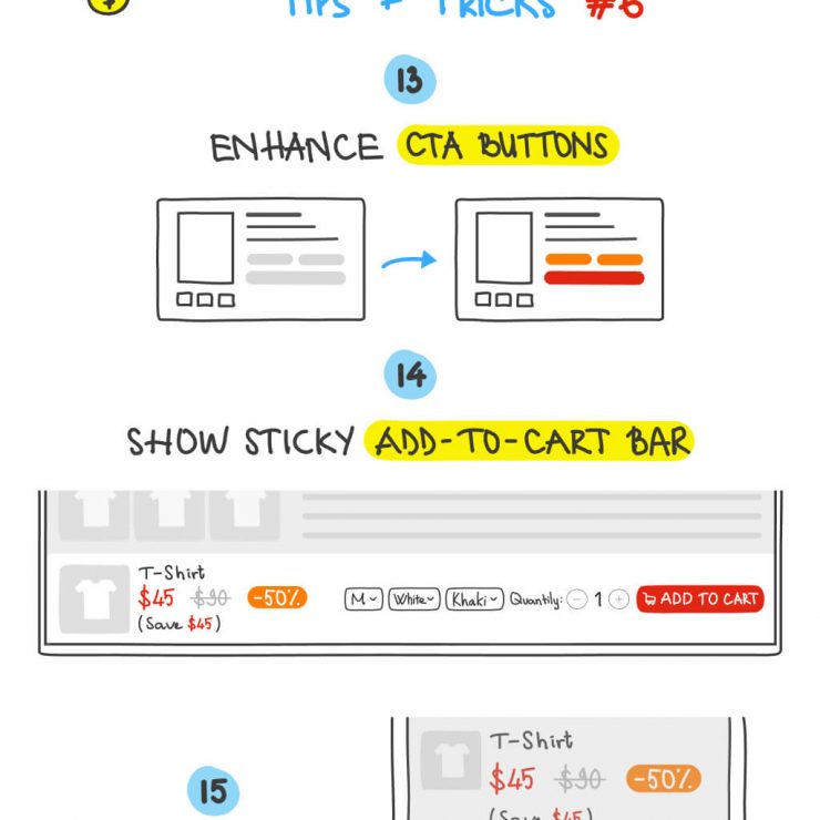
Put CTA Above The Fold
What does “Above The Fold” mean?
The area of your website that people see when they first arrive on a page is referred to as being “above the fold.” The header, text, image, or video that readers can see without having to scroll down is referred to as the content above the fold.
The “fold” of a website is considered to be at the bottom of the screen. The exact location of the fold will depend on the device that the visitor is using to load the page. As we all know too well, desktops, tablets, and mobile devices have different screen sizes and resolutions, so all content must be formatted differently to be appealing to all users.

Why CTA should be placed above the fold?
As a brief reminder, “above the fold” refers to any part of a website that appears on a user’s screen when they first access a webpage. The content that appears above and below the fold may differ depending on the device you’re visiting a website with.
A report into the “importance of being seen” found that above-the-fold ads and CTAs had a 73% rate of visibility compared to only 44% for those below the fold. If your CTA is above the fold, then your chances of it being seen are significantly higher. Some customers might not want to scroll to the bottom of a page to find out what they need to do next in their buyer journey. And clients must be encouraged to make a purchase when they have a clear perspective and standout sight of your page.
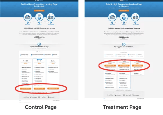
No Navigation Landing Page
Why navigation should be removed?
The landing page has so many links that it directs users away from the present page, which is the largest problem that can adversely affect the conversion rate. As a result, the client is less focused and less attentive to the objectives of the website.
From a user experience (UX) perspective, it all makes perfect sense: When you take away distractions from a website, your visitors aren’t inundated with confusing options to make. Their thoughts are at peace, allowing them to concentrate solely on the landing page’s page objective.
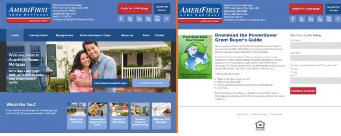
Making a landing page without navigation is best to increase conversions and ROI (return on investment). According to research by a HubSpot resource, removing navigation can increase conversion by 10 – 50%. Let’s agree on this principle: your landing page must be naked, don’t wear them with navigation. Let the customers focus on you and your offer, and complete the conversion.
Conclusion
To convert your prospects and leads into customers, we hope that our ideas for landing page optimization will enable you to identify what appeals to them.
Don’t forget basing your website design changes on real user data can make conversion rates soar. Use visual data reports and recordings whenever possible to collect more information about your website visitors. With those strategies in place, you’re well-positioned to conquer your competition.
