Normally, eCommerce businesses focus on upgrading the main menu and product page but don’t mind about the shopping cart and checkout page as well. The shopping cart and checkout stages are critical since this is where conversion happens. Everything else leads up to those stages. You don’t want to miss sales at the last minute because you stopped making it easy for them to commit, and your visitors abandon their carts.
According to Baymard Institute, 69.82% of online shopping carts are abandoned. For this reason, we will show you how to fully optimize your eCommerce cart and the checkout experience.
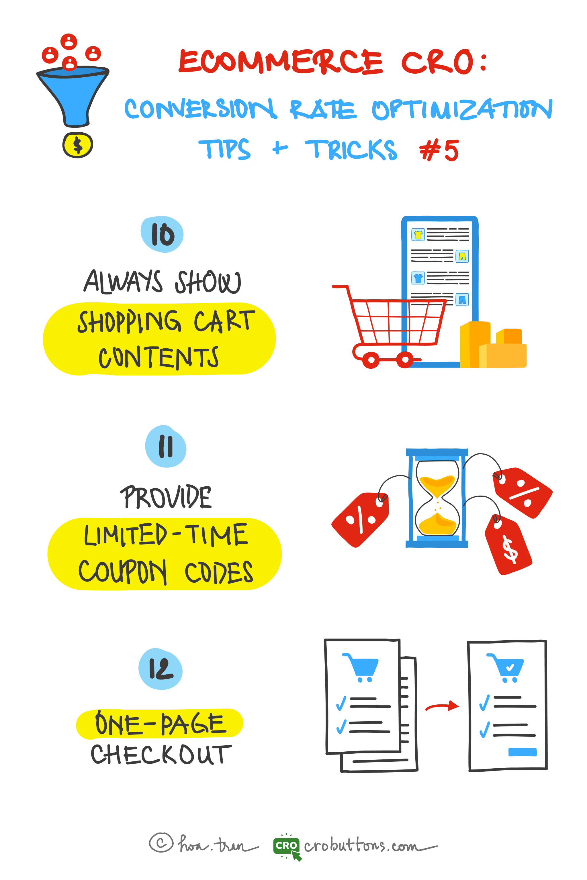
Always show shopping cart content
Most online shopping customers will keep the items in the cart and have no decision to buy even though they are interested in that product. Therefore, it is necessary to make sure the most prominent shopping cart icon is possible on every page to provide shortcuts for customers when they need to carefully check the selected items. If they can not find the cart, they will reduce the level of payment ready for the last time, which can lead to the cancellation of orders and loss of conversion.
Baymard Institute found that 16% of customers abandon their cart because they can’t calculate total order cost up-front.
What should you do to decrease the cart abandonment rate?
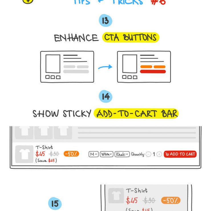
The “Add to cart” button
Many would say that the “Add to cart” button should be placed close to the price and not far from the product’s image since it is strongly related to the product. There are different cases depending mostly on the kind of product. There is a substantial difference between products with rich specs (e.g. computers) and products with sparse specs (e.g. clothes).
Let’s simplify it! Design your product pages so that the customer doesn’t have to look for the “Add to Cart” button. You want them to keep adding products, so make sure they can at any time in the shopping process.

The cart icon
It would help if you also placed the Cart icon on the top right of the page, where most people expect them to be. This placement is especially ideal for mobile shoppers. Make the shopping cart icon as prominent as possible on every page to provide shortcuts to customers when they demand to double-check their selected items.
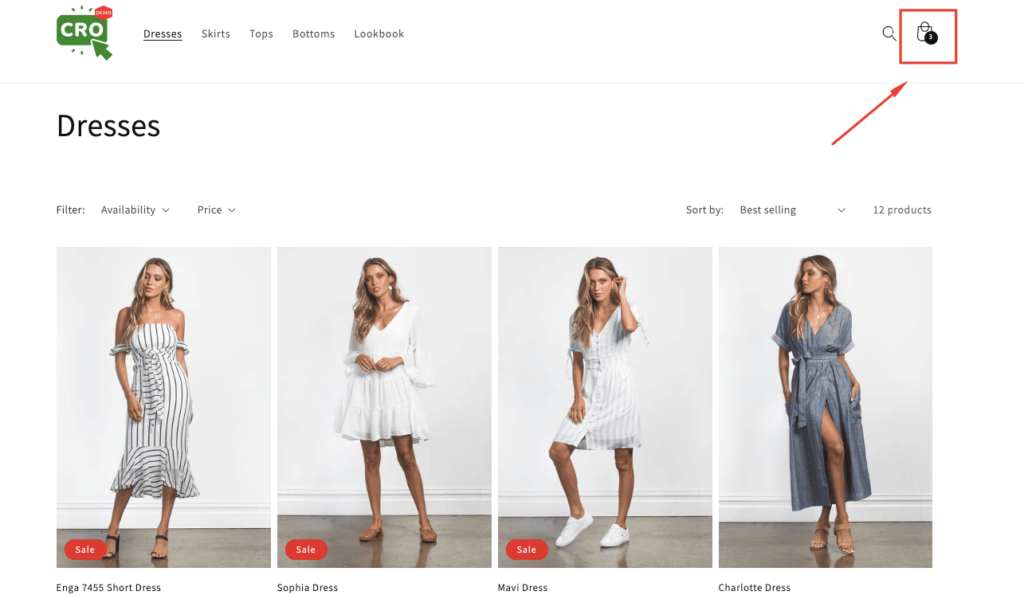
Let’s try to:
- Show the pop-up to confirm “Item added to your cart”
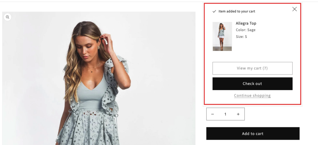
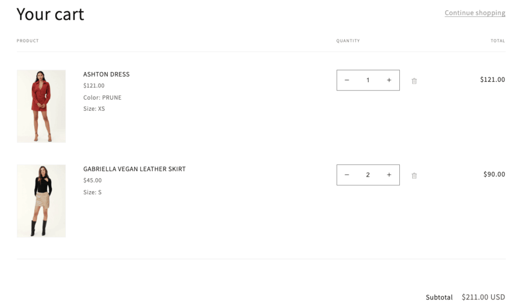
- Fully displayed subtotal and quantity for customers to verify firmly before paying.
Provide limited-time coupon codes
1. What is a limited-time coupon code?
A limited-time coupon code is a kind of limited-time offer, it can provide a discount, deal, special gift, or reward a buyer can get if they purchase from you during a certain period.
2. Why the eCommerce business should provide limited-time coupon codes?
Limited-time coupons are a great way to get shoppers to take action immediately. When taking the final checkout steps, customers are likely to grow more satisfied knowing that their orders are qualified for coupon codes including discounts on the selected products or shipping fees. Shoppers experience the fear of missing out (FOMO) when they know a discount code is about to expire. So they want to get in on the action before the offer ends.
According to Statista:
The majority (88%) of people look for discount codes throughout the product research process.
Why do customers abandon their shopping carts? Usually, it’s because they think that they can get a better deal elsewhere. Discount codes, by their very definition, assure customers that they get a special rate that’s just for them. And when they receive these via email, they know that the codes are not available to just anyone.
3. How to make it effective?
Try to create coupon codes that require conditions to acquire and avail at a set period only. Secret coupon codes given to certain customers illustrate the advantages of multiple special purchases. Setting a deadline for the included discounts generates a sense of urgency that encourages customers to quickly close the deal. The coupon codes should be automated and operated with the help of other useful tools such as emails or additional confidential links.
One-page checkout
According to “Reasons for Abandonments During Cart & Checkout (2022 data)” of Baymard:
17% of shoppers abandoned an order because the checkout process was too complex.
You can have the best product page in the world. But if shoppers are exacerbated during the checkout process, or their needs go unmet, converting them into paying customers can become an impossible task.
Some typical criteria determine an effective checkout page that stores can keep in mind.
Simple one-step checkout
Displaying all checkout information on one page helps reduce mouse clicks that normally take much time to conduct while giving customers a better category navigating experience. Besides, a one-step checkout form will enhance page loading speed, decreasing cart abandonments compared to a multiple-checkout-pages process.
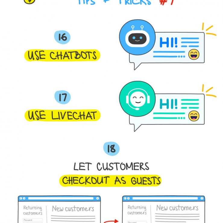
Allow guest checkout
John Cheng, founder and CEO of Baotris said: “A lot of people may see the process of creating an account as an obstacle because they are looking for a fast and easy way to buy the product they want”. So guest or social checkout allows shoppers to complete their purchase without entering unnecessary details, such as their birthdate or password, which helps reduce friction purchase process and fasten conversion steps.
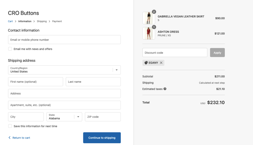
Remove unnecessary steps
Abandoned carts are often due to people changing their minds from having to fill out too much information. People want as few steps as possible. Store administrators should manage checkout fields effectively and select the necessary ones that can optimize customers’ payment conclusions.
The standard checkout process for a consumer should be:
- Adding to the cart
- Billing details
- Shipping details
- Delivery method
- Preview order
- Payment
- Confirmation
Save customers’ information for next purchases
Customers only need to fill in their information once. Their name, email address, and shipping location are stored within the payment processor for future use, allowing them to breeze through the online checkout experience with one click when returning to the same website. Information about customers should be stored and auto-filled the next time they visit.


