Great items and brand awareness are crucial, but so are all the tiny elements that make up the shopping experience on your website. Everything influences how well you can convert surfers into purchasers, commonly known as your site’s conversion rate, from the way your items are sorted to the live chat widget (or lack thereof). The shopping cart in your online store is one of the most significant of these aspects.
In the previous article, we explored some ways to optimize the shopping cart. Among those design approaches, we mentioned the mini shopping cart. In this article, let’s delve deeper into it together, shall we?
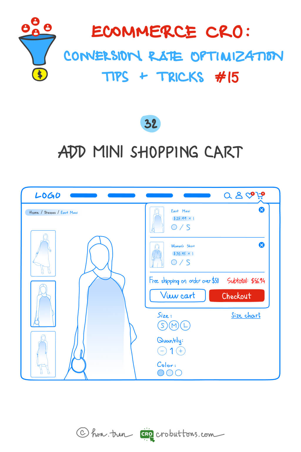
32. Add Mini Shopping Cart
What is a mini shopping cart?
A mini shopping cart is a shortened and smaller form of a standard shopping cart that is frequently shown in the website’s header or sidebar. One of the primary advantages of a tiny shopping cart is that it allows consumers to quickly and easily examine the contents of their current cart without leaving their current page. This is especially helpful for customers who want a simplified and quick browsing experience. Users can immediately view the things they’ve added to their cart as well as the overall cost of their order by hovering over the cart icon, providing them with the information they need to make smart purchasing decisions.
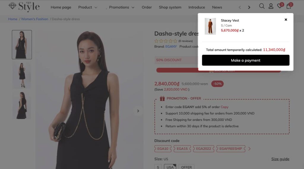
Why the website should have a mini shopping cart?
Aside from the convenience factor, another advantage of a small shopping cart is that it takes up less screen space than a full-sized shopping cart. This means it is less obtrusive and does not interfere with the browsing experience of users.
Users are frequently brought to a new page or overlay when using a full-sized shopping cart, which can disrupt their browsing experience and make it more difficult to browse the site. A small shopping cart, on the other hand, is constantly displayed and does not force consumers to leave their current website. This allows customers to continue exploring and finding things of interest without having to worry about losing their existing basket contents.
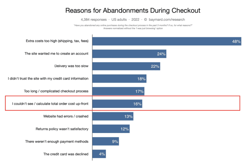
Baymard’s research reveals the top reasons for cart abandonment, 16% say that they didn’t complete their purchase because they can’t see/calculate total order cost up-front
In addition to these advantages, a small shopping cart can assist minimize cart abandonment and enhance conversions. Users are less likely to forget about their order or abandon their cart before completing their transaction if the items in their basket and the total order amount are visible reminders.
This increases the possibility that consumers will complete their transactions, resulting in more sales and revenue for the ecommerce site. In general, a well-designed mini shopping cart may be a valuable tool for enhancing the user experience and increasing conversions on an e-commerce website.
Best Practices for Mini Shopping Cart Design
When building a tiny shopping cart, keep the user experience and overall appearance and feel of your website in mind to create a comfortable cart
- Making the cart easily visible on the page, without being intrusive: Placing the mini cart in the website’s header or sidebar is a typical option since it allows users to instantly access their cart without leaving the page they are on.
- Making the cart visually appealing: Using clear and easy-to-read typography and color schemes that are consistent with your website’s branding.
- Including essential information in the mini cart: such as the number of items in the cart, the total cost, and a checkout button. When a user is ready to make a purchase, they may simply access their cart and direct to checkout.
- Making the mini cart responsive and mobile-friendly: Many users are tending to browse on their smartphones or tablets, which ensures that your mini cart will be optimized for smaller screens and touch-based interactions.
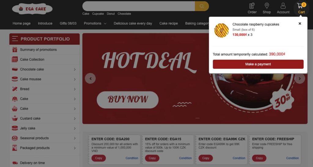
By following these best practices, you can enhance a small cart that is optimized for consumers and delivers a smooth shopping experience across all platforms.
Conclusion
Finally, including a mini shopping cart on your e-commerce website can offer a variety of advantages, ranging from improved user experience to increased conversions and income. You may construct a visually beautiful and user-friendly mini cart by following best practices for design and execution. It is critical to consider the user experience throughout the design phase, ensuring that the mini cart is easy to discover, concise, and mobile-friendly.
If you need assistance with setting up a mini cart or optimizing your e-commerce website, get in touch with CRO Buttons to design a website that fits your style!
With the right approach and tools, you can set up a mini shopping cart that helps to streamline the purchasing process and provides a positive shopping experience for your customers.
