
Shopping online has become a handy and popular way for individuals to buy things, but one recurring issue is the frequency of abandoned shopping carts. Despite the rise in online shopping, many customers abandon their shopping carts before finishing their purchases. This results in lost sales for businesses and a terrible user experience for customers.
This article will look at the reasons for empty shopping carts as well as design strategies that organizations can employ to prevent cart abandonment and increase conversions.
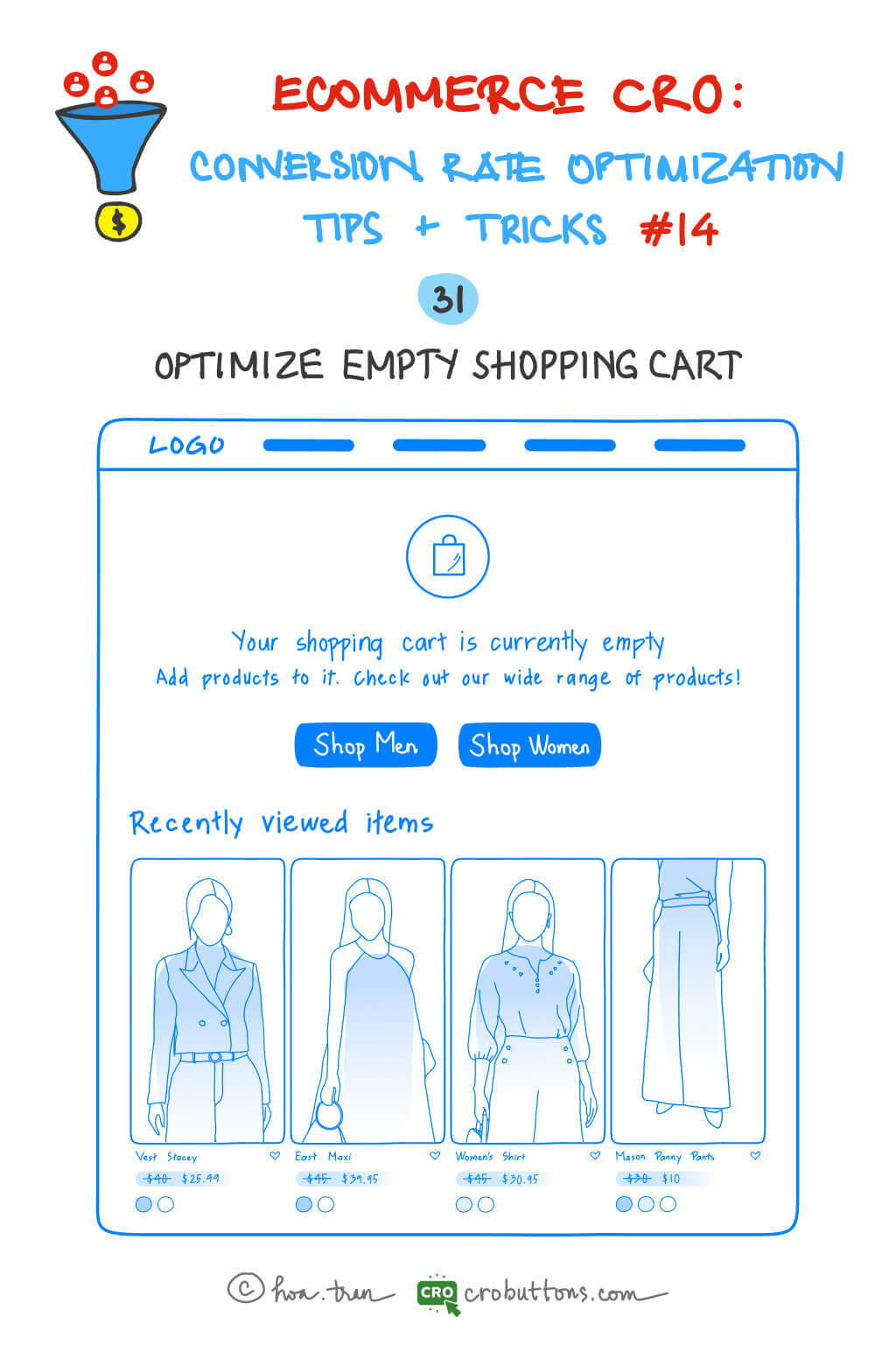
31. Optimize Empty Shopping Cart
Factors Contributing to Empty Shopping Carts
Shopping carts that are left empty may be extremely inconvenient for both e-commerce enterprises and customers. Several factors contribute to this problem, as we have discussed several times in prior posts.
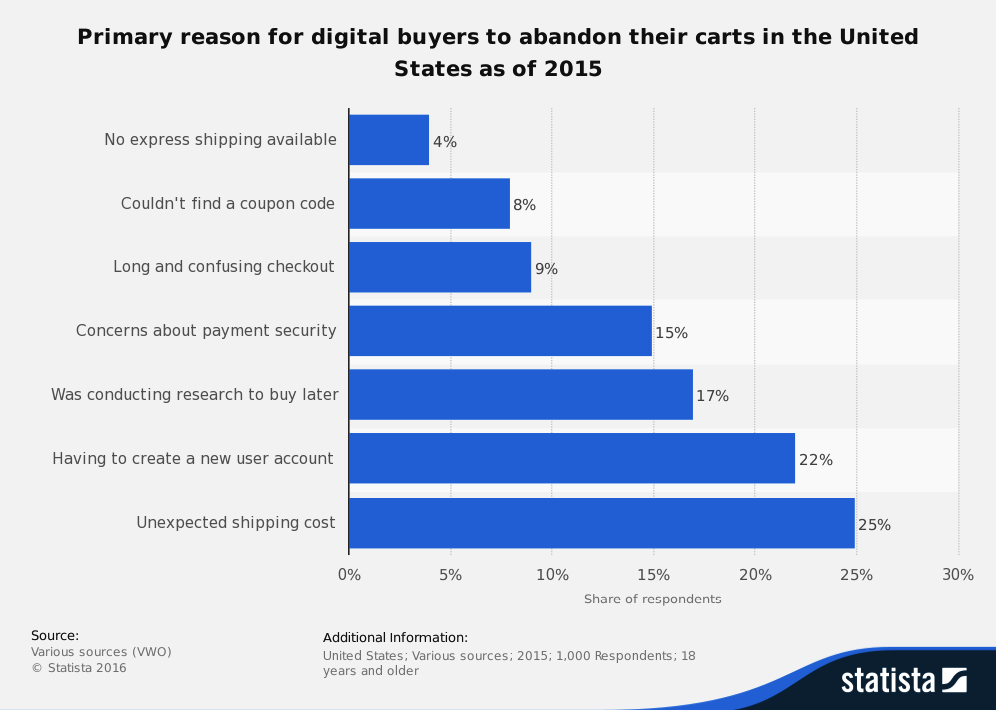
A long checkout procedure, a lack of trust in the website, excessive delivery prices, and restricted payment alternatives are all examples. A confused or overpowering website design might also result in abandoned shopping carts. Businesses may take proactive actions to improve the consumer experience and prevent shopping cart abandonment by identifying the elements that contribute to empty shopping carts.
The sole focus of this article is on providing design recommendations.
Design ideas and usability tips for shopping cart page design
Changing the design of e-commerce websites and shopping cart pages takes care of many of these issues.
The average e-commerce site can improve its conversion rate by 35% solely through design improvements to the checkout process – Baymard Institute
1. Empty shopping cart
It is critical to address the issue of an empty shopping cart since it can have a negative influence on the user experience and eventually result in a decline in conversions. Rather than merely showing a notice stating that the basket is empty, it is essential to actively connect with the user and give a clear and effective solution. To encourage customers to add things to their cart, provide shopping instructions and a compelling call to action. You may also improve the customer experience by providing product recommendations based on their browsing history or highlighting your store’s unique selling qualities that set it apart from rivals.
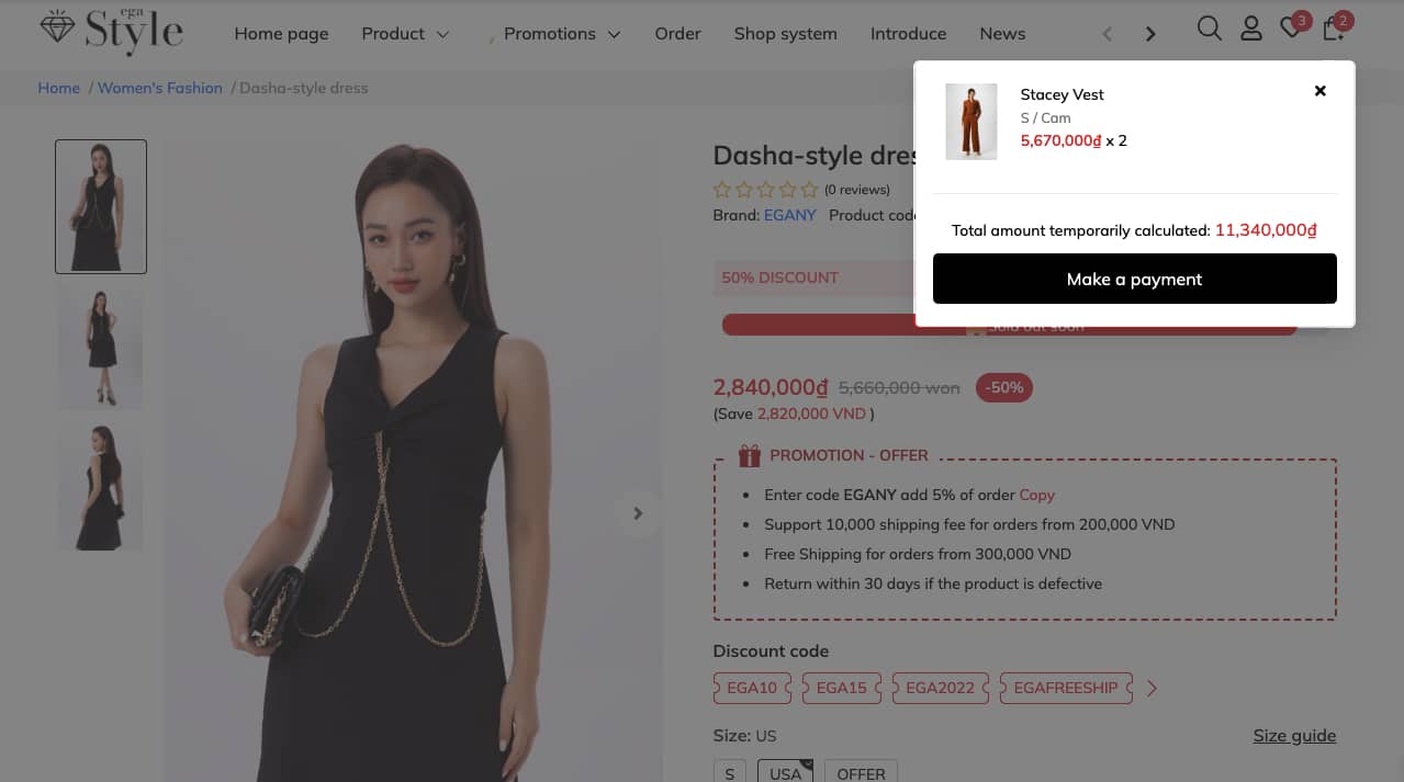
2. Mini shopping cart
When faced with an empty shopping cart, it’s important to provide users with more than just a simple notification of its emptiness. Instead, consider offering shopping instructions and a clear call to action that encourages them to fill it. Utilizing a mini shopping cart is certainly convenient for keeping track of expenditures and purchased items, but it should not be seen as a replacement for the full-page cart.
The mini cart can serve as a helpful tool for monitoring purchases, but making purchasing decisions with just a mini cart can become overwhelming for shoppers. To enhance the shopping experience, consider including a link within the mini cart that takes users directly to the full page cart rather than straight to checkout. A mini cart may be used to validate that a product has been put into the cart without switching to a new tab.
3. Full page cart
When users reach the cart page, they make their final purchase choice. Shoppers add things to their carts so they may examine or compare the items they’ve chosen, see if the purchase total is within their budget, or if they qualify for free delivery, and so on. So, create your cart page in such a way that it supports your customers in making purchasing decisions.