
You understand the importance of engagement and conversion rates, as well as how they are inextricably intertwined. The more interaction you have with your target audience, the higher your conversions will be. This is because people will always conduct business with individuals they know, trust, and like, and nothing develops a stronger bond with your customer base than engagement.
Website engagement is a metric used to gauge the success of an online business by measuring user interest and behavior. The growth of the internet has made it easier for businesses to expand globally. Improving website engagement can lead to a better user experience and increased conversions.
Having clear insights on what’s happening on the site, and what content drives more user engagement helps businesses to make the right decision. Implementing certain strategies can increase website engagement and conversion rates.
Let’s take a look at some of the ways you can increase your engagement, and as a result, your conversions.
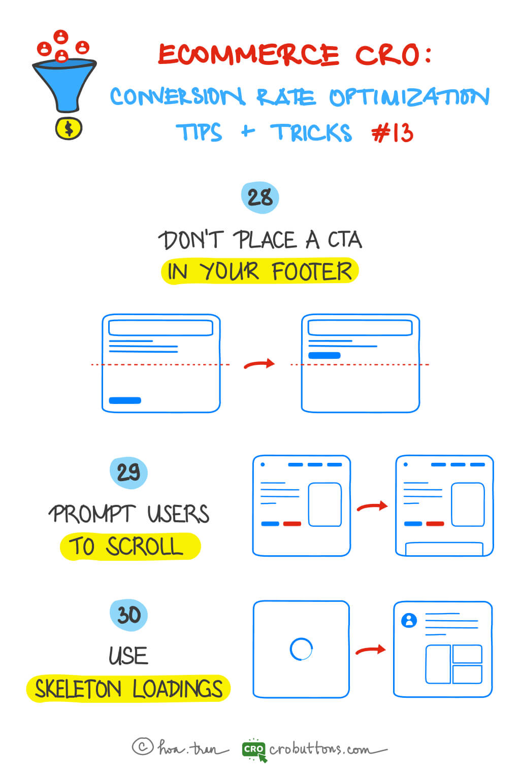
28. Don’t Place the CTA In Your Footer
Incorporating a Call-to-Action (CTA) button into a website is an indispensable step toward boosting conversion rates. However, it’s not just about having CTA buttons on the website, but also about placing them in the right location. The location of the CTA button can greatly impact its effectiveness, and if not placed strategically, it may not bring about the desired results.
Why footer is not an effective location for CTAs?
When it comes to website design and conversion optimization, one of the least successful places to place the Call-to-Action (CTA) button is the footer.
According to NN Group, the information towards the top of the screen received more attention than the information towards the bottom. More than 65% of the viewing time above the fold was concentrated in the top half of the viewport.

The footer of a website ranks as one of the lowest converting locations for a CTA for a few reasons:
- Visitors must read/scroll to the bottom to see it: The footer is typically situated at the bottom of a web page; visitors are unlikely to scroll down to the absolute bottom of the page to look for something. Let’s strive to convert your visitors into leads as quickly as feasible.
- It is surrounded by several other navigation links and buttons — competing for attention: The bottom of a website is frequently crammed with information and links that might redirect users’ attention away from the Call-to-Action (CTA) button, limiting its efficacy. This amount of content in the footer may overload visitors, making it difficult for them to discover and focus on the CTA, reducing its odds of eliciting desired actions from visitors.

By putting the CTA button in the footer, it may not obtain the visibility and prominence needed to compel visitors to take action, resulting in a low conversion rate.
The alternative locations for CTA buttons
Don’t be concerned! A Call-to-Action (CTA) button can be placed in a variety of places on a website to increase its exposure and impact:
- Above the fold: Placing the CTA button above the fold, or at the top half of the screen, boosts its visibility and accessibility to visitors without needing them to scroll down the page.
- Inline: Inline CTAs appear in the body text of a blog post as anchor text or a form field. They work effectively because the reader may be primed with relevant material before you ask for any kind of action. Moreover, inline CTAs are less invasive and do not distract your reader as much as huge pictures or buttons. If your content is lengthy, use inline CTAs to break up the text. One at the beginning, middle, and end.
- Popup: Popups, while contentious, push your visitors to take action in some way. It compels your visitor to take action and pay attention to you. Whether it’s clicking through to whatever you’re giving or clicking the “X” to shut the window. It breaks your visitor’s trance and forces them to pay attention.
These are just a few examples of alternate CTA placements; the optimum location will be determined by your website’s individual goals and target audience. When determining where to position your CTA, consider aspects such as the CTA’s purpose, the user’s journey through the site, and the site’s style and layout.
29. Prompt Users To Scroll
Why do we have to prompt people to scroll??
It allows users to interact with the information and explore the site’s many areas. Scrolling, when done correctly, may generate a sense of discovery and keep users interested, resulting in more time spent on the site and a higher possibility of them doing a desired action, such as making a purchase or signing up for a newsletter.
Scrolling may also assist visitors to comprehend the value and benefits of a product or service by displaying extra information, pictures, and testimonials. This fosters confidence and trustworthiness, increasing the likelihood of the visitor doing the desired action.
Furthermore, companies may better regulate the flow of content and steer the user’s trip across the site by encouraging users to scroll. This can assist direct the visitor’s attention to certain locations, such as the CTA, and enhance the likelihood that they will do the intended action.

Techniques to encourage scrolling
1. Provide interesting content right from the beginning
The materials at the top and the viewable section of the screen are critical. What displays at the top of the page makes a first impression and establishes a quality expectation for your users. Users do scroll, but only if what they see when they get to the page looks promising. Organizing the page’s material in an easy-to-follow manner, using aesthetically distinguishable headers, subheadings, and graphics. This makes it easy for visitors to comprehend what they’re looking at and keeps them scrolling.
You must produce material that engages your visitors by delivering fascinating facts and attractive visuals (users pay close attention to images and pictures that contain relevant information) to engage and encourage visitors to keep scrolling, ultimately increasing their chances of taking the desired action.
2. Using arrows or “scroll prompt”
Sometimes asking consumers to scroll is the greatest way to get them to do it. Simply remind consumers that the majority of the material is located below the fold. A small visual signal, such as an arrow pointing off-screen or the words “scroll down,” might alert readers that the majority of the material is located below.
3. Keep navigation options consistently visible
Navigation is a critical component of a website’s user experience. One of the most serious hazards of employing extensive scrolling in your design is user disorientation. If the navigation bar disappears when users scroll down, they will have to scroll back up when they reach the bottom of the page. Typically, this behavior perplexes and annoys users.
The obvious answer to this problem is to use a sticky navigation menu that displays the current location and stays in the same position on the screen at all times.
On the contrary, it makes no sense on mobile devices. Since the mobile screen is much smaller than the desktop screen, a visible navigation bar can take up a relatively significant part of the screen. One way to solve the problem of a small screen estate is to hide a navigation bar when users are scrolling for new content and make it visible when users pull down to get back to the top.
30. Use Skeleton Loading
In this era of digitalization, teams are focusing more on giving the best experience to the users. So, user experience keeps on evolving, and new methodologies and components are being adopted by the teams. One among them is Skeleton Loader which you might have seen on many websites and mobile apps.
What is a skeleton screen?

Oh, there is no problem with your internet connection. This is simply a mock-up of the skeleton screen!
A skeleton screen is an animated placeholder that resembles the layout of a website while data is being loaded. It involves displaying a simplified representation of the page’s layout, such as a series of gray boxes that match the size and shape of the expected content, to give users an indication that something is loading.
Benefits of using skeleton loading
Using skeleton loading can offer several benefits for a website:
- Improved user experience: Skeleton loading gives users an indication of what is to come while the content is being loaded, instead of displaying a blank screen or a loading spinner, which can be frustrating for users. This can result in a better user experience and increase engagement. The issue with using a loading spinner is that it does not indicate how long the loading process will take. Similarly, skeleton loading may not offer a solution to this problem, but it does present a visually interesting alternative for visitors to view while they wait. Right?
- Reduce bounce rate: The percentage of visitors that depart a website after reading only one page is known as the bounce rate. Skeleton loading can assist to minimize the bounce rate and encourage users to explore additional pages on the site by keeping them engaged and interested.
- Faster Load Time Perception: Skeleton loading can also aid in reducing the perceived load time for users. Users are more likely to perceive that the site is loading fast if some information is displayed, even if it is only momentary.
- Improved User Feedback: Skeleton loading can provide immediate feedback to users, letting them know that the site is actively working to load the content they have requested. This can improve the overall user experience and increase user satisfaction.
When to use
- Use on high-traffic pages where resources take a bit long to load like Account Dashboard.
- When the component contains a good amount of information, such as a List or Card.
- Could be replaced by Spin in any situation, but can provide a better user experience.
- Use when there’s more than 1 element loading at the same time that requires an indicator.
When not to use
- Not to use for a long-running process, e.g. importing data, etc.
- Not to use for fast processes that take less than 300ms.
However, don’t allow the skeleton screen to show too frequently; it indicates that your website’s performance is suffering; promptly research solutions to improve page loading speed.
Conclusion
Finally, establishing an interesting and effective website necessitates paying attention to a variety of factors such as the positioning of CTAs, the encouragement of scrolling, and the usage of skeleton loading. You can improve the user experience, increase conversions, and decrease bounce rates by carefully incorporating these aspects. Always emphasize the demands of the user and try multiple techniques to find what works best for your audience. A well-designed website not only gives visitors a great experience but also drives commercial success.